
Turn on suggestions
Auto-suggest helps you quickly narrow down your search results by suggesting possible matches as you type.
Showing results for
Please log in to access translation
Turn on suggestions
Auto-suggest helps you quickly narrow down your search results by suggesting possible matches as you type.
Showing results for
Community Tip - Stay updated on what is happening on the PTC Community by subscribing to PTC Community Announcements. X
- Community
- Augmented Reality
- Vuforia Studio
- Re: Change css styling for slider widget
Translate the entire conversation x
Please log in to access translation
Options
- Subscribe to RSS Feed
- Mark Topic as New
- Mark Topic as Read
- Float this Topic for Current User
- Bookmark
- Subscribe
- Mute
- Printer Friendly Page
Change css styling for slider widget
Apr 23, 2019
05:11 AM
- Mark as New
- Bookmark
- Subscribe
- Mute
- Subscribe to RSS Feed
- Permalink
- Notify Moderator
Please log in to access translation
Apr 23, 2019
05:11 AM
Change css styling for slider widget
Hi,
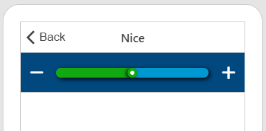
I'm currently trying to change the colour and height of the bar, and also the icon used for the sliding if possible on the slider input widget, but the css page doesn't have any information on how to change the colour or height of the bar itself. I've attached an image for reference. I have attached what I currently have, and in a new comment attached what I want ideally.
Thanks,
Jon
Solved! Go to Solution.
ACCEPTED SOLUTION
Accepted Solutions
Apr 24, 2019
05:42 AM
- Mark as New
- Bookmark
- Subscribe
- Mute
- Subscribe to RSS Feed
- Permalink
- Notify Moderator
Please log in to access translation
Apr 24, 2019
05:42 AM
Not sure what happens to my prev answer but i build up a good example
.customSlider.item {
  background-color: #01487f !important;
}
.customSlider {
  i{
    color: white;
  }

  input {
    background: transparent;
  }

  input[type=range]::-webkit-slider-runnable-track {
    background: #0098D1;
    overflow: hidden;
    border-radius: 25px;
    height: auto;
    box-shadow: 2px 2px 10px black;
    margin:5px;
  }
  input[type=range]::-webkit-slider-thumb {
    border: 4px solid #12A910;
    height: 14px;
    width: 14px;
    border-radius: 100%;
    background: #ffffff;
    cursor: pointer;
    -webkit-appearance: none;
    box-shadow:  -2px 1px 8px #000000, calc(-100vw - 7px) 0 0 100vw #12A910;
  }
}
4 REPLIES 4
Apr 23, 2019
05:12 AM
- Mark as New
- Bookmark
- Subscribe
- Mute
- Subscribe to RSS Feed
- Permalink
- Notify Moderator
Please log in to access translation
Apr 24, 2019
03:55 AM
- Mark as New
- Bookmark
- Subscribe
- Mute
- Subscribe to RSS Feed
- Permalink
- Notify Moderator
Please log in to access translation
Apr 24, 2019
03:55 AM
So yeah it's possible but a bit different as outer Widgets. The Slider use a small trick to generate the slidebar and this is not like the normal input in HTML so this is the reason i set the Background of input to transparent.
What does it means? The Slider uses the Input element of HTML and an Input can get some appearance css properties. This Properties are a bit different in for each browser. In the example and for Vuforia Studio you have to use the Chrome specific "-webkit.." properties.
Additionally an Input can get a type definition in case of a slider it called in HTML "range"
If we put these together we can define a new track (slidebar) and a new thumb.
The Problem you can't see this kind of CSS in the inspector, but if you google "range input css" you got more examples.
.customSlider.item {
  background-color: #01487f !important;
}
.customSlider {
  i{
    color: white;
  }

  input {
    background: transparent;
  }

  input[type=range]::-webkit-slider-runnable-track {
    background: #0098D1;
    overflow: hidden;
    border-radius: 25px;
    height: auto;
    box-shadow: 2px 2px 10px black;
    margin:5px;
  }
  input[type=range]::-webkit-slider-thumb {
    border: 4px solid #12A910;
    height: 14px;
    width: 14px;
    border-radius: 100%;
    background: #ffffff;
    cursor: pointer;
    -webkit-appearance: none;
    box-shadow:  -2px 1px 8px #000000, calc(-100vw - 7px) 0 0 100vw #12A910;
  }
}
Apr 24, 2019
05:33 AM
- Mark as New
- Bookmark
- Subscribe
- Mute
- Subscribe to RSS Feed
- Permalink
- Notify Moderator
Please log in to access translation
Apr 24, 2019
05:33 AM
Hi Jon,
there are some parts of the css, that you can change and some parts, that are overwritten from annother directory. It seems that some of the changes you want to do, will get overwritten.
You can change the background color and the thumb color (the round thing you move around).
If you want to search for css to adjust the slider you best search for "range slider css"
Here is some code to play around with. You have to put "rangeCustom" into the class field of your slider properties.
Greetings
whity
.rangeCustom input {
display: inline-block;
overflow: hidden;
margin-top: 5px;
margin-bottom: 5px;
padding-right: 2px;
padding-left: 1px;
width: auto;
height: 43px;
outline: none;
background: -webkit-gradient(linear, 50% 0%, 50% 100%, color-stop(0%, #ccc), color-stop(100%, #ccc));
background: linear-gradient(to right, #ccc 0%, #ccc 100%);
background-position: center;
background-size: 99% 2px;
background-repeat: no-repeat;
-webkit-appearance: none;
}
.rangeCustom input::-moz-focus-outer {
/* hide the focus outline in Firefox */
border: 0; }
.rangeCustom input::-webkit-slider-thumb {
position: relative;
width: 28px;
height: 28px;
border-radius: 50%;
background-color: #ff0000;
box-shadow: 0 0 2px rgba(0, 0, 0, 0.3), 0 3px 5px rgba(0, 0, 0, 0.2);
cursor: pointer;
-webkit-appearance: none;
border: 0;
}
.rangeCustom input::-webkit-slider-thumb:before {
/* what creates the colorful line on the left side of the slider */
position: absolute;
top: 13px;
left: -2001px;
width: 2000px;
height: 5px;
background: #ff0000;
content: ' '; }
.rangeCustom input::-webkit-slider-thumb:after {
/* create a larger (but hidden) hit area */
position: absolute;
top: -15px;
left: -15px;
padding: 30px;
content: ' '; }
.rangeCustom input::-ms-fill-lower {
height: 20px;
background: #00ff00; }
Apr 24, 2019
05:42 AM
- Mark as New
- Bookmark
- Subscribe
- Mute
- Subscribe to RSS Feed
- Permalink
- Notify Moderator
Please log in to access translation
Apr 24, 2019
05:42 AM
Not sure what happens to my prev answer but i build up a good example
.customSlider.item {
  background-color: #01487f !important;
}
.customSlider {
  i{
    color: white;
  }

  input {
    background: transparent;
  }

  input[type=range]::-webkit-slider-runnable-track {
    background: #0098D1;
    overflow: hidden;
    border-radius: 25px;
    height: auto;
    box-shadow: 2px 2px 10px black;
    margin:5px;
  }
  input[type=range]::-webkit-slider-thumb {
    border: 4px solid #12A910;
    height: 14px;
    width: 14px;
    border-radius: 100%;
    background: #ffffff;
    cursor: pointer;
    -webkit-appearance: none;
    box-shadow:  -2px 1px 8px #000000, calc(-100vw - 7px) 0 0 100vw #12A910;
  }
}


