
Turn on suggestions
Auto-suggest helps you quickly narrow down your search results by suggesting possible matches as you type.
Showing results for
Please log in to access translation
Turn on suggestions
Auto-suggest helps you quickly narrow down your search results by suggesting possible matches as you type.
Showing results for
Community Tip - Want the oppurtunity to discuss enhancements to PTC products? Join a working group! X
- Community
- Creo+ and Creo Parametric
- 3D Part & Assembly Design
- Re: What font are you guys using in dwg mode?
Translate the entire conversation x
Please log in to access translation
Options
- Subscribe to RSS Feed
- Mark Topic as New
- Mark Topic as Read
- Float this Topic for Current User
- Bookmark
- Subscribe
- Mute
- Printer Friendly Page
What font are you guys using in dwg mode?
Mar 20, 2013
12:50 PM
- Mark as New
- Bookmark
- Subscribe
- Mute
- Subscribe to RSS Feed
- Permalink
- Notify Moderator
Please log in to access translation
Mar 20, 2013
12:50 PM
What font are you guys using in dwg mode?
Why is it so hard to find a font made for Engineering dwgs? I want a totally circular "O", and a zero with a line thru it. I want a 1 with the little "flag" on top, I want capital "i" to look like a Roman numeral, and I want the capital "L" to have the foot on it. We recently made a change to our font to: "iso30985font", and it's better than the "Font" text for sure, but I'd still lie to have the capital "i" look like a Roman numeral. I mean, in most fonts, you can't tell the difference between a lower-case "L" and a one and an upper-case "i".
Why does this seem to be such a difficult thing?
What are you guys using?
35 REPLIES 35
Mar 20, 2013
01:34 PM
- Mark as New
- Bookmark
- Subscribe
- Mute
- Subscribe to RSS Feed
- Permalink
- Notify Moderator
Please log in to access translation
Mar 20, 2013
01:34 PM
I definitely fell your pain on this one. For a while I was experimenting with many of the different fonts, but I could never find one that I really fell in love with. I can usually find a font that I initially like better than the default "Font" font, but I always find shortcomings the more I use them. I was using CG Triumvirate for a while and didn't hate it, but eventually stopped using it. You wouldn't like it due to it not having the Roman numeral style capital "i". Alas, I'm back to using the default font and suppressing the urge to vomit every time I make a drawing.
I usually frown upon comparing features of different CAD programs and CAD programs in general, and I sincerely hope I don't derail this thread by doing so... but... I've always felt that Solidworks did an amazing job with their drawings package as a whole, very much including their default font. Every time I'm in the shop, I can pick out the drawings made with Solidworks and the ones made with ProE/Creo instantly. Anyone know what they use?
Mar 20, 2013
02:17 PM
- Mark as New
- Bookmark
- Subscribe
- Mute
- Subscribe to RSS Feed
- Permalink
- Notify Moderator
Please log in to access translation
Mar 20, 2013
02:17 PM
I too prefer the ISO30985font. I am just not liking the way Creo treats TTF on the drawings. the only other thing I do is add thickness of .012 to the ISO font to help it stand out in PDF plots.
If you really want to go back to the "source" you would look at the Leroy lettering templates. These do not have the little features you are seeking either so they are technically not "required" although ISO does address these better.
The "O" and "0" issue is commonly resolved with width. The "O" is typically -rounder- when compared to "known" zeroes. The upper case I (eye) and lover case l is always an issue without serifs. In the past, drawings used only upper case and special cases were created for the use of "i" such as not using them in revisions. As for the 1's, this one is a no brainer... it should have the small tick on the top in my opinion even if Leroy doesn't agree.
Do a Google search for Drafting Fonts and you will get a lot of "recommendations". You can always drop a TTF in the appropriate install folder of Creo and use it. Just remember that each time you update your software, you need to re-install the font. So keep a copy handy.
BTW: you do know you can create your own fonts for Creo, right?
Mar 20, 2013
02:22 PM
- Mark as New
- Bookmark
- Subscribe
- Mute
- Subscribe to RSS Feed
- Permalink
- Notify Moderator
Please log in to access translation
Mar 20, 2013
02:22 PM
And have a look at ISOCTEUR and ISOCPEUR in your windows character map. It seems pretty close by delineating the lower case L with a small hook and O's are blocky while zero's are oval.
Mar 20, 2013
02:33 PM
- Mark as New
- Bookmark
- Subscribe
- Mute
- Subscribe to RSS Feed
- Permalink
- Notify Moderator
Please log in to access translation
Mar 20, 2013
02:33 PM
It seems the best of what we have loaded, and I do wish it was a little thicker.
I know yo can create fonts, but I've never seen the need to try, when there are so many fonts out there. SOMEBODY, hopefully, has made one we can just use. I might play with it one day, just for fun, but haven't seen the need yet.
Haven't seen a TTF font that I wanted to use like this, but i can look again. It seems there's a new font every day......
Ahhh, Ye Olde Leroy days. I still have some of the templates, and the "bugs" used. we actually had some of th every first custom tmeplates made for GD&T when I worked for the Navy from '83 - '91.
We skip "i", "O", "Q", and "Z" revs
Mar 20, 2013
02:48 PM
- Mark as New
- Bookmark
- Subscribe
- Mute
- Subscribe to RSS Feed
- Permalink
- Notify Moderator
Please log in to access translation
Mar 20, 2013
02:48 PM
The .012 as a default text thickness works really well. I often have to print D-size on A and the text is very legible... as long as I have my readers on 
{drawing_config}.dtl
text_thickness 0.012000
def_view_text_thickness 0.012000
Mar 20, 2013
03:47 PM
- Mark as New
- Bookmark
- Subscribe
- Mute
- Subscribe to RSS Feed
- Permalink
- Notify Moderator
Please log in to access translation
Mar 20, 2013
03:47 PM
Funny, I changed the width from .012, to .008, to .006, and printed them all, and it seems there's no difference in the PDF.
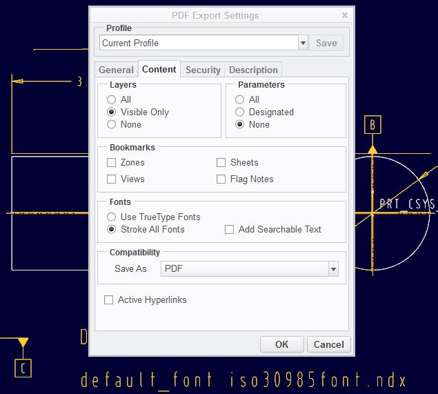
Now, one thing to remember to get the font to print right, is do NOT hit the "Stroke All Fonts" option. NNow I've got to tweak the tolerance block a little, to fix some things, but this sure makes things more readable! Thanks!
Mar 20, 2013
03:57 PM
- Mark as New
- Bookmark
- Subscribe
- Mute
- Subscribe to RSS Feed
- Permalink
- Notify Moderator
Please log in to access translation
Mar 20, 2013
03:57 PM
I do use the stroke all fonts... but they are not truetype fonts. The width only works for the .fnt fonts. That seems to be the case with stroking the fonts as well.
Does the font show a thickness on the screen when it is assigned? I think the time you really notice it is when you print to a much smaller scale; when lines start to disappear.
It may also be dependent on pen tables. I do not use pen tables.
Mar 20, 2013
04:41 PM
- Mark as New
- Bookmark
- Subscribe
- Mute
- Subscribe to RSS Feed
- Permalink
- Notify Moderator
Please log in to access translation
Mar 20, 2013
04:41 PM
i made the change to .012, and it showed on the screen, but with "stroked" fonts on the PDF did not show the width change. I turned it off, and the PDF showed the width change, but didn't appear to change thickness when I changed to .006. It's like the resolution on the PDF's is limited, and those small changes don't do anything. But, it's definately more readable in hard copy now with the thickness and "stroke" changes, but some of the text runs together in my format so I'll have to change that.
Thanks again, and if i find the "perfect" font, I'll post!
Mar 20, 2013
05:36 PM
- Mark as New
- Bookmark
- Subscribe
- Mute
- Subscribe to RSS Feed
- Permalink
- Notify Moderator
Please log in to access translation
Mar 20, 2013
05:36 PM
Yes, the resolution of PDF's are "scaled". That is how they can cause problems at various print or viewing scales.
You probably have a different interface. If I do not stroke all fonts, it uses true type fonts. And we -really- don't want that 
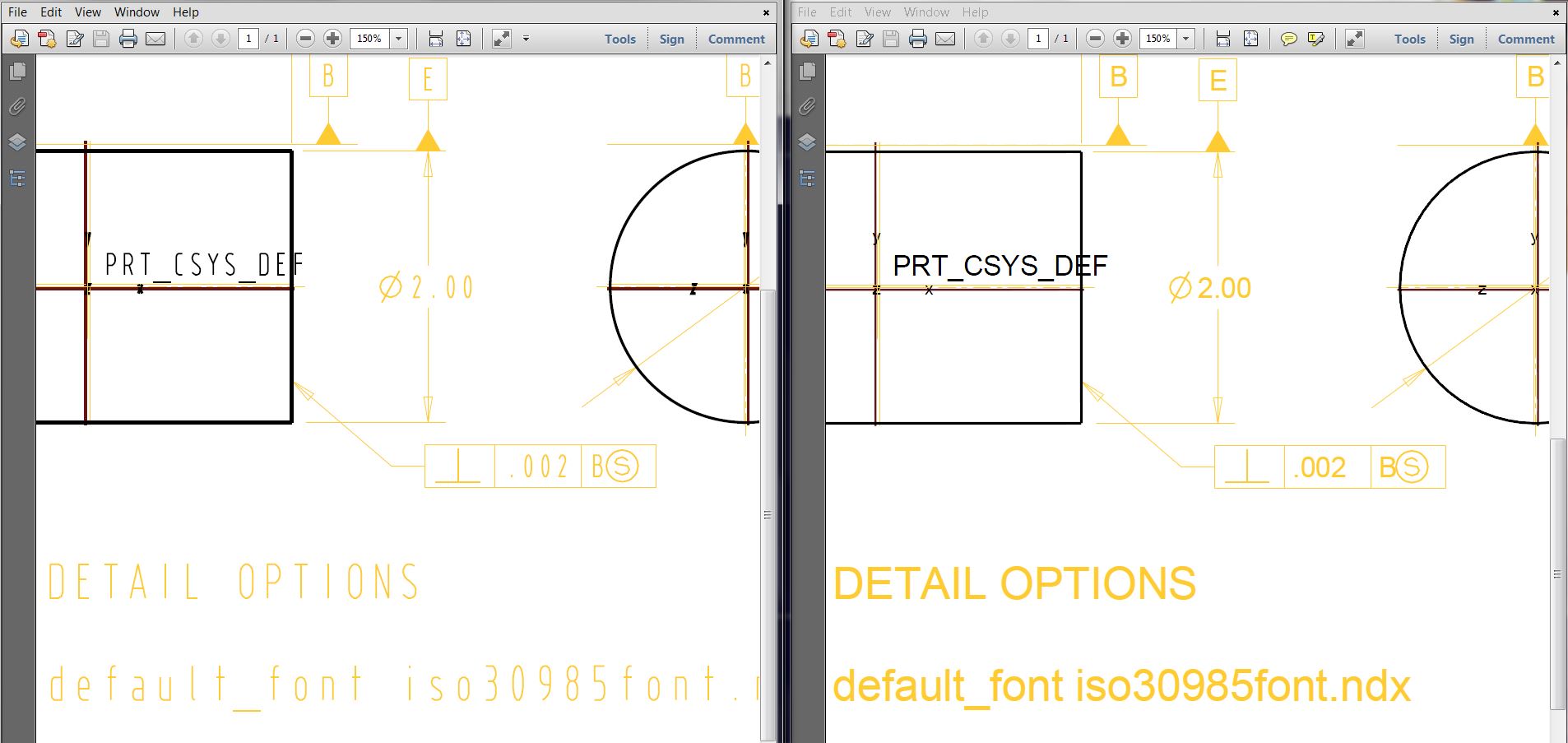
This is the comparison between stroked and TrueType...
Mar 20, 2013
06:45 PM
- Mark as New
- Bookmark
- Subscribe
- Mute
- Subscribe to RSS Feed
- Permalink
- Notify Moderator
Please log in to access translation
Mar 20, 2013
06:45 PM
I REALLY wanted to use true type fonts to make and print PDF'd from, as they came out SO nice, but obviously Pro/E does a really pi$$ poor job of making the font on the screen look like what it's going to print like. My text in my tables was all over the place, but it looked right on the screen. Is it really THAT friggin' difficult to do this? Seriously? Gah! ah well, it looks better on the screen than the PDF.
I think maybe the way to fix the issue is to use pen tables, and assign a thicker line weight to the text color. I'll have to play with that.......
Oh, and in AutoCAD, when you drag text around, you get the text, so you can see exactly where it will go and what it will look like. We STILL get just a box.....
Mar 20, 2013
07:02 PM
- Mark as New
- Bookmark
- Subscribe
- Mute
- Subscribe to RSS Feed
- Permalink
- Notify Moderator
Please log in to access translation
Mar 20, 2013
07:02 PM
WYSIWYG is only true for windows apps, not UNIX If only!
So you are saying that if you use TTF in your drawings, it it doesn't map to the very same font, and very same formatting as it does on the screen when printing?
Darn, now I have to try that out. I have to be able to depend on making silkscreens with Swiss fonts. I know I can make sketch features with it and it remains stable, but I was hoping to simplify that process.
Mar 21, 2013
09:45 AM
- Mark as New
- Bookmark
- Subscribe
- Mute
- Subscribe to RSS Feed
- Permalink
- Notify Moderator
Please log in to access translation
Mar 21, 2013
09:45 AM
The width I get on screen is not what I get when I make a PDF using the true type setting. The font is subttly different, and wider. Now, I LIKE it better, it looks much better in print, but it FUBAR's things where if I have a width of a colum in a table and all the text fits, the PDF has the text spilling out all over the place, and I have to keep going back into the dwg to GUESS how wide to make the column.
I found it was totally not worth it. I can never tell what's going to happen and I don't have time to look over every piece of text on a PDF to make sure it works. So, I'm going to set the .dtl file to the right text, add a thickness to it to make it easier to read on-screen, and then try and get the pen table to print the text thicker. I should be able to do that.....when I get some spare time.......
Mar 21, 2013
09:55 AM
- Mark as New
- Bookmark
- Subscribe
- Mute
- Subscribe to RSS Feed
- Permalink
- Notify Moderator
Please log in to access translation
Mar 21, 2013
09:55 AM
Spare time ....
Mar 21, 2013
02:47 PM
- Mark as New
- Bookmark
- Subscribe
- Mute
- Subscribe to RSS Feed
- Permalink
- Notify Moderator
Please log in to access translation
Mar 21, 2013
02:47 PM
I feel a new Support Case coming on.
I know that fonts can be substituted when the font is not available for export or import, but when you have the font in session, it should follow directly. It must be ignoring certain font formatting in the export. This really does require an explanation by PTC since they are pushing the TTF by making it default.
Mar 20, 2013
02:22 PM
- Mark as New
- Bookmark
- Subscribe
- Mute
- Subscribe to RSS Feed
- Permalink
- Notify Moderator
Please log in to access translation
Mar 20, 2013
02:22 PM
Default Font for most and Filled for some things in title block. I agree with you that zeros should have slash,
"Z"s and sevens should be crossed. And the things with "I" and "l" (do you know which one is which - they are different).
Since I am with a company, I don't change things that much, but it would probably be differenct if I was on my own.
Mar 20, 2013
02:24 PM
- Mark as New
- Bookmark
- Subscribe
- Mute
- Subscribe to RSS Feed
- Permalink
- Notify Moderator
Please log in to access translation
Mar 20, 2013
02:24 PM
Do you still skip using "i" and "O" and "Q" in on revision levels?
Mar 20, 2013
02:31 PM
- Mark as New
- Bookmark
- Subscribe
- Mute
- Subscribe to RSS Feed
- Permalink
- Notify Moderator
Please log in to access translation
Mar 20, 2013
02:31 PM
Yep.
Mar 21, 2013
04:44 AM
- Mark as New
- Bookmark
- Subscribe
- Mute
- Subscribe to RSS Feed
- Permalink
- Notify Moderator
Please log in to access translation
Mar 21, 2013
04:44 AM
We use numerical issue control, but we produce family-tabled drawings (12345-A, 12345-B etc) and on those, yes, we go G-H-J-K, M-N-P-Q.
Mar 20, 2013
02:39 PM
- Mark as New
- Bookmark
- Subscribe
- Mute
- Subscribe to RSS Feed
- Permalink
- Notify Moderator
Please log in to access translation
Mar 20, 2013
02:39 PM
It seems the dotted or slashed zero's came from the advent of computer terminals when the screens resolution was limited. I found only 4 fonts in Windows 7 that does this:
8514OEM
CONSOLAS
FIXEDSYS
TERMINAL
(and one that was an artist font not worth listing here)
...several of which is low-rez friendly. You will also see that limited serifs are deployed for the i-L issues.
Mar 21, 2013
03:18 PM
- Mark as New
- Bookmark
- Subscribe
- Mute
- Subscribe to RSS Feed
- Permalink
- Notify Moderator
Please log in to access translation
Mar 21, 2013
03:18 PM
ISOCPEUR.ttf looks very similar to AutoCAD's isocp2.shx.
But in case of PDF's coming from Pro/E, there are always special characters, that will come out as a mess, if you use a *.ttf font.
It's a battle that can't be won.
On Pro/E *.ndx fonts you can apply the text_thickness in *.dtl options file, on TTF fonts applying thickness is not possible.
Mar 22, 2013
06:49 PM
- Mark as New
- Bookmark
- Subscribe
- Mute
- Subscribe to RSS Feed
- Permalink
- Notify Moderator
Please log in to access translation
Mar 22, 2013
06:49 PM
I did a little investigation on this today.
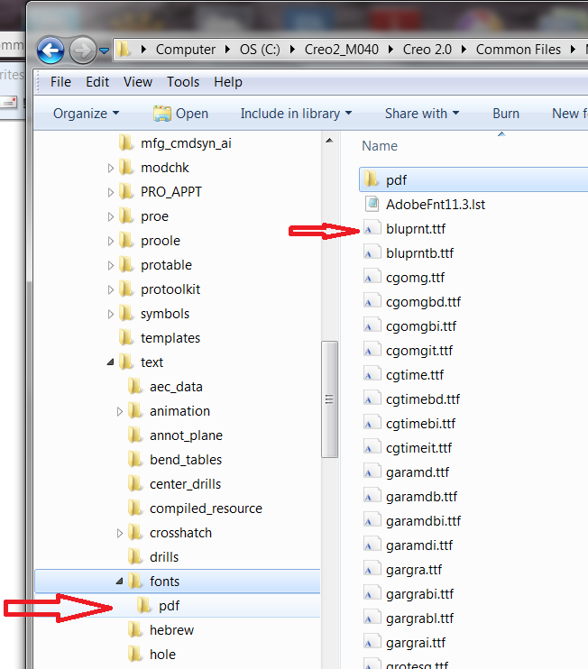
I stumbled across a PDF folder under the TTF folder. This got me thinking. The PDF folder is full of odd files none of which are purely TTF files. These must be conversion compensation files of sorts.
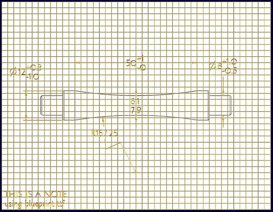
My 1st test was to use one of the default fonts... bluprnt.ttf (nice architectural font!). What Jakub said about thickness not affecting TTF is true. In the case of this font, the aspect ration too is unaffected. Height is affected (obviously). However, when you use symbols (diameter symbol below) the system reverts back to the default symbol library library and thickness config setting does affect these.
I plotted the drawing using the "USE TTF" option (no stroke) to PDF (save-as>export) and brought the BMP image back into the drawing as an overlay (underlay). The two compared very nicely!
So what I am thinking is happening with the non-default TTF is that there is not a 1 for 1 conversion in that odd PDF folder. Also notice that odd file in the top of the font folder "AdobeFnt11.3.lst". Are only the default fonts compatible? I don't know yet, but this is a step in the right direction.
In the case of bluprnt.ttf at least, it seems a WYSIWYG conversion.
Mar 25, 2013
10:38 AM
- Mark as New
- Bookmark
- Subscribe
- Mute
- Subscribe to RSS Feed
- Permalink
- Notify Moderator
Please log in to access translation
Mar 25, 2013
10:38 AM
Interesting. I guess I just fail to understand why PTC can't make the font work on screen the way it should. It shouldn't be hard. But, of course, we STILL have to deal with the fact that text on a dwg is just a "box" when we try and manipulate it, vs AutoCAd showing us the actual text........
Mar 25, 2013
12:39 PM
- Mark as New
- Bookmark
- Subscribe
- Mute
- Subscribe to RSS Feed
- Permalink
- Notify Moderator
Please log in to access translation
Mar 25, 2013
12:39 PM
I guess PTC doesn't care if somebody want's to export drawing into a non-native Creo file (PDF), and have it looking the same.
Have a look into the PDF folder that Tom has pointed out. Some of these text files are old as dirt.
Mar 25, 2013
12:35 PM
- Mark as New
- Bookmark
- Subscribe
- Mute
- Subscribe to RSS Feed
- Permalink
- Notify Moderator
Please log in to access translation
Mar 25, 2013
12:35 PM
I can't seem to find this "AdobeFnt11.3.lst" in my installdir. Could you please post contents of it?
What you say about symbol characters being affected by thickness change is true. Just open one of those *.ndx files in wordpad and you will see what's going on.
I know I am going backwards in your post, but there is certainly something with the default and non-default TTF fonts and Pro/E.
Let's say you create a drawing with lots of compound dims, gtols and notes, and then try to apply some random non-default TTF found that you find elsewhere on the internet perhaps or in windows font folder. When you export this Pro/E drawing to PDF, it will come out as a mess. Some text are completely out of place, some are missing.
On the other hand if you do the same with one of the default TTF fonts. Then the notes, compound gtols, etc. may stay in place, but will they? I highly doubt that.
Try to put in the drawing a text with plain text note with some symbols in between. I would bet that one is not gonna come out as WYSIWYG.
Now, the not very pleasing part is that in Czech language we have some sort of special characters with lots of different diacritic marks, and these are not contained in any of these default TTF Pro/E fonts.
Mar 25, 2013
01:12 PM
- Mark as New
- Bookmark
- Subscribe
- Mute
- Subscribe to RSS Feed
- Permalink
- Notify Moderator
Please log in to access translation
Mar 25, 2013
01:12 PM
Jakub, the only thing I load special during the install is Co Create file compatability. I doubt this affects the font definition file loading.
This is where the file is installed:
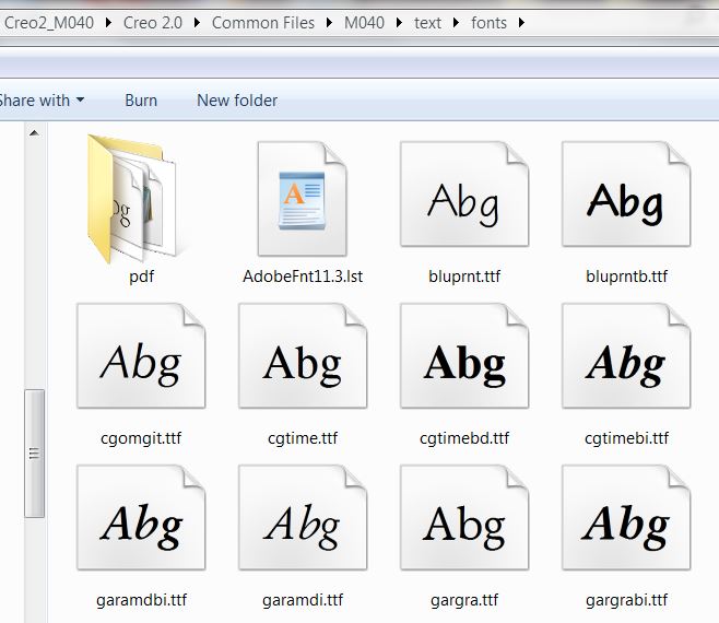
...and this is some of the entries:
%!Adobe-FontList 1.11.3
%Locale:0x409
%BeginFont
Handler:DirectoryHandler
FontType:TrueType
FontName:BlueprintMT
FamilyName:Blueprint MT
StyleName:Regular
FullName:Blueprint MT
MenuName:Blueprint MT
StyleBits:0
WritingScript:Roman
OutlineFileName:C:\Creo2_M040\Creo 2.0\Common Files\M040\text\fonts\\bluprnt.ttf
DataFormat:sfntData
FileLength:39476
FileModTime:1360912558
WeightClass:400
WidthClass:5
AngleClass:0
%EndFont
%BeginFont
Handler:DirectoryHandler
FontType:TrueType
FontName:BlueprintMT-Bold
FamilyName:Blueprint MT
StyleName:Bold
FullName:Blueprint MT Bold
MenuName:Blueprint MT
StyleBits:2
WritingScript:Roman
OutlineFileName:C:\Creo2_M040\Creo 2.0\Common Files\M040\text\fonts\\bluprntb.ttf
DataFormat:sfntData
FileLength:41096
FileModTime:1360912558
WeightClass:700
WidthClass:5
AngleClass:0
%EndFont
...
%BeginFont
Handler:DirectoryHandler
FontType:CMap
CMapName:Katakana
Registry:Adobe
Ordering:Japan1
OutlineFileName:C:\Creo2_M040\Creo 2.0\Common Files\M040\text\fonts\\pdf\Katakana
FileLength:1548
FileModTime:1360912566
%EndFont
...
I don't know what generates this list but something does. I found my Swiss721 fonts in there.
I don't know about mixing the symbols with supported fonts. The diameter symbol is one of those as is the special handling of text boxes. Since each of these have a boundary defined, it shouldn't be an issue. I will take a drawing I've done in the past and run it through a conversion and see.
Mar 25, 2013
01:25 PM
- Mark as New
- Bookmark
- Subscribe
- Mute
- Subscribe to RSS Feed
- Permalink
- Notify Moderator
Please log in to access translation
Mar 25, 2013
01:25 PM
Oh, and I use a custom install folder
This may be an Adobe thing, however. My install file dates are 2/14/2013 but the font list file is 3/20/2013. The "PDF" folder has its own version. So this seems to be a red herring.
Mar 25, 2013
01:39 PM
- Mark as New
- Bookmark
- Subscribe
- Mute
- Subscribe to RSS Feed
- Permalink
- Notify Moderator
Please log in to access translation
Mar 25, 2013
01:39 PM
Ok, thanks for posting that file, I guess it's just one of those Creo has generated during one of it's odd operations.
I sometimes get those too, and just delete those. As far as I know LST files can be used to control some functions inside Creo, like for example lists of model params.
What I meant to show in the picture I've posted above that there is some distinction between symbol chars and normal text letter chars.
Several months ago when I tried to dig deep into this, I've found that there is a font editor to create and edit these *.fnt files. I wasn't able to make this font editor run under Win 7 since it's also old as dirt.
Now, I can't even remember where in the Creo installdir this exe file was.
You know, Tom, we really should leave this to.... a horse. Perhaps he can at least chew it better?
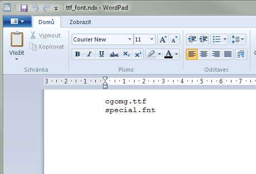
Well, there is one more thing to add to make this more clear. If it ever can be clear to anyone. And that is when you set the font in your DTL file to isocpeur.ttf file, which is a non-default TTF font, then to show up special characters Pro/E will use this special.fnt file, which is located somewhere in the depths of installdir.
So if you also want to change the look of your special chars, like diameter symbols, etc. It could be worth it to make and edit to one of your own *.ndx files.
Ok, so I'll end this senseless post here, and type in another one next, that you can actually take something from.
Mar 25, 2013
02:40 PM
- Mark as New
- Bookmark
- Subscribe
- Mute
- Subscribe to RSS Feed
- Permalink
- Notify Moderator
Please log in to access translation
Mar 25, 2013
02:40 PM
compile_font.exe and decompile_font.exe are found in ...Creo 2.0\Common Files\M040\x86e_win64\obj
Mar 25, 2013
03:04 PM
- Mark as New
- Bookmark
- Subscribe
- Mute
- Subscribe to RSS Feed
- Permalink
- Notify Moderator
Please log in to access translation
Mar 25, 2013
03:04 PM
Yeap, and I have no idea what with it.


