Community Tip - Need to share some code when posting a question or reply? Make sure to use the "Insert code sample" menu option. Learn more! X
- Subscribe to RSS Feed
- Mark Topic as New
- Mark Topic as Read
- Float this Topic for Current User
- Bookmark
- Subscribe
- Mute
- Printer Friendly Page
Creating graph with dual y axis for Bode plots
- Mark as New
- Bookmark
- Subscribe
- Mute
- Subscribe to RSS Feed
- Permalink
- Notify Moderator
Creating graph with dual y axis for Bode plots
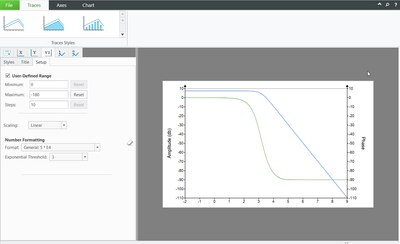
I am wondering if anyone knows a way to make a Bode plot that shows a y-axis on the left for db (amplitude) and a scale on the right for phase. The Plot function does not support it, but I thought perhaps the "chart" function does since it does allow a second y axis scale on the right. But as I understand it, this is not quite the case. In the "chart" function it seems that the scale on the right is only a replica of the one on the left. This function was very nicely supported in Mathcad 15. Is there a way to do it in Prime 9? Much appreciation for any thoughts/help!
Solved! Go to Solution.
- Labels:
-
Electrical_Engineering
- Tags:
- bode plot
Accepted Solutions
- Mark as New
- Bookmark
- Subscribe
- Mute
- Subscribe to RSS Feed
- Permalink
- Notify Moderator
So with some more stumbling, I was indeed able to make it work! The key point I was looking for was how to go into the window to set which axis each equation used. Once I found that, it all works wonderfully!
Thank you for the help!!!
- Mark as New
- Bookmark
- Subscribe
- Mute
- Subscribe to RSS Feed
- Permalink
- Notify Moderator
Some old discussions:
- "How to make a bode plot from a transfer function": https://community.ptc.com/t5/Mathcad/How-to-make-a-bode-plot-from-a-transfer-function/td-p/697413
- "Bode plot transfer function? mathcad prime4": https://community.ptc.com/t5/Mathcad/bode-plot-transfer-function-mathcad-prime4/td-p/556548
- Mark as New
- Bookmark
- Subscribe
- Mute
- Subscribe to RSS Feed
- Permalink
- Notify Moderator
These articles do not address the original question. I already can plot magnitude Bode plots or phase Plots separately, or even make both make db magnitude plots and phase plots together; but they use the same scale. I want to be able to use 2 different scales.
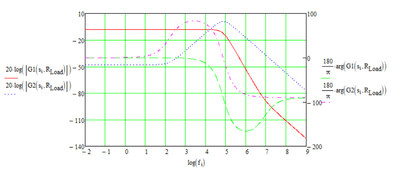
In th4 above plot (from MCAD 15) you can see that the db magnitude is on the left and the phase scale is on the right.
The question is NOT how to make Bode plots. It is how to do it with separate amplitude and phase scales that are separately controllable.
- Mark as New
- Bookmark
- Subscribe
- Mute
- Subscribe to RSS Feed
- Permalink
- Notify Moderator
Have you looked into the Chart Component, then? It allows for more detailed plots and formatting, and importantly for you, a second y-axis.
- Mark as New
- Bookmark
- Subscribe
- Mute
- Subscribe to RSS Feed
- Permalink
- Notify Moderator
If you look at my first post, you will see that I have already done that. I said "In the "chart" function it seems that the scale on the right is only a replica of the one on the left". As far as I can tell the "charr" function does not support this. If someone knows how to do it with "chart" I would love to see it.
- Mark as New
- Bookmark
- Subscribe
- Mute
- Subscribe to RSS Feed
- Permalink
- Notify Moderator
In the "chart" function it seems that the scale on the right is only a replica of the one on the left.
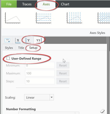
Do you mean you can't set the axis limits and step width independently from each other in the Chart Component.
I can't provide an example as the Chart Component is unusable in my configuration, but I would have expected that it should be possible to set different values for the Y and the Y2 tab here:
- Mark as New
- Bookmark
- Subscribe
- Mute
- Subscribe to RSS Feed
- Permalink
- Notify Moderator
- Mark as New
- Bookmark
- Subscribe
- Mute
- Subscribe to RSS Feed
- Permalink
- Notify Moderator
You have definitely showed me that it can be done and I would have been surprised if it could not; but for some reason I cannot make it happen in my worksheet.
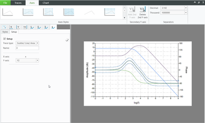
As you can see in the above picture, I have changed the right hand y2 axis but it does not update on the graph. Also, I cannot seem to find where to associate each data (or equation) with which scale. Do you know of a tutorial on how to do this which would walk me through it. I have literally spent hours trying to do it and cannot seem to make it happen. Thanks!
- Mark as New
- Bookmark
- Subscribe
- Mute
- Subscribe to RSS Feed
- Permalink
- Notify Moderator
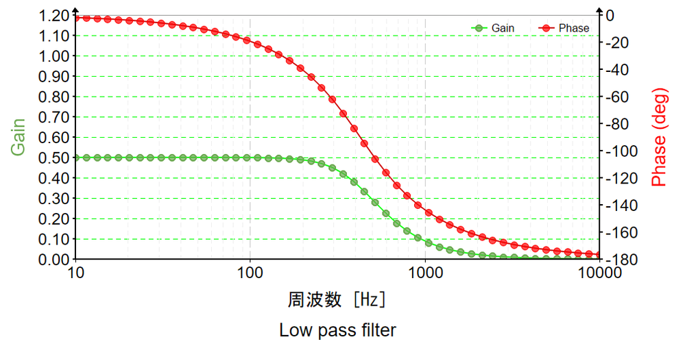
So with some more stumbling, I was indeed able to make it work! The key point I was looking for was how to go into the window to set which axis each equation used. Once I found that, it all works wonderfully!
Thank you for the help!!!

