Community Tip - New to the community? Learn how to post a question and get help from PTC and industry experts! X
- Subscribe to RSS Feed
- Mark Topic as New
- Mark Topic as Read
- Float this Topic for Current User
- Bookmark
- Subscribe
- Mute
- Printer Friendly Page
How I can shade area under graph in Mathcad Prime 3.1?
- Mark as New
- Bookmark
- Subscribe
- Mute
- Subscribe to RSS Feed
- Permalink
- Notify Moderator
How I can shade area under graph in Mathcad Prime 3.1?
- Labels:
-
Other
Accepted Solutions
- Mark as New
- Bookmark
- Subscribe
- Mute
- Subscribe to RSS Feed
- Permalink
- Notify Moderator
Richard Jackson wrote:
If the chart I think from a point table as it could color the area?
It could, but it would be a lot more work than what Stuart shows.
Thats true 😉

- Mark as New
- Bookmark
- Subscribe
- Mute
- Subscribe to RSS Feed
- Permalink
- Notify Moderator
I didn't write this, I just fished it out of my collection and converted it to Prime
- Mark as New
- Bookmark
- Subscribe
- Mute
- Subscribe to RSS Feed
- Permalink
- Notify Moderator
Richard Jackson wrote:
I didn't write this, I just fished it out of my collection and converted it to Prime
Neat. For simple plots, you can also get by using the Column trace type (I've also selected the "Cross Axes at 0,0" to get rid of the space between the plot proper and the x axis). I've doubled up on the target function to highlight the edge.

Stuart
- Mark as New
- Bookmark
- Subscribe
- Mute
- Subscribe to RSS Feed
- Permalink
- Notify Moderator
If the chart I think from a point table as it could color the area?

- Mark as New
- Bookmark
- Subscribe
- Mute
- Subscribe to RSS Feed
- Permalink
- Notify Moderator
Ricardo Huaranga wrote:
If the chart I think from a point table as it could color the area?
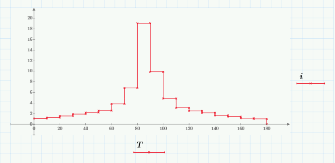
Do you mean something like this?

If so, just click on the y-axis variable you want (i in this case) and select "Column Trace" from the "Change Type" drop down.
Stuart
- Mark as New
- Bookmark
- Subscribe
- Mute
- Subscribe to RSS Feed
- Permalink
- Notify Moderator
Hi Stuart, thank you very much for your help.
I want to make is this:
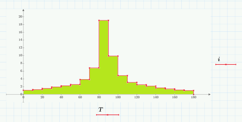
The red graph from data T i vs created. I want to color the green area.
- Mark as New
- Bookmark
- Subscribe
- Mute
- Subscribe to RSS Feed
- Permalink
- Notify Moderator
Ricardo Huaranga wrote:
Hi Stuart, thank you very much for your help.
I want to make is this:
The red graph from data T i vs created. I want to color the green area.
I'm not sure that Prime will do what you want. Where did you get that plot? (And that colour green - it's not on my palette?). I haven't looked at Werner's solution, but the nearest I could get using just basic settings was this:

But both our solutions need 2 traces, not the one that your plot shows.
Stuart
- Mark as New
- Bookmark
- Subscribe
- Mute
- Subscribe to RSS Feed
- Permalink
- Notify Moderator
I'm not sure that Prime will do what you want. Where did you get that plot? (And that colour green - it's not on my palette?).
I'm not sure Prime can do this either.
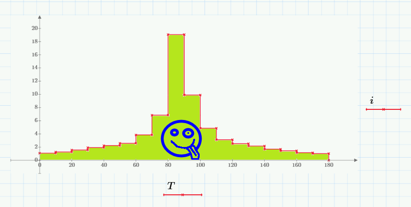
But it can be done ![]()
- Mark as New
- Bookmark
- Subscribe
- Mute
- Subscribe to RSS Feed
- Permalink
- Notify Moderator
Richard Jackson wrote:
I'm not sure that Prime will do what you want. Where did you get that plot? (And that colour green - it's not on my palette?).I'm not sure Prime can do this either.
But it can be done
Hey! Your phone's got a selfie facility too!

Stuart
- Mark as New
- Bookmark
- Subscribe
- Mute
- Subscribe to RSS Feed
- Permalink
- Notify Moderator
If the chart I think from a point table as it could color the area?
It could, but it would be a lot more work than what Stuart shows.
- Mark as New
- Bookmark
- Subscribe
- Mute
- Subscribe to RSS Feed
- Permalink
- Notify Moderator
Richard Jackson wrote:
If the chart I think from a point table as it could color the area?
It could, but it would be a lot more work than what Stuart shows.
Thats true 😉

- Mark as New
- Bookmark
- Subscribe
- Mute
- Subscribe to RSS Feed
- Permalink
- Notify Moderator
Werner, Thank you very much, this is just what I wanted.
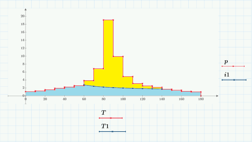
How can I do this:
- Mark as New
- Bookmark
- Subscribe
- Mute
- Subscribe to RSS Feed
- Permalink
- Notify Moderator
First approach could be to first plot the area underneath T-p in yellow over the full range as before.
Then you'll have to create a new vector of ordinate values, consisting of the values in i1 and surrounded by the appropriate values of p as the first and last values. Use then "shade" to color the area under that new vector in blue.
Or you write a routine similar to mine which shades the area of two graphs given by vectors. Then you would plot the area under p in blue first and the the area between p and i2 in yellow.
Writing that routine would even be more work, because to make it a real utility function you would also have to consider the situation, where the values in the abscissa vectors of both graphs don't match.
For shading the area under a function oder between two functions given by vectors can also use the routines which are presented or referred to here Shading Graph
as you can turn the vectors into a functions by using some sort of interpolation, e.g. linear interpolation. But unfortunately this will not work in your case, as "linterp" will not work on abscissa vectors containing equal values which you need because of the vertical line segments.
An option might be to write your own modified routine for linear interpolation.
Werner
- Mark as New
- Bookmark
- Subscribe
- Mute
- Subscribe to RSS Feed
- Permalink
- Notify Moderator
Thank you very much for your help Werner, based on your file shade I could do.
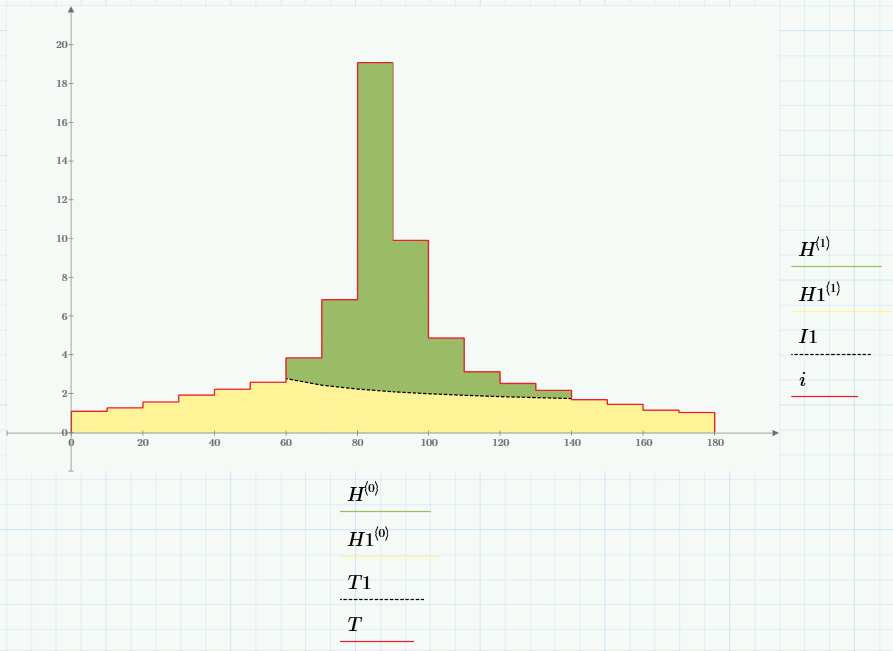
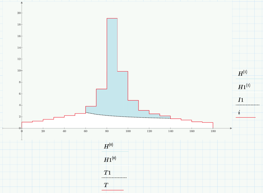
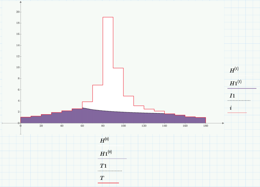
The expected result is obtained with two functions and overlaying graphics shade:
SHADE 1
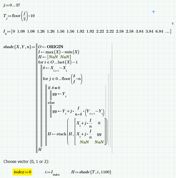
SHADE 2:
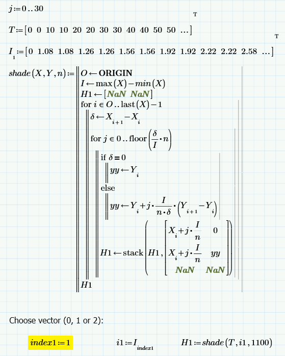
Here is the file for which interest them:
- Mark as New
- Bookmark
- Subscribe
- Mute
- Subscribe to RSS Feed
- Permalink
- Notify Moderator
Unfortunately my Prime 3.0 version can't read files in P3.1 format, so I am using a somewhat different vector.
I played around with my second idea and wrote a linterp2 function, which does not choke on equal abscissa values.
Using a short shade2 routine which shades the area between two graphs in a given interval I could also achieve what you wanted by turning the vectors into linear interpolated functions.
"fill1" could have been created using my original "shade", too.

Regards, Werner
- Mark as New
- Bookmark
- Subscribe
- Mute
- Subscribe to RSS Feed
- Permalink
- Notify Moderator
Here is a slightly different approach with an extra function for the border line.
That way you don't have to work with overlapping shaded regions but can shade the exact regions you want to.

Werner
- Mark as New
- Bookmark
- Subscribe
- Mute
- Subscribe to RSS Feed
- Permalink
- Notify Moderator
OK, her at last a version especially for Richard and Stuart ![]()

Werner
- Mark as New
- Bookmark
- Subscribe
- Mute
- Subscribe to RSS Feed
- Permalink
- Notify Moderator
Werner Exinger wrote:
OK, her at last version especially for Richard and Stuart
![]()
- Mark as New
- Bookmark
- Subscribe
- Mute
- Subscribe to RSS Feed
- Permalink
- Notify Moderator
OK, her at last a version especially for Richard and Stuart
![]()
![]()
- Mark as New
- Bookmark
- Subscribe
- Mute
- Subscribe to RSS Feed
- Permalink
- Notify Moderator
I just found this lying around on my hard drive, so I thought I would add it to the thread for completeness. It was written by Byrge Birkeland, and as you might expect it's the (30 page) tour de force on shading ![]()
- Mark as New
- Bookmark
- Subscribe
- Mute
- Subscribe to RSS Feed
- Permalink
- Notify Moderator
Yes -> Hatch.zip
Prof. Birkelands work is always a pleasure to study - his "Amazing Images" E-Book is a legendary classic.
But his work is in no way easy to digest for the reader, so I hesitated to mention his work here 😉
Shading/Hatching an area is quite often needed and many very simple plot programs are able to do it, so there should be an easy way to do it implemented in Mathcad.
But I know - the wish list is very long and it got even much longer when Prime was introduced as we now have to wish things we already were used to in Mathcad.
Werner
- Mark as New
- Bookmark
- Subscribe
- Mute
- Subscribe to RSS Feed
- Permalink
- Notify Moderator
Werner Exinger wrote:
Shading/Hatching an area is quite often needed and many very simple plot programs are able to do it, so there should be an easy way to do it implemented in Mathcad.
But I know - the wish list is very long and it got even much longer when Prime was introduced as we now have to wish things we already were used to in Mathcad.
One other thing that this thread shows is the need to have a step display. I'm guessing that the intended data set for the OP's plotting doesn't come with the data duplicated at each T index. In which case, it's probably useful to have a "step" generating function. I've used you nice little image plotting function to give a slightly more mathematical feel to the plot than Richard's and my images do...

Stuart
(In case it's not clear from the images, we're using Simpson's Rule to evaluate the integral of Homer from doughnut to beer. )
- Mark as New
- Bookmark
- Subscribe
- Mute
- Subscribe to RSS Feed
- Permalink
- Notify Moderator
Nice work, as usual!
I've used you nice little image plotting function to give a slightly more mathematical feel to the plot than Richard's and my images do...
![]() I like that spikedmath.com and mathfail.com sites a lot!
I like that spikedmath.com and mathfail.com sites a lot!
Werner

