Community Tip - Did you get an answer that solved your problem? Please mark it as an Accepted Solution so others with the same problem can find the answer easily. X
- Subscribe to RSS Feed
- Mark Topic as New
- Mark Topic as Read
- Float this Topic for Current User
- Bookmark
- Subscribe
- Mute
- Printer Friendly Page
Is it possible to show only one x-axis title when plotting two variables?
- Mark as New
- Bookmark
- Subscribe
- Mute
- Subscribe to RSS Feed
- Permalink
- Notify Moderator
Is it possible to show only one x-axis title when plotting two variables?
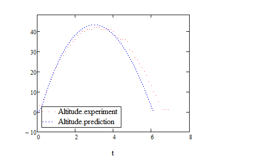
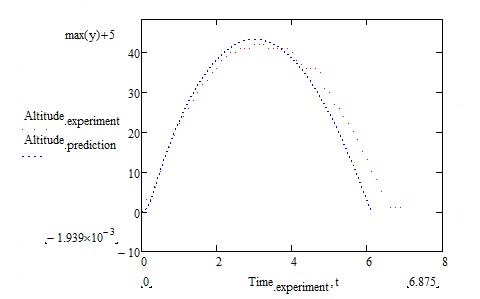
In the figure below, Altitude (prediction) and Altitude (experiment) are both functions of time. How do I eliminate the title "Time(experiment)" from the x-axis. I would like to have the x-axis title as "t" only.
- Labels:
-
Other
- Mark as New
- Bookmark
- Subscribe
- Mute
- Subscribe to RSS Feed
- Permalink
- Notify Moderator
I don't think that its possible to do what you demand (only if Time.experiment and t are the very same vectors).
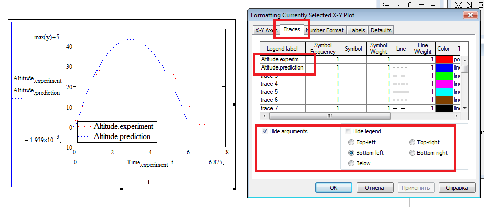
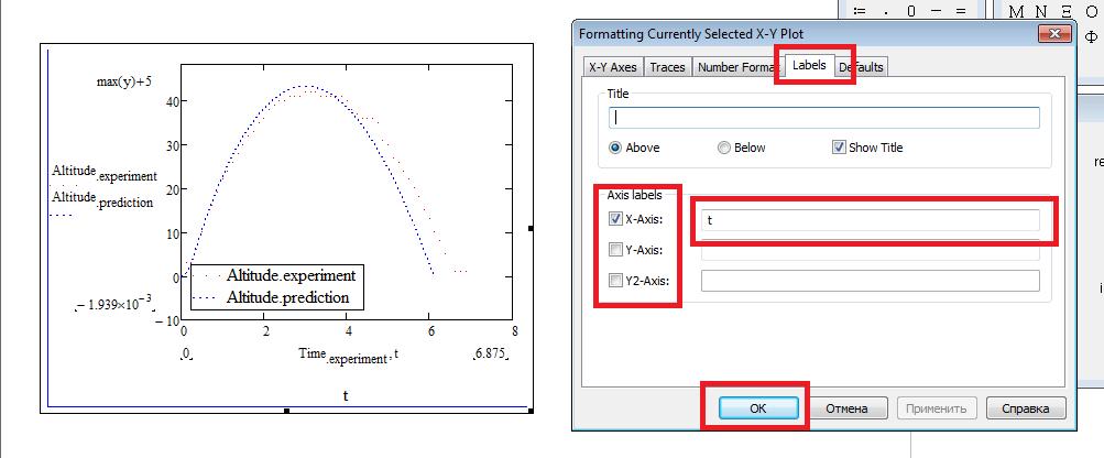
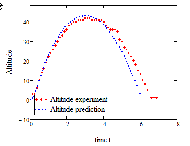
You could hide the arguments completely and add a legend and axis labels:
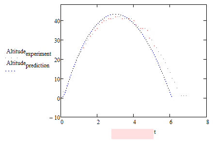
Of course you could cheat and put a piece of white graphics or a textregion with spaces which is highlighted in white (in the pic I had chosen a light red so you can see whats going on) over the unwanted argument. But thats unreliable and awkward and the "t" is not centered (you could use a variable with a short name instead of Time.experiment to cope with that -> "i:=Time.experiment" and use i just in the plot.
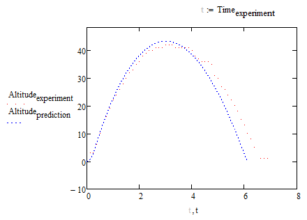
Yet another idea: You could define a User Math Style (Menu - Format -> Equation) with font color white and use a variable of that style for plotting - you still will see the comma, though. In the picture I have chosen font color light grey (silver) and named the variable "t", too. Because the variables have different style they are seen as different variables despite the same name.
WE
- Mark as New
- Bookmark
- Subscribe
- Mute
- Subscribe to RSS Feed
- Permalink
- Notify Moderator
I suppose that Altitude.prediction is a function that you defined yourself, I imagine you have a (mathematical) model for your predictions. This means that you can calculate the Altitude.prediction values at any time point you like.
Now have the variable t hold the time points at which you have experimental results, so t:=Time.experiment.
Then plot both Altitude.experiment and Altitude.prediction as a function of this (single) variable t, noting that you need to provide the x-axis parameter only once when all your y-values are related to it.
Done.
Success!
Luc
- Mark as New
- Bookmark
- Subscribe
- Mute
- Subscribe to RSS Feed
- Permalink
- Notify Moderator
I suppose that Altitude.prediction is a function that you defined yourself, I imagine you have a (mathematical) model for your predictions. This means that you can calculate the Altitude.prediction values at any time point you like.
That was my first idea, Luc 😉
Altitude and time from experiment are vectors with 65 elements each. Unfortunately Altitude.prediction and t are vectors with more than 6000 elements gained by an iteration process, not a function.
Nevertheless it would be possible to create an interpolation function to achieve what you suggested. Not sure if the OP is willing to go through the hassle. He will tell us what his preference is.
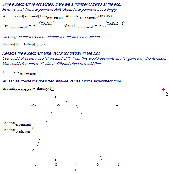
WE
- Mark as New
- Bookmark
- Subscribe
- Mute
- Subscribe to RSS Feed
- Permalink
- Notify Moderator
Hi,
Please find some solution in attachment. Double click on the plot and edit "Traces", "Labels" tabs.
