
Turn on suggestions
Auto-suggest helps you quickly narrow down your search results by suggesting possible matches as you type.
Showing results for
Please log in to access translation
Turn on suggestions
Auto-suggest helps you quickly narrow down your search results by suggesting possible matches as you type.
Showing results for
Community Tip - Did you get an answer that solved your problem? Please mark it as an Accepted Solution so others with the same problem can find the answer easily. X
Translate the entire conversation x
Please log in to access translation
Options
- Subscribe to RSS Feed
- Mark Topic as New
- Mark Topic as Read
- Float this Topic for Current User
- Bookmark
- Subscribe
- Mute
- Printer Friendly Page
Mathcad 15.0 Surface Plots - Extra "Depth" on Z-axis for data that does not exist
Jun 04, 2014
12:25 PM
- Mark as New
- Bookmark
- Subscribe
- Mute
- Subscribe to RSS Feed
- Permalink
- Notify Moderator
Please log in to access translation
Jun 04, 2014
12:25 PM
Mathcad 15.0 Surface Plots - Extra "Depth" on Z-axis for data that does not exist
Hello,
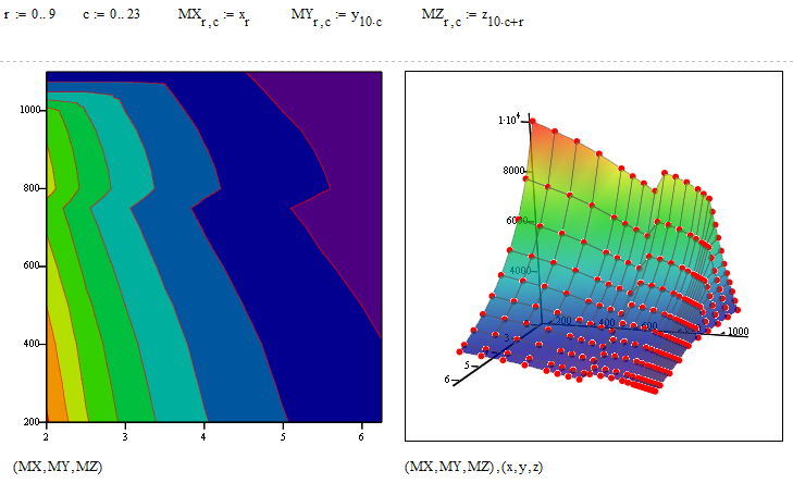
I've got a surface plot of some X, Y, Z data that is correct. However, when I add contour lines (or do the 2D contour plot), there are extra contours that do not exist in my data. My Z axis should only have data from 200 to 1100, but in the picture, you can see data well below 200 into the negative values, and some data that exists above 1100. It appears mathcad is trying to interpolate data that isn't there to fill whitespace. When I fill the backplane, it only tints the contours that don't exist with the shade of the backplane fill.
Any fixes, or is this a glitch in 15?
Thanks
Solved! Go to Solution.
Labels:
- Labels:
-
Statistics_Analysis
ACCEPTED SOLUTION
Accepted Solutions
Jun 04, 2014
04:09 PM
- Mark as New
- Bookmark
- Subscribe
- Mute
- Subscribe to RSS Feed
- Permalink
- Notify Moderator
Please log in to access translation
Jun 04, 2014
04:09 PM
I have created the correct data to form a 2D surface for you. Notice that I renamed the vectors so that z is the dependent one!
First we show it in x,y,z order, load rating in z-direction and we see that now that scatterplot of the points perfectly fits:
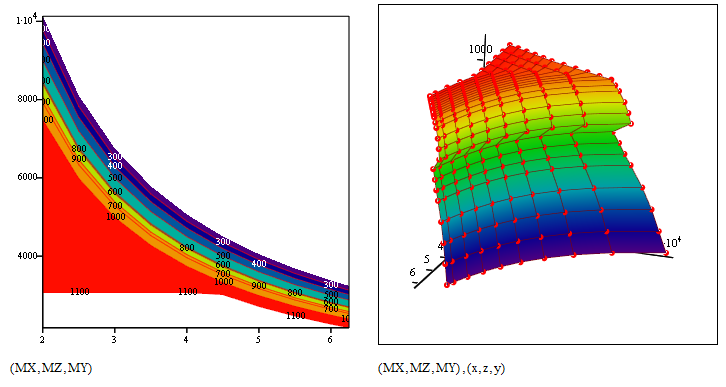
But you can change the order. Here is the same order you used in your sheet (height is height 😉
You may get a smoother result if you use some sort of spline interpolation of your data but at least now we see the correct surface. BTW, what is Excel showing? Does it create the correct surface?
13 REPLIES 13
Jun 04, 2014
12:28 PM
- Mark as New
- Bookmark
- Subscribe
- Mute
- Subscribe to RSS Feed
- Permalink
- Notify Moderator
Please log in to access translation
Jun 04, 2014
12:28 PM
You'll get a far better response if you post the sheet rather than a picture.
Jun 04, 2014
12:33 PM
- Mark as New
- Bookmark
- Subscribe
- Mute
- Subscribe to RSS Feed
- Permalink
- Notify Moderator
Please log in to access translation
Jun 04, 2014
01:42 PM
- Mark as New
- Bookmark
- Subscribe
- Mute
- Subscribe to RSS Feed
- Permalink
- Notify Moderator
Please log in to access translation
Jun 04, 2014
01:42 PM
Its not a glitch in Mathcad.
The main problem is that you are not provide a surface and IMHO Mathcad should even refuse to do a surface or contourplot of that data.
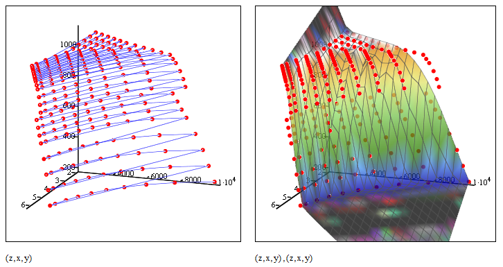
You provide a simple list of points in 3D space. So all you could ask Mathcad for is to plot those points and maybe connect them in the order defined by your vector - this is done using a scatter plot.
You may create your own interpolation routine to get a surface, but as it looks to me some of your points are lying one on top of the other (at least close). So an interpolation routine, providing for any given pair of z and x value a height y, would be ambiguous.
BTW, Is there any deeper reason for naming abscissa, ordinate and aplicate z,x,y rather than x,y,z as usual?
Facit: The surface you see when you plot your data points is not the surface you want to be plotted. Its Mathcad's interpretation of your data and its a surface which comes close to your points and is also defined outside the region given by your points. I am not sure how exactly Mathcad interpretes your data, but by looking at the last plot in the attached sheet and turning around the plot you see that not all points are lying in the surface created by Mathcad. I embdedded the data of your excel sheet so the file is selfcontained which is more convenient here.
Its unusual that you create your data in Excel and try to use Mathcad for plotting (I know, missing 3D capability). Usually people are going the opposite way and calculate their data in Mathcad. How is the data you use derived? Any chance of being able to provide the three matrices which Mathcad needs to plot a surface? Or at least - can you privide a table with heights (y-values) for every gridpoint in a rectangular(!) z,x-area?
Jun 04, 2014
02:35 PM
- Mark as New
- Bookmark
- Subscribe
- Mute
- Subscribe to RSS Feed
- Permalink
- Notify Moderator
Please log in to access translation
Jun 04, 2014
02:35 PM
Thank you for replying.
I performed a bunch of iterations of the same calculation in excel that vary three parameters (the X, Y, and Z in the plots). I thought I might be able to develop a better contour plot in mathcad, given Excel's plotting is so bad. My mathcad is hack at best, and calling myself a novice user is generous. Thanks for embedding the table, its easier than the help file made it out to be. The plot is set up already with height Y as a function of X and Z
The axes are labled differently because when I was fooling around with the contour plot, I didn't realize I could change the axis of the contour lines from the dropdown in the properties window, so I changed the data on each axis.
What did you do to "turn off" the contours that go beyond the end of my data? There is a remnant but nothing MS paint cannot fix
Jun 04, 2014
02:51 PM
- Mark as New
- Bookmark
- Subscribe
- Mute
- Subscribe to RSS Feed
- Permalink
- Notify Moderator
Please log in to access translation
Jun 04, 2014
02:51 PM
I didn't do anything to your contour plot. I just embedded the data and added the two 3D plots.
Jun 04, 2014
02:11 PM
- Mark as New
- Bookmark
- Subscribe
- Mute
- Subscribe to RSS Feed
- Permalink
- Notify Moderator
Please log in to access translation
Jun 04, 2014
02:11 PM
The first column is clearly the dependent data, so plot that as z. Then it works fine
Jun 04, 2014
02:55 PM
- Mark as New
- Bookmark
- Subscribe
- Mute
- Subscribe to RSS Feed
- Permalink
- Notify Moderator
Please log in to access translation
Jun 04, 2014
02:55 PM
Richard Jackson wrote:
The first column is clearly the dependent data, so plot that as z.
Its obvious that the other data columns are not derive by measurement or iterations, but Matt seems to insist that the second column should be the dependent data.!??
Then it works fine
No, we have the very same problem here! Mathcad still creates a surface which does not include (all) of the data points, so the contourplot would look correct, but isn't. Don't know how Mathcad interpretes the data but IMHO it shouldn't show a surface at all with the data. Not sure if the surface Mathcad shows is an approximation at all (while it looks that way) - it sure is no interpolation.
Compare the surface with the scatter plot of the data points:
Jun 04, 2014
03:09 PM
- Mark as New
- Bookmark
- Subscribe
- Mute
- Subscribe to RSS Feed
- Permalink
- Notify Moderator
Please log in to access translation
Jun 04, 2014
03:09 PM
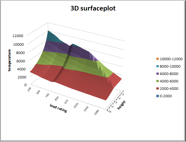
In the marix you embedded, the first column is my dependent data. Load rating of a product with the parameters being temperature (second column) and height (third column).
Jun 04, 2014
03:21 PM
- Mark as New
- Bookmark
- Subscribe
- Mute
- Subscribe to RSS Feed
- Permalink
- Notify Moderator
Please log in to access translation
Jun 04, 2014
03:21 PM
The confusion is that usually the dependent data is plotted as height, as Richard did, and the independent data horizontally, even if the meaning of one of them is height.
The main problem still is that your data does not form a surface and surface Mathcad shows (maybe Excel, too) is NOT the surface containing all your data points.
Think of the problem not in 3D but in 2D for a moment. You provide a set of 2D data points, but no order. There are numerous way to conect them to form a (1D) curve. You have to specify an order, an antecessor and successer for every point to be able to create a curve. You would usually do this by putting the data in a vector - one for the x and on efor the y coordinates.
Now for a 2D surface you must specify four neighbours for each point, forming sort of a grid on the surface you want to create. This is usuall done by putting the data in a 2D matrix one for x, y and z. This is missing here and thats the reason I was saying that Mathcad should refuse to plot a surface anyway as your data is not defining a surface.
Jun 04, 2014
04:09 PM
- Mark as New
- Bookmark
- Subscribe
- Mute
- Subscribe to RSS Feed
- Permalink
- Notify Moderator
Please log in to access translation
Jun 04, 2014
04:09 PM
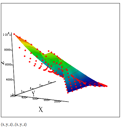
I have created the correct data to form a 2D surface for you. Notice that I renamed the vectors so that z is the dependent one!
First we show it in x,y,z order, load rating in z-direction and we see that now that scatterplot of the points perfectly fits:
But you can change the order. Here is the same order you used in your sheet (height is height 😉
You may get a smoother result if you use some sort of spline interpolation of your data but at least now we see the correct surface. BTW, what is Excel showing? Does it create the correct surface?
Jun 04, 2014
04:27 PM
- Mark as New
- Bookmark
- Subscribe
- Mute
- Subscribe to RSS Feed
- Permalink
- Notify Moderator
Please log in to access translation
Jun 04, 2014
04:27 PM
Thank you!
Excel with Y on the vertical axis. The surface renders nicely, but the problem is that the x and z values are not the actual values, but rather their position in the array you are plotting. On the X axis, I had renamed it the actual number values, but on the Z the values are still names Series1, Series2... The X and Z do not scale with their value either.
Jun 04, 2014
04:33 PM
- Mark as New
- Bookmark
- Subscribe
- Mute
- Subscribe to RSS Feed
- Permalink
- Notify Moderator
Please log in to access translation
Jun 04, 2014
04:33 PM
Is was easy to do so for whatever its worth are the contour lines in a 2D plot.

Jun 04, 2014
06:19 PM
- Mark as New
- Bookmark
- Subscribe
- Mute
- Subscribe to RSS Feed
- Permalink
- Notify Moderator
Please log in to access translation
Jun 04, 2014
06:19 PM
Excel with Y on the vertical axis. The surface renders nicely, but the problem is that the x and z values are not the actual values, but rather their position in the array you are plotting. On the X axis, I had renamed it the actual number values, but on the Z the values are still names Series1, Series2... The X and Z do not scale with their value either.
Thats what I suspected - its wrong in Excel, too. Same error as in Mathcad! You need to turn your data in a 2D matrix (a table) in EXCEL, too, to be able to plot a correct 3D surface!!
Maybe you take a look here for an example http://www.herber.de/bbs/user/10215.xls
or google for further help as the built-in help proved not to be very helpful.
I am not sure if its possible to create a correct diagram in Excel where the dependent variable is NOT vertical, though.
EDIT: Here is a correct Excel plot - independent data vertical. It was the simplest way to create the necessary table using a pivot table. Otherwise we would have to resort to copy and paste or usage of error prone Exxcel formulas. Turning the plot the way you would like it to be is sure much more difficult than in Mathcad - if possible anyway.


