Community Tip - Learn all about the Community Ranking System, a fun gamification element of the PTC Community. X
- Subscribe to RSS Feed
- Mark Topic as New
- Mark Topic as Read
- Float this Topic for Current User
- Bookmark
- Subscribe
- Mute
- Printer Friendly Page
wierd graph bug in 15.0?
- Mark as New
- Bookmark
- Subscribe
- Mute
- Subscribe to RSS Feed
- Permalink
- Notify Moderator
wierd graph bug in 15.0?
Hi,
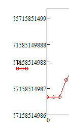
I've got a simple sheet that ends up with a single graph. All of the values being graphed are the same, 19.486. When i graph it i get crazy numbers on my y-axis. Whats the deal?
If i set the y-axis bounds (e.g. 20 & -20) the scale "settles down" and looks normal.
best regards,
russ
- Mark as New
- Bookmark
- Subscribe
- Mute
- Subscribe to RSS Feed
- Permalink
- Notify Moderator
The values in your vector p are NOT all the same, they differ very slighty!

So Mathcad scales the ordinate, zooming in so you can see the graph (with the axis limits you suggested you will only see a straight horizontal line).
When the graph is not selected you see the strange numbers you noticed

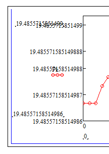
but if click in th egraph you see this

and realize, that those strange numbers simply are the last eleven decimals of the axis values when they are written with (14) decimals. So Mathcads autoscaling is trying its best (and fails) to provide values at the axis which are different. And in doing so it doesn't respect the setting of the number format (which is 3 decimals) and obviously runs in some kind of space limit(?).
The same happens, if you manually chose axis limit in the same range, e.g. put max(p) at the top and min(p) at the bottom.
So, yes, its a bug as this should not happen, but the alternative woul be to provide you with an ordinate which has the very same number (19.486) at each tick. This would be probably better, but we are playing at the limits of Mathcads numerics and so this behaviour is excusable in my opinion. Nevertheless, PTC, if there is a fix, please implement it in the next release.
If you are happy with a precision of, lets say, 10 decimals, you may round your values before you plot them,

making them all equal in your example, and the plot will look "normal".


