Community Tip - Did you get called away in the middle of writing a post? Don't worry you can find your unfinished post later in the Drafts section of your profile page. X
- Community
- Creo+ and Creo Parametric
- System Administration, Installation, and Licensing topics
- Re: Annotation color in Creo
- Subscribe to RSS Feed
- Mark Topic as New
- Mark Topic as Read
- Float this Topic for Current User
- Bookmark
- Subscribe
- Mute
- Printer Friendly Page
Annotation color in Creo
- Mark as New
- Bookmark
- Subscribe
- Mute
- Subscribe to RSS Feed
- Permalink
- Notify Moderator
Annotation color in Creo
Anyone have any idea how to change the color of annotation features in Creo. My company just switched to Creo from Wildfire 4 and I am partially color blind. The default scheme doesn't agree with my eyes very well. Thanks.
- Mark as New
- Bookmark
- Subscribe
- Mute
- Subscribe to RSS Feed
- Permalink
- Notify Moderator
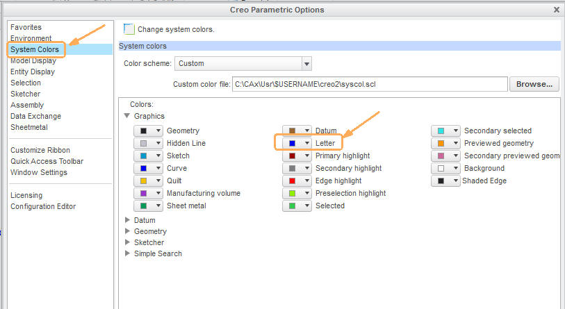
I have a color table set to closely mimic the old Pro|E interface. Someone may have one that matches the WF interface. Technically, you can reset pretty much all the colors through a syscolor.scl system color file that is called up in config.pro.
system_colors_file <drive>:\<path>\<sys-color-file>.scl
- Mark as New
- Bookmark
- Subscribe
- Mute
- Subscribe to RSS Feed
- Permalink
- Notify Moderator
i think it is the "Letter" color in the Colors>Graphics.
The color settings are confusing. It was a game of wack-a-mole to figure out what controls what, confusing because the description of what color you are setting isn't consistent.
- Mark as New
- Bookmark
- Subscribe
- Mute
- Subscribe to RSS Feed
- Permalink
- Notify Moderator
Hi Ryan,
Thanks for the reply. The 'letter' color setting wasn't the one I was going after. I'm going after the ones below...
- Mark as New
- Bookmark
- Subscribe
- Mute
- Subscribe to RSS Feed
- Permalink
- Notify Moderator
Mark, are you talking about CreoelmentsPro (WF5) or Creo1 or 2?
As Ryan points out, the color is driven by the 'Letter' setting.
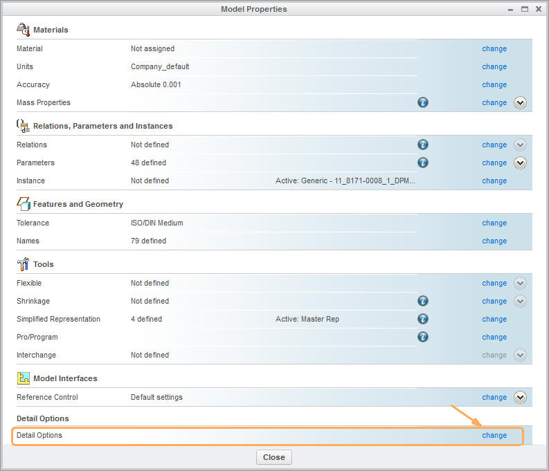
All other 'drawing setup' options for the 2D elements in 3D models in Creo1 or 2 the are managed within the part, such as text hight, tol display and many more.
That means if you want to have it permanently changed you must implement it in your start part.
It is to be found and modified here:

- Mark as New
- Bookmark
- Subscribe
- Mute
- Subscribe to RSS Feed
- Permalink
- Notify Moderator
Constantin, I am actually referring to Creo 2.0 and am specifically referring to various annotations as they are viewed in part modeling mode.
For instance, when you display a coordinate system on a part, what color setting needs to be adjusted to change the color of the 'X, Y, Z' on each of the 3 axes? I have tried adjusting the 'Letter' setting but this isn't it. I've also adjusted the color of the 'tag' for the coordinate system (and tags for other datum features) but this only controls the color of the name label for the coordinate system.
Take a look at the image below to see what I'm trying to adjust.

- Mark as New
- Bookmark
- Subscribe
- Mute
- Subscribe to RSS Feed
- Permalink
- Notify Moderator
i don't think I ever found out which one controls that.
you would think that developers would have some color blind people somewhere in the process run through things like this.
- Mark as New
- Bookmark
- Subscribe
- Mute
- Subscribe to RSS Feed
- Permalink
- Notify Moderator
PTC didn't have a UI group. The VP of product development was cold to the suggestion they need a UI group, a suggestion made at PTC User a few years back. Typically, Human Factors and A.D.A. guidelines would be used to help select colors.
- Mark as New
- Bookmark
- Subscribe
- Mute
- Subscribe to RSS Feed
- Permalink
- Notify Moderator
yeah, because usability isn't important at all. ![]()
- Mark as New
- Bookmark
- Subscribe
- Mute
- Subscribe to RSS Feed
- Permalink
- Notify Moderator
....which is why we got the dreaded ribbon.......... ![]()
- Mark as New
- Bookmark
- Subscribe
- Mute
- Subscribe to RSS Feed
- Permalink
- Notify Moderator
There is an app if the developers what to "see" what their interface looks like for various type of color blindess.
"ColorblindVis" - down load it to your phone and the point the phone at the interface and see what others see.
Hopefully this could be used in the future.
Thanks, Dale
- Mark as New
- Bookmark
- Subscribe
- Mute
- Subscribe to RSS Feed
- Permalink
- Notify Moderator
Hi Mark,
sorry, that setting I do not know. I thought you meant annotations.
Honestly, I would change the background colour for that matter, either to much lighter or much darker in order to increase the contrast.


