
Turn on suggestions
Auto-suggest helps you quickly narrow down your search results by suggesting possible matches as you type.
Showing results for
Please log in to access translation
Turn on suggestions
Auto-suggest helps you quickly narrow down your search results by suggesting possible matches as you type.
Showing results for
Community Tip - Did you know you can set a signature that will be added to all your posts? Set it here! X
- Community
- Creo+ and Creo Parametric
- System Administration, Installation, and Licensing topics
- Re: Why does PTC insist on Ribbon Interface? Over...
Translate the entire conversation x
Please log in to access translation
Options
- Subscribe to RSS Feed
- Mark Topic as New
- Mark Topic as Read
- Float this Topic for Current User
- Bookmark
- Subscribe
- Mute
- Printer Friendly Page
Why does PTC insist on Ribbon Interface? Over 40% strongly dislike!
Jun 20, 2013
02:19 PM
- Mark as New
- Bookmark
- Subscribe
- Mute
- Subscribe to RSS Feed
- Permalink
- Notify Moderator
Please log in to access translation
Jun 20, 2013
02:19 PM
Why does PTC insist on Ribbon Interface? Over 40% strongly dislike!
Why does PTC insist on pushing the Ribbon Interface in Creo?
I personally feel that the Ribbon Interface doesn't work well in 3D CAD software. CAD softwares are geared to use the mouse as the main input device. The demands of everyday CAD work requires users to click away on the interface. For MS Office Suites, the Ribbon Interface works well. This is because the main input device for these tools is the keyboard. People spend more time typing away and uses the mouse seldomly to format what they have typed. And when they use the mouse, the selections are mostly under one tab. Has PTC conducted any real world usuability studies?
The Ribbons Interface doesn't make Creo easier to use. It's a smoke and mirrors interface. What I mean by this is that it is an interface that may make Creo look like an MS Office product which PTC thinks will make the public think that Creo is finally "Easy to Use". This interface doesn't adress the true usability issue. It's the same tool with a different skin. PTC needs to overhaul their interface from ground up and provide solutions that is truly innovative.
I understand that PTC's management made the decision to license the Ribbon Interface from Microsoft but these management people don't have any clue on how to use the product. When speaking to people from PTC regard the issues with the Ribbons Interface, it sounds like this conversation isn't even open for discussion. They have a lot invested in the interface and managment have given them directives that nobody wants to challenge.
Microsoft shouldn't be a company that PTC should look at for inspiration. What is the last innovative product that Microsoft made? Surface Tablet?
I feel that PTC has dropped the ball and have ignore its customers needs. When going over the polls in this discussion forum, I find that over 40% of the users don't like the ribbon interface. This is a staggering figure.
I'd like to hear what others have to say about this.
Labels:
- Labels:
-
Licensing
72 REPLIES 72
Jun 20, 2013
02:59 PM
- Mark as New
- Bookmark
- Subscribe
- Mute
- Subscribe to RSS Feed
- Permalink
- Notify Moderator
Please log in to access translation
Jun 20, 2013
02:59 PM
Oh man, you're singing to the choir here. I've started several threads blasting the absurd ribbon.........
Jun 20, 2013
03:10 PM
- Mark as New
- Bookmark
- Subscribe
- Mute
- Subscribe to RSS Feed
- Permalink
- Notify Moderator
Please log in to access translation
Jun 20, 2013
03:10 PM
Here's my .02.
I love it. I am able to get everything I need from all of the tabs (I only do part modeling and assembly), rearranged where I want it in one part modeling interface. I find it extremely flexible. Everything I use the most often is in the middle of the ribbon, and the most used commands are at the bottom near the graphics region. I've even go so far as to modify the Import Data Doctor ribbon to include the measure and appearance tabs so I'm not flipping between tabs to get at those items. Adding our own custom commands is easy as well.
Where it can use some work: The Part Modeling ribbon is NOT the same as the "Activated Part in and Assmebly" ribbon. This is annoying. I had to make the modifications twice.
However, since I've made these changes, I'm far happier with this interface than with the old Wildfire or 2000i interface. I have exactly what I need at my fingertips.
The only other thing that annoys me is (as an administrator) that everyone has their own system, and when I'm helping someone I tend to look for my layout instead, but that's the same as if I try to use one of my mapkeys that the user doesn't have. I can say that everyone here is pretty happy with it, even if it had a slight learning curve.
What they can fix, though I wouldn't put this as a priority, is the annoying "To select an object, hold down the ALT key message" so that when I click the box, it never never never shows up again.
Jun 20, 2013
06:14 PM
- Mark as New
- Bookmark
- Subscribe
- Mute
- Subscribe to RSS Feed
- Permalink
- Notify Moderator
Please log in to access translation
Jun 20, 2013
06:14 PM
Well Dave, if you only do part and assembly modeling, you really can't have experienced the rubbish that is the ribbon. I'm on creo, and it is the worst interface I've seen in the 16+ years I've been using it. And for the record, the "alt" thing only gives about 1/2 the functionality lost. 
Jun 20, 2013
08:34 PM
- Mark as New
- Bookmark
- Subscribe
- Mute
- Subscribe to RSS Feed
- Permalink
- Notify Moderator
Please log in to access translation
Jun 20, 2013
08:34 PM
Not bashing anyone, just pointing out that if he hasn't had to use the abomination that is the drawing ribbon, he really can't give an opinion on the ribbon. From what I've seen, there really isn't a ribbon in those modes he uses, but in dwg mode it REALLY bogs down performance. Most of the complaints I've seen are about dwg performance.
Jun 21, 2013
08:53 AM
- Mark as New
- Bookmark
- Subscribe
- Mute
- Subscribe to RSS Feed
- Permalink
- Notify Moderator
Please log in to access translation
Jun 21, 2013
08:53 AM
Are you on Creo Elements 5 (WF5) or Creo? In Elements, which was caleld WF5, the ribbon only exists in drawing mode and it's awful. IN Creo 1 & Creo 2, it's throughout the software and I actualyl like it. It's much better than the old rev 19 & earlier cascading menus and better in my view than the WF interface as well.
Jun 21, 2013
10:11 AM
- Mark as New
- Bookmark
- Subscribe
- Mute
- Subscribe to RSS Feed
- Permalink
- Notify Moderator
Please log in to access translation
Jun 21, 2013
10:11 AM
Aww, c'mon Doug, you didn't love those Unix cascading menus??!!!?? IF you memorized every command, it was so easy.
Jun 21, 2013
10:52 AM
- Mark as New
- Bookmark
- Subscribe
- Mute
- Subscribe to RSS Feed
- Permalink
- Notify Moderator
Please log in to access translation
Jun 21, 2013
10:52 AM
WF5 creo elements. And yes, it's pathetic in dwg mode. I don't like ribbon interfaces in general. Mapkeys should work the same in any mode. I didn't have a problem with cascading menus at all, the commands are still buried in sub-menus, now they're just buried in sideways sub-menus with pretty colors......
Jun 21, 2013
11:40 AM
- Mark as New
- Bookmark
- Subscribe
- Mute
- Subscribe to RSS Feed
- Permalink
- Notify Moderator
Please log in to access translation
Jun 21, 2013
11:40 AM
Ribbon maybe better than the cascading menu but I wouldn't say that the Ribbon UI is the best solution that PTC could have come up with.
Oh wait, PTC didn't come up with the Ribbon UI. A non-innovative company came up with the interface. PTC only adopted the non-innovative, clunky interface designed for word processing. They should have borrowed ideas from Adobe and Apple.
Jun 21, 2013
09:52 AM
- Mark as New
- Bookmark
- Subscribe
- Mute
- Subscribe to RSS Feed
- Permalink
- Notify Moderator
Please log in to access translation
Jun 21, 2013
09:52 AM
Then I'm going to assume that you're using Creo Elements/WF 5 where the ribbon only exists in the drafting module. I'm on Creo 2, and the ribbon is always there. The point I'm trying to make is that you can put almost any command in one tab (so yes, everything for me is in the Model tab). I move things from the Analysis and View tabs to the Model tab, and everything I ever need is there. For me, it is far more functional than the icon stripe down the side of Wildfire, or the old menu manager.
Jun 21, 2013
10:22 AM
- Mark as New
- Bookmark
- Subscribe
- Mute
- Subscribe to RSS Feed
- Permalink
- Notify Moderator
Please log in to access translation
Jun 21, 2013
10:22 AM
You make a good point Dave. Wildfire 5 or Creo Elements / Pro 5.0 was an interim release as far as I'm concerned. The fact that only the Detail module changed made it OK as a preliminary step to a full ribbon. The fact that they required the ALT button to be hit for a lot of functions really made the ribbon a headache.
Creo 1 had a host of problems but was at least fully "ribbonized". I and I think many others, looked at Creo 1 as more of a beta release for a fully ribbonized system. I recall that very few companies moved to this release.
In regards to Creo 2, I defintely prefer it. I jump between WF4, WF5 and Creo 2 on a regular basis. I've found that I prefer using Creo 2 out of all the builds. As you mention, I can drop commonly-used functions in a new tab and have everything right in front of me.
Jun 21, 2013
11:56 AM
- Mark as New
- Bookmark
- Subscribe
- Mute
- Subscribe to RSS Feed
- Permalink
- Notify Moderator
Please log in to access translation
Jun 21, 2013
11:56 AM
There is always a work around.
One should not have to customize the interface to make it work "right."
The features located in the Model, Analysis, and View Tab should be on a flat level. These are the tools that everybody uses. People think about this. Shouldn't this be default for all users.
Unless users become advanced users, people will not customize.
Oct 17, 2013
02:19 PM
- Mark as New
- Bookmark
- Subscribe
- Mute
- Subscribe to RSS Feed
- Permalink
- Notify Moderator
Please log in to access translation
Oct 17, 2013
02:19 PM
@Dave Clark, I'm curious about your customized tab. When you're in your cutom tab in drawing mode, can you select text in a note or table without using alt? Also, can you RMB-click on a view and edit its properties? These are the functions that I have noticed are tab specific and if a customized tab works to eliminate that behavior, that would be great.
Jun 20, 2013
03:33 PM
- Mark as New
- Bookmark
- Subscribe
- Mute
- Subscribe to RSS Feed
- Permalink
- Notify Moderator
Please log in to access translation
Jun 20, 2013
03:33 PM
The default ribbon layout is rubbish... actually the whole ribbon idea is rubbish.
In SpaceClaim there is also a ribbon interface, but it's not possible to set up the hotkeys there. SpaceClaim offers just a predefined hotkey layout which is a nightmare to use. When I worked with SpaceClaim all day once, my hand wanted to fall off.
Luckily in Creo there are mapkeys. Yes, they are pain to set up such that they let you overcome ribbon completely, but at least mapkeys offer a way to go in Creo, without the hand on the mouse to drop off after a whole day at work.
The only good thing on ribbon in Creo is that it can be hidden for the most part by the little up arrow thing in the top left corner of the window.
Well, overall, just considering the ribbon alone, its allright as it is. It's just the white-ish color of the ribbon, and all the menus, which can't be changed atm, that was really a dumb idea.
Jun 20, 2013
08:16 PM
- Mark as New
- Bookmark
- Subscribe
- Mute
- Subscribe to RSS Feed
- Permalink
- Notify Moderator
Please log in to access translation
Jun 20, 2013
08:16 PM
i don't like the ribbon interface either. in my opinion they should have atleast kept it the wildfire way. primary reason being i guess that we all are so used to that kind of interface.
now i have been one year on creo 2.0...i still feel it hinders productivity....
even guys who have initially trained on creo 2.0 and now working on wildfire 4.0 like the wildfire 4.0 interface more.
but i have interacted with guys who have switched from other ribbon based 3D parametric softwares..and yes they like the new creo 2.0 interface......but these other softwares have long been on ribbon.
creo interface should always have been in wildfire mode, that is also what made it different....but now since it has changed...they should keep it this (ribbon) way..and only try to make it more user friendly.....otherwise if they change again....that would really really make all very angry...!
Jun 21, 2013
12:04 PM
- Mark as New
- Bookmark
- Subscribe
- Mute
- Subscribe to RSS Feed
- Permalink
- Notify Moderator
Please log in to access translation
Jun 21, 2013
12:04 PM
I don't think that WF5 UI is the best solution either.
PTC should have done a usability study with Pallets and Dialogue Boxes.
There are solutions which could be much more elegant than what they have.
I don't think PTC really thought too much on mouse clicks and mouse travel.
Jun 21, 2013
12:44 AM
- Mark as New
- Bookmark
- Subscribe
- Mute
- Subscribe to RSS Feed
- Permalink
- Notify Moderator
Please log in to access translation
Jun 21, 2013
12:44 AM
Rohit Rajan has it right:" people who dislike the ribbon are all coming from wildfire..."
I've been personally using Solid Edge/ NX7/Wildfire4.0/ CREO 2.0 in that order. I am doing modelling, assembly AND drawing...moving to wildifire 4.0 felt like going back in time (in a wrong way).....I guess it's just a question of "Breaking your Habits" when it comes to the Ribbon interface....
Jun 21, 2013
12:19 PM
- Mark as New
- Bookmark
- Subscribe
- Mute
- Subscribe to RSS Feed
- Permalink
- Notify Moderator
Please log in to access translation
Jun 21, 2013
12:19 PM
People who are complaining are the one who really use the software.
The new interface requires more mouse travel and more mouse clicks. When you really get into the software, it becomes clearly evident.
I don't think it has anything to do with breaking bad habits. Breaking bad habit hold more true for Rev 2000i to WF5 where menu options were shuffled around. But these were habits that people were able to overcome.
Ribbon UI was a complete interface overhaul which disrupts the usability of the tool.
Jun 21, 2013
12:50 PM
- Mark as New
- Bookmark
- Subscribe
- Mute
- Subscribe to RSS Feed
- Permalink
- Notify Moderator
Please log in to access translation
Jun 21, 2013
12:50 PM
Nope, this isn't about "breaking the habits". The implemenation of the ribbon is just wrong.
The default layout of ribbon shoudn't force the user to switch to Table tab, just so a table cell can be selected. It shoudn't force the user to switch to Layout tab, just so the crosshatching can be selected either. Both applies for Creo 2.0. Usage of Alt key isn't a good enough solution for something this simple, it makes the workflow of making a drawing pretty much disturbing.
I guess noone at PTC ever has to bother with drawings anymore, that's why these issues still remain in Creo since WF5 till now.
Jun 21, 2013
04:46 AM
- Mark as New
- Bookmark
- Subscribe
- Mute
- Subscribe to RSS Feed
- Permalink
- Notify Moderator
Please log in to access translation
Jun 21, 2013
04:46 AM
I haven't worked with the Creo ribbon in anger, but I'm yet to be convinced by it in Office.
My main impression is that it makes every task longer by at least one mouse click or key press, usually two clicks if you consider returning to the Home tab after completing the task. In addition, I don't find it any easier to find little-used commands than it was with menus.
For example, Goal Seek in Excel was Alt, T, G or click Tools, Goal Seek (3 keys or 2 clicks). Now it's Alt, A, W, G (where the A stands for Data!) or click Data, What If, Goal Seek (and finally Home) (4 keys or 3-4 clicks). (Yes, I know that Alt, T, G still works - but I suspect it's deprecated.)
Someone in our company has created a custom ribbon tab for Powerpoint which tries to put 95% of the tools you ever use in a single tab - so that's basically just a large toolbar - and I've found that it works pretty well. Independently, my colleague who's been trying out Creo 2 (we're still on WF4 for live projects) has decided that the way to go will be to create one custom tab for modelling, and one for drawing.
In short, then, the Ribbon works well enough if you configure it to only need one tab...
Jun 21, 2013
12:06 PM
- Mark as New
- Bookmark
- Subscribe
- Mute
- Subscribe to RSS Feed
- Permalink
- Notify Moderator
Please log in to access translation
Jun 21, 2013
12:06 PM
Have all tools in one tab defeats the purpose of the Ribbon UI.
Wouldn't you agree?
Jun 21, 2013
07:56 AM
- Mark as New
- Bookmark
- Subscribe
- Mute
- Subscribe to RSS Feed
- Permalink
- Notify Moderator
Please log in to access translation
Jun 21, 2013
07:56 AM
I agree with much of what Johnathan said. I think that the Home tab is fine as long as you set it up properly.
I don't think that toolbars full of icons were ever a good idea for Windows applications. Menus such as File, Edit and View were always more intuitive. Who would guess that Offset is initiated by clicking an icon depicting a curved arrow pointing to a corner?
The Ribbon seems like a hybrid of the two older options: menus and toolbars, and I think it's a good move. I think that the problem with many implementations, including in Creo, is that functionality in the workspace changes depending on what tab you have selected in the Ribbon.
What PTC really need to add is the option for small icons without text labels. I think that this simple addition would please many people who consider the Ribbon to waste too much space.
Jun 21, 2013
12:28 PM
- Mark as New
- Bookmark
- Subscribe
- Mute
- Subscribe to RSS Feed
- Permalink
- Notify Moderator
Please log in to access translation
Jun 21, 2013
12:28 PM
Interfaces that is managed properly will not require so many icons to be loaded up on a toolbar.
PTC should look at other graphics tools such as Photoshop. Pallet, icons, floating dialogue boxes work really well for millions of users around the world.
Let's say that Creo was palletized like Photoshop.
In the part modeling mode, the pallet for Analysis could always be displayed. If the user doesn't want to see it, they can minimize it so that it wouldn't be too distracting. This way, this tool set could always be available for want to use without switching tabs.
Jun 21, 2013
09:58 AM
- Mark as New
- Bookmark
- Subscribe
- Mute
- Subscribe to RSS Feed
- Permalink
- Notify Moderator
Please log in to access translation
Jun 21, 2013
09:58 AM
and just to give an example, here's what I've done with the modeling ribbon, along with the other toolbars...
Jun 21, 2013
10:59 AM
- Mark as New
- Bookmark
- Subscribe
- Mute
- Subscribe to RSS Feed
- Permalink
- Notify Moderator
Please log in to access translation
Jun 21, 2013
10:59 AM
One of my main complaints with ribbons is the loss of a lot of valuable screen space, the ribbon wastes a ton of it. Yes, you can hide it, but then you have to deal with that.
From a speed perspective I can tell you I'm a lot faster on WF4 than on creo, and I'd challenge anyone on the new interface vs me on WF4.
Pro/E is an Engineering tool, not a word processing tool. None of the other expert users I personally know think the ribbon is anything but a major step backwards in terms of speed.
Jun 21, 2013
12:32 PM
- Mark as New
- Bookmark
- Subscribe
- Mute
- Subscribe to RSS Feed
- Permalink
- Notify Moderator
Please log in to access translation
Jun 21, 2013
12:32 PM
As I have mentioned before, doesn't having everything under one tab defeat having the ribbon in the first place?
What do you do if you have to measure something while you are in Sketcher? Don't you still have to switch tabs to measure? Or do you have the most used analysis tools in the Sketcher Tab as well?
Jun 21, 2013
12:32 PM
- Mark as New
- Bookmark
- Subscribe
- Mute
- Subscribe to RSS Feed
- Permalink
- Notify Moderator
Please log in to access translation
Jun 21, 2013
12:32 PM
I agree with mouse travels are bit longer in creo,last time i remember my mouse was asking for "taxi fare" to travel from one tab to another.he clearly stated all this travel is killing his durability.
Jun 21, 2013
12:35 PM
- Mark as New
- Bookmark
- Subscribe
- Mute
- Subscribe to RSS Feed
- Permalink
- Notify Moderator
Please log in to access translation
Jun 21, 2013
12:35 PM
LOL...
My mouse went on strike! It got arthritis and wants worker's comp.
In all serious note. This ribbon in Creo can't be good for carpel tunnel.
Jun 21, 2013
12:59 PM
- Mark as New
- Bookmark
- Subscribe
- Mute
- Subscribe to RSS Feed
- Permalink
- Notify Moderator
Please log in to access translation
Jun 21, 2013
12:59 PM
I have some additional gripes with the Ribbon UI. Please let us know if you all agree.
For those who like the Ribbon UI, what do you do if when you have to measure existing features when you are in the middle of feature creation?
Don’t you find it annoying to take these steps?
- Move the cursor to Analysis Tab.
- Click on the Analysis Tab.
- Move the cursor over to the Measure Icon.
- Click on the Measure Icon
- Move the cursor to the Distance Icon.
- Click on the Distance Icon
- Click on points to measure from-to (Same in old and new)
- Move the cursor to the tab you were working on.
- Click on the tab you were working on.
In the WF5, with the default analysis toolset turned on, all you had to do is the following to accomplish the same task:
- Move the cursor over to the Measure Distance icon.
- Click on the Measure Distance icon.
- Click on points to measure from-to (Same in old and new)
The Ribbon UI requires 3X more actions for the same task! This is crazy! This is the type of inefficiencies that this UI creates.
And what’s up with the large icons? The large icons in the Ribbon UI is distracting. People’s eyes will naturally gravitate towards larger icons. And the text next to the icon takes up a lot of screen real-estate.
I also don’t like having a drop down menu at the bottom of the tool bar. Items inside the drop down menu is hard to find. PTC could clean some of these items up. For instance, why don’t they combine Cosmetic Sketch, Cosmetic Groove, and ECAD Area with Sketched Datum Curve?
Why are we forced to use only the Top Ribbon area for customization? Why are we not allowed to put icons on the sides of the window? These are valuable real-estate that is not leveraged. Also, the sides naturally create separation by its physical location on the screen. This helps organize my working environment.
Why is Publish Geom and other tools located under two different tabs? It is confusing.
It really makes me wonder who is testing out the product.
The management of PTC needs to wake up and admit that they made a mistake with their business decision. Their choice of choosing the Ribbon interface to address the ease of use objection was wrong.
I’m not here to be negative here. I want PTC to make a better product. I hope they can take what is being said here as constructive criticism. I’ve tried to talk to PTC developers directly and they were not so open minded. I’m hoping that a public forum here could bring to light regarding what is not working.
To be fair, for those who like the Ribbon UI, I would like to hear feedback as to why they like the UI. Please explain how the UI that has enhanced your experience.
Jun 21, 2013
01:17 PM
- Mark as New
- Bookmark
- Subscribe
- Mute
- Subscribe to RSS Feed
- Permalink
- Notify Moderator
Please log in to access translation
Jun 21, 2013
01:17 PM
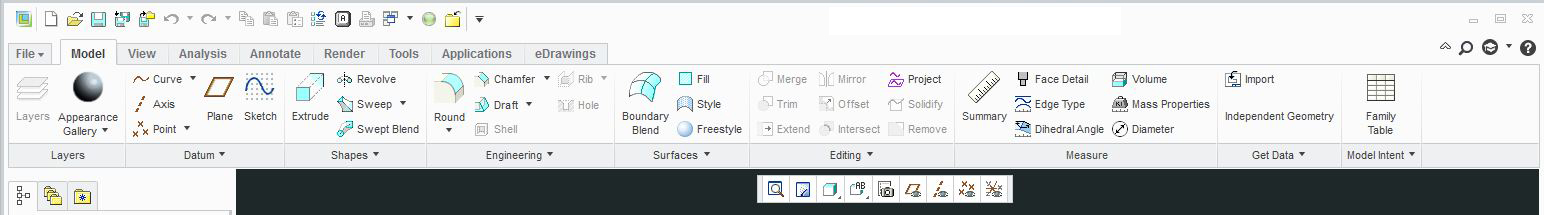
I'm going to assume you mean feature creation using sketcher, as my previous replies show how I have it available on the Model tabl all the time. It's not as many clicks if you put the measure icon in the sketcher ribbon as shown below:
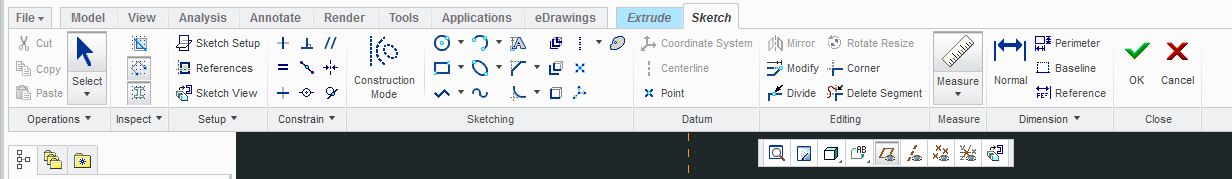
then, while sketching it's click measure (which is distance by default) and click on the items you're measuring. So its:
1. Click measure icon
2. Click points/entities to measure.
You can also choose which icons are large, and which are small, or whether or not they have labels on or off.
I'm not trying to fuel a fire here, but as an admin, I try to make my user group lives easier.
I'll agree that it may not have been thoroughly thought out, but I feel it's much easier to use and customize than any prior release.
Again, I'm not trying to get anyone angry or stir the pot. I'm just trying to share the things that I've done that have made my job easier.
I hope this helps.


Top Tags
