- Community
- ThingWorx
- ThingWorx Developers
- Collection Widget Row Spacing (table view)
- Subscribe to RSS Feed
- Mark Topic as New
- Mark Topic as Read
- Float this Topic for Current User
- Bookmark
- Subscribe
- Mute
- Printer Friendly Page
Collection Widget Row Spacing (table view)
- Mark as New
- Bookmark
- Subscribe
- Mute
- Subscribe to RSS Feed
- Permalink
- Notify Moderator
Collection Widget Row Spacing (table view)
I'm trying to put some vertical space between rows in a collection widget when it is in Table view. There is a RowSpacing property but it only seems to apply to the Flow view. I've been playing around with the CSS but I can't seem to get anything to work. Any thoughts?
I have a workaround that almost gets me there (making the row a bit taller and put in a container that is the same color as the background of the main mashup), but then the border radius doesn't look right.
Solved! Go to Solution.
- Labels:
-
Mashup-Widget
Accepted Solutions
- Mark as New
- Bookmark
- Subscribe
- Mute
- Subscribe to RSS Feed
- Permalink
- Notify Moderator
Hi @nmilleson ,
There is a very simple way of overcoming this. Set your Collection on Flow layout. Set the FlowLayoutGravity to Expand, FlowLayoutAlignment to Top and FlowLayoutContentGravity to Top. And set the MashupWidth to 9999 or something crazy like that. It will basically occupy the whole with of the collection container no matter what. Then you can set the spacing between the rows.
Good luck,
Gabriel
- Mark as New
- Bookmark
- Subscribe
- Mute
- Subscribe to RSS Feed
- Permalink
- Notify Moderator
Hi @nmilleson.
Here is a guide that may help in using CSS. For your specific scenario, we will have to test it.
Regards.
--Sharon
- Mark as New
- Bookmark
- Subscribe
- Mute
- Subscribe to RSS Feed
- Permalink
- Notify Moderator
Thanks for the reply. I am pretty familiar with using CSS on the widgets, I just can't find where I'd be able to change that vertical spacing on a table view collection widget. There are a few places where I can change margins and padding in the browser console, but they don't seem to affect how the rows are spaced.
Thanks!
Nick
- Mark as New
- Bookmark
- Subscribe
- Mute
- Subscribe to RSS Feed
- Permalink
- Notify Moderator
Hi @nmilleson.
We've been looking at this, but need clarification of your intent. You mentioned vertical spacing on a table, which would mean between the columns, but later mention row spacing. Just need clarification.
There are properties for MinimumSpacing between the cells in the Row. There is also RowSpacing that affects vertical spacing between the rows.
Have you tried the above and it's not working for you? We did not find an issue under 9.1. Which version of ThingWorx are you running?
Regards.
--Sharon
- Mark as New
- Bookmark
- Subscribe
- Mute
- Subscribe to RSS Feed
- Permalink
- Notify Moderator
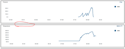
My apologies for not being clear. I'm talking about the spacing between rows on a collection widget that is set to "Table" mode. See image below (circled portion):
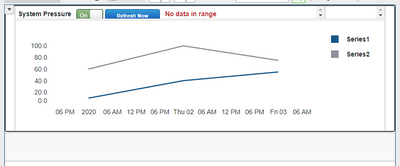
Right now I am "faking" that space in by putting an extra container under the time-series chart :
However, I'd rather set the spacing via mashup parameter or css. Right now, when I want to select one of the rows in the collection, the chart and the space below are highlighted.
- Mark as New
- Bookmark
- Subscribe
- Mute
- Subscribe to RSS Feed
- Permalink
- Notify Moderator
Hi @nmilleson.
Which version of ThingWorx are you running? Changes were made starting with ThingWorx 9.0, so if you're using a release before that, we'll need to take a look at it.
Regards.
--Sharon
- Mark as New
- Bookmark
- Subscribe
- Mute
- Subscribe to RSS Feed
- Permalink
- Notify Moderator
- Mark as New
- Bookmark
- Subscribe
- Mute
- Subscribe to RSS Feed
- Permalink
- Notify Moderator
Hi @nmilleson.
We tested under 9.1.0 as well and were able to use the RowSpacing parameter. It's not possible to set the spacing via a mashup parameter.
What happens when you use the RowSpacing parameter?
Regards.
--Sharon
- Mark as New
- Bookmark
- Subscribe
- Mute
- Subscribe to RSS Feed
- Permalink
- Notify Moderator
I'm referring to when the collection widget is a "Table" type. RowSpacing is not visible/usable when the View is set to "Table".
--Nick
- Mark as New
- Bookmark
- Subscribe
- Mute
- Subscribe to RSS Feed
- Permalink
- Notify Moderator
Greetings,
This is the ThingWorx Developer Portal (DevPortal).
We actually have a guide on using the Collection Widget. You can find it here: https://developer.thingworx.com/en/resources/guides/collection-widget-how-to
Having said that, though, I'm not sure there are instructions in that guide to achieve exactly what you're looking for. The Collection Widget is Responsive. It's going to try and use the least amount of space possible to get everything displayed.
Well... with one caveat. From your attached screenshots, it looks like you're repeating a graph. You want that graph to have some space around it for visual-separation of each repeating part.
One thing that the linked Collection Widget guide above recommends is to make the Mashup containing the Collection Widget Responsive (so it can grow and shrink as needed by screen real estate), but to make the sub-Mashups with your actual data Static. To clarify, I'm not talking about the Static (Legacy) Mashup option you get when you create a new Mashup. I'm talking about creating a regular Responsive Mashup... not Responsive (Legacy)... and then going into the Layout tab in the top-left and setting Positioning to Static.
This allows you to get your sub-Mashups with your Data to look *EXACTLY* how you want them to look. You can make the graphs as big or as small as you want, and then collapse or expand the Mashup Container itself to have as much "white space" around the Graph as you want.
Then, when you use the Collection Widget, it won't be able to compress the repeated sub-Mashups down below the Static Container size.
So, on second though, it might be good to go through our Collection Widget guide, because you'll see the exact steps used to create the Static sub-Mashups.
Hope this helps.
Thanks,
Jason
- Mark as New
- Bookmark
- Subscribe
- Mute
- Subscribe to RSS Feed
- Permalink
- Notify Moderator
@jwyatt ,
Thanks for the response. I'm just looking for a way to add more spacing between the individual rows in the collection widget when it is set to 'Table' view. There is a RowSpacing parameter that works just fine for the "Flow" view but for some reason does not apply to the "Table" view. If the only way to work around it is to modify the 'repeated' mashups to have 'built-in' space on the bottom then I'll continue to do that. If it would be easier to jump on a call for me to show you what I'm referring to, I would be glad to do that as well.
Thanks,
Nick
- Mark as New
- Bookmark
- Subscribe
- Mute
- Subscribe to RSS Feed
- Permalink
- Notify Moderator
Hi @nmilleson.
I'm afraid that we haven't been able to come up with a solution to this, other that the one you're already using. Possibly someone else in the community will have some ideas.
Regards.
--Sharon
- Mark as New
- Bookmark
- Subscribe
- Mute
- Subscribe to RSS Feed
- Permalink
- Notify Moderator
Hi @nmilleson ,
There is a very simple way of overcoming this. Set your Collection on Flow layout. Set the FlowLayoutGravity to Expand, FlowLayoutAlignment to Top and FlowLayoutContentGravity to Top. And set the MashupWidth to 9999 or something crazy like that. It will basically occupy the whole with of the collection container no matter what. Then you can set the spacing between the rows.
Good luck,
Gabriel
- Mark as New
- Bookmark
- Subscribe
- Mute
- Subscribe to RSS Feed
- Permalink
- Notify Moderator
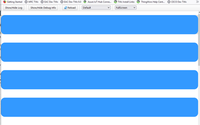
Thanks for the solution! We also have a requirement that the corners of each collection tile need to be rounded. It appears that your workaround still shows the rounded corners on the right-hand side of the screen!
- Mark as New
- Bookmark
- Subscribe
- Mute
- Subscribe to RSS Feed
- Permalink
- Notify Moderator


