- Community
- ThingWorx
- ThingWorx Developers
- Re: Line chart: X-axis too wide for given dataset
- Subscribe to RSS Feed
- Mark Topic as New
- Mark Topic as Read
- Float this Topic for Current User
- Bookmark
- Subscribe
- Mute
- Printer Friendly Page
Line chart: X-axis too wide for given dataset
- Mark as New
- Bookmark
- Subscribe
- Mute
- Subscribe to RSS Feed
- Permalink
- Notify Moderator
Line chart: X-axis too wide for given dataset
Hello,
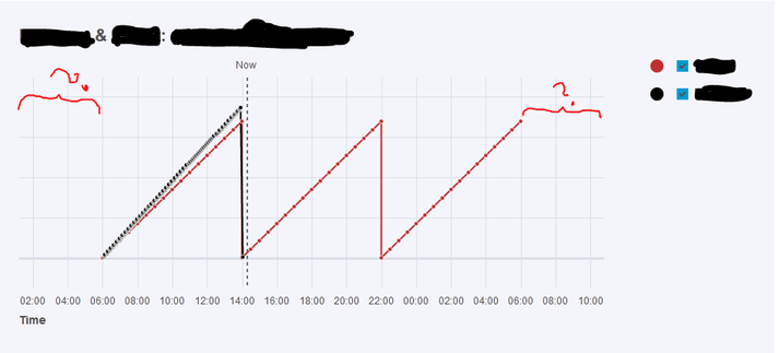
I'm building following line chart view with Thingworx 9.2.3:
The data I'm using starts always at 06:00, and ends at 06:00 the next day (24h).
But when I draw it with the standard line chart widget, it adds +4 hours into both ends of the timeline. This causes the usable drawing area for the actual data to be 8 hours less than the actual width I'm giving to the widget.This result graph looks too crowded for the data, and I can't for example display value indicators on the lines, as then it becomes absolutely unreadable.
I would like to be able to remove this extra "margin" completely from the draw view, or to configure it to be for example just 1 hours extra empty space. Are there any options, or is the margin hard-coded?
I have witnessed the same behavior with other datasets and TW 9 line chart too, so it doesn't seem to be related to data used in this example.
Thanks.
Solved! Go to Solution.
- Labels:
-
Mashup-Widget
Accepted Solutions
- Mark as New
- Bookmark
- Subscribe
- Mute
- Subscribe to RSS Feed
- Permalink
- Notify Moderator
Hello @natpaa,
The issue you are seeing is because the properties of the Chart are not configured correctly for what you are trying to accomplish. You need to set the XAxisMaximumValues and XAxisMinimumValues to be the first and last time on your chart. If you take a look at the screen capture:
There are 3 fields you need to be aware of:
- XAxisDateFormatToken - This field changes based on the type of XAxis.
- XAxisMaximumValues - This is a blindable field, If you enter the end Date/time your chart will end on that value
- XAxisMinimumValues - This is a blindable field, If you enter the start Date/time your chart will end on that value
Let me know if this address your issue.
Regards,
Peter
- Mark as New
- Bookmark
- Subscribe
- Mute
- Subscribe to RSS Feed
- Permalink
- Notify Moderator
Thanks! I had already tried it but it wasn't getting proper datetime values into XAxis max/min properties because of a issue in my service. Fixed that and now the chart scales correctly.


