- Community
- ThingWorx
- ThingWorx Developers
- Re: Plot icons in a timeline
- Subscribe to RSS Feed
- Mark Topic as New
- Mark Topic as Read
- Float this Topic for Current User
- Bookmark
- Subscribe
- Mute
- Printer Friendly Page
Plot icons in a timeline
- Mark as New
- Bookmark
- Subscribe
- Mute
- Subscribe to RSS Feed
- Permalink
- Notify Moderator
Plot icons in a timeline
Hello All,
I have a use case where I want to display different issues that happened in a machine throughout the day in a timeline to see concentrations of issues of the same type.
Does anyone have an idea of an approach to do it?
Cheers
Ewerton
Solved! Go to Solution.
- Labels:
-
Troubleshooting
Accepted Solutions
- Mark as New
- Bookmark
- Subscribe
- Mute
- Subscribe to RSS Feed
- Permalink
- Notify Moderator
Hello All,
I was able to get it working!
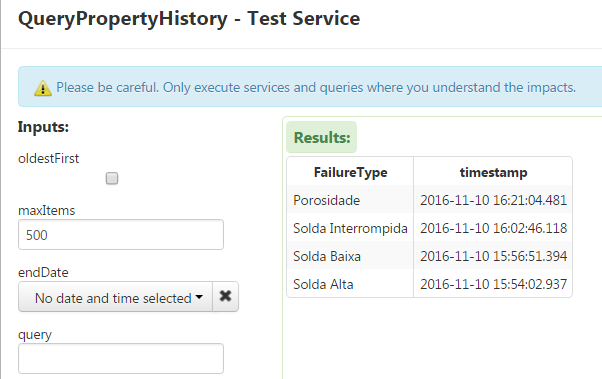
I only needed to use one data series, which I got from pulling the data from a Value Stream:

There is some configuration on the widget to be done but once I figure it would it was really easy:
Main trick was to change the marker size to control the Icon Size. Its default value is 3 so the icons are tiny.

Then I applied some State Based Formatting:

The result (not final) is something like this:

Every icon in the timeline is a different type of issue
Thanks Carles Coll and Bogdan Mihaiciuc for the tips.
Cheers
Ewerton
- Mark as New
- Bookmark
- Subscribe
- Mute
- Subscribe to RSS Feed
- Permalink
- Notify Moderator
You can use a XY or a Label Chart, put on the X axis the hour of the day ( 0..24 ) and on the Y axis the repetition times number.
- Mark as New
- Bookmark
- Subscribe
- Mute
- Subscribe to RSS Feed
- Permalink
- Notify Moderator
of course you will need multiple series in order to map different types of issues.
- Mark as New
- Bookmark
- Subscribe
- Mute
- Subscribe to RSS Feed
- Permalink
- Notify Moderator
Thanks Carles,
Tried it but I don't seem to be able to make the Icons appear.Tried a state based formatting and the series formatting itself and did not succeed so far.
Also tried the event chart. Still struggling.
Cheers
Ewerton
- Mark as New
- Bookmark
- Subscribe
- Mute
- Subscribe to RSS Feed
- Permalink
- Notify Moderator
Hello All,
I was able to get it working!
I only needed to use one data series, which I got from pulling the data from a Value Stream:

There is some configuration on the widget to be done but once I figure it would it was really easy:
Main trick was to change the marker size to control the Icon Size. Its default value is 3 so the icons are tiny.

Then I applied some State Based Formatting:

The result (not final) is something like this:

Every icon in the timeline is a different type of issue
Thanks Carles Coll and Bogdan Mihaiciuc for the tips.
Cheers
Ewerton


