- Community
- ThingWorx
- ThingWorx Developers
- Re: Responsive Application
- Subscribe to RSS Feed
- Mark Topic as New
- Mark Topic as Read
- Float this Topic for Current User
- Bookmark
- Subscribe
- Mute
- Printer Friendly Page
Responsive Application
- Mark as New
- Bookmark
- Subscribe
- Mute
- Subscribe to RSS Feed
- Permalink
- Notify Moderator
Responsive Application
Hello,
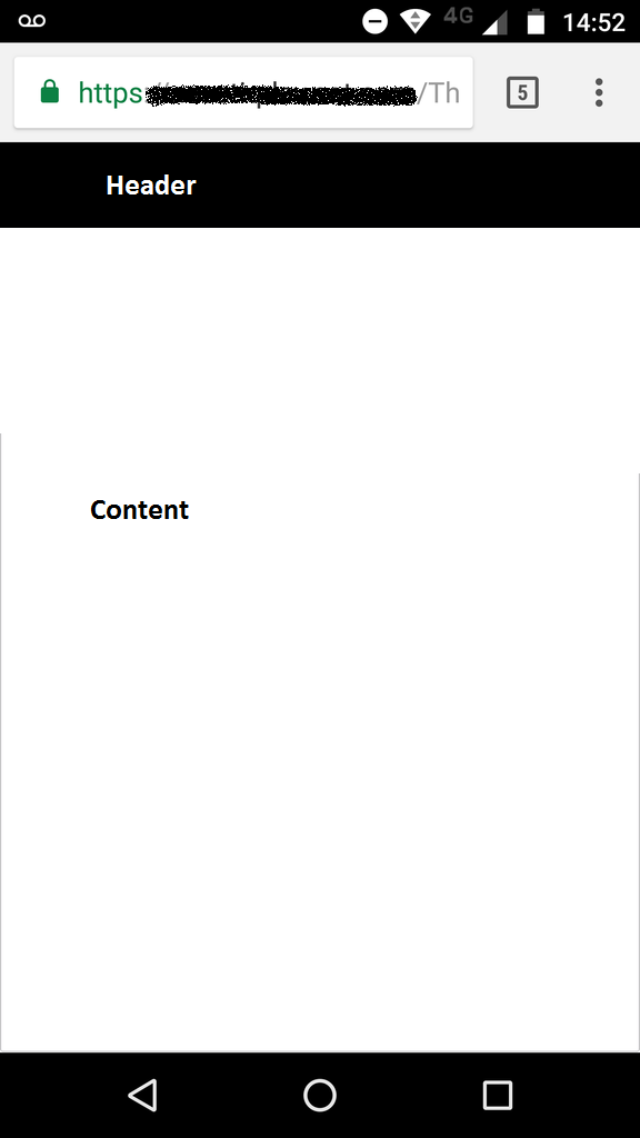
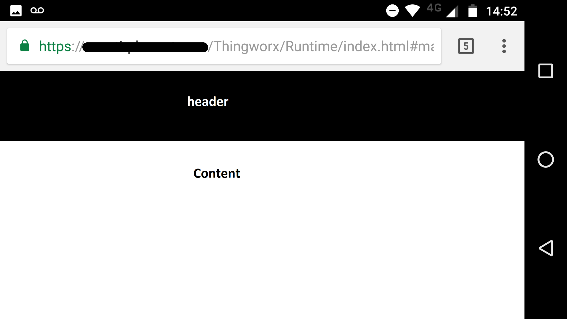
I'm building an application that must fit on a smartphone screen. Everything works fine except when I rotate the device. I have to images below to exemplify the case.
The application is composed with a master that is horizontally divided and has one header and one responsive row. The header is 130px height.


As we can see on the images above, when the device is vertically rotated, the header seems to consume less space on screen than when it's horizontally rotated. Ideally, I want everything to work as if it was vertically.
- Labels:
-
Design
-
Troubleshooting
- Tags:
- mobile
- Mark as New
- Bookmark
- Subscribe
- Mute
- Subscribe to RSS Feed
- Permalink
- Notify Moderator
Hi Radix Engineering and Software,
As per my understanding from the images shared; the height of the Header seems same but the content size has reduced. Could you please confirm if the zoom level is same when the orientation is horizontal vs vertical?
I hope it helps.
- Mark as New
- Bookmark
- Subscribe
- Mute
- Subscribe to RSS Feed
- Permalink
- Notify Moderator
Hi, Ankit Gupta.
Thanks for your response. The zoom level on the browser is the same for both orientations and the image I sent has different resolutions
What I expect to happen is that the application is responsive related both to the height and the width of the screen. Or, maybe block page rotation. Is it possible?
- Mark as New
- Bookmark
- Subscribe
- Mute
- Subscribe to RSS Feed
- Permalink
- Notify Moderator
Hi Radix Engineering and Software,
Rotation for mobile application is defined in the Mobile settings so it can be set there.
As far as I know; Mobile Mashup Builder would be available in future for Mobile Mashup.
Refer to following Thread I found regarding same; https://community.thingworx.com/message/42864#42864
- Mark as New
- Bookmark
- Subscribe
- Mute
- Subscribe to RSS Feed
- Permalink
- Notify Moderator
Thank you for your Response Ankit Gupta.
So far I haven't found any acceptable solution, though.
- Mark as New
- Bookmark
- Subscribe
- Mute
- Subscribe to RSS Feed
- Permalink
- Notify Moderator
Hi,
Did you find any solution to this issue of responsive application?
Thanks,
Tarun


