- Community
- ThingWorx
- ThingWorx Developers
- Re: ThingWorx v9.0 Line Chart scaling and responsi...
- Subscribe to RSS Feed
- Mark Topic as New
- Mark Topic as Read
- Float this Topic for Current User
- Bookmark
- Subscribe
- Mute
- Printer Friendly Page
ThingWorx v9.0 Line Chart scaling and responsiveness
- Mark as New
- Bookmark
- Subscribe
- Mute
- Subscribe to RSS Feed
- Permalink
- Notify Moderator
ThingWorx v9.0 Line Chart scaling and responsiveness
Hello everyone,
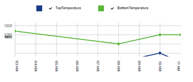
I've been facing an issue while migrating our solution to v9.0. When applying the Line Chart widget to our mashups, I've noticed that I have a scaling problem. Not all data is displayed inside the Line Chart widget, and some of the yAxis values are stacked on top of each other (see image in attachment for reference)
Is this a known issue? Or am I missing any configuration settings from the widget itself?
Thanks,
- Labels:
-
Design
-
Mashup-Widget
-
TWX Dev Portal
- Mark as New
- Bookmark
- Subscribe
- Mute
- Subscribe to RSS Feed
- Permalink
- Notify Moderator
Hi @rnfonseca.
We have an internal case for addressing the migration when dates/times are involved. This is being addressed in ThingWorx 9.1 which is being released in December.
However, it appears that you may be trying to size the chart too small to be able to display all the content. It may also be necessary to split it into 2 charts to display properly.
You may see some improvement also by applying the latest patch release of ThingWorx (assuming you are not running ThingWorx Apps, Navigate, etc. which have very specific compatibility requirements). Is the behavior the same under different browsers? Another option would be to set a fixed height and widget at the container level to prevent users from deviating outside the range required.
Regards.
--Sharon
- Mark as New
- Bookmark
- Subscribe
- Mute
- Subscribe to RSS Feed
- Permalink
- Notify Moderator
Hi @rnfonseca.
Did you take a look at my last response for addressing your issue? In addition, ThingWorx 9.1 was released last week.
If the previous response helped you to find a solution, please mark it as the Accepted Solution for the benefit of others with the same issue.
Regards.
--Sharon
- Mark as New
- Bookmark
- Subscribe
- Mute
- Subscribe to RSS Feed
- Permalink
- Notify Moderator
Hi @slangley,
Yes, I took a look at your reply. We are planning a migration to v9.1. If it works I'll mark it as the solution


