cancel
Showing results for 
Search instead for 
Did you mean: 
cancel
Showing results for 
Search instead for 
Did you mean: 

Community Tip - Help us improve the PTC Community by taking this short Community Survey! X

Best practice of 3D Connecting Line/Arrow ?

dsgnrClarK
16-Pearl

Best practice of 3D Connecting Line/Arrow ?

Hi there,


I wonder what's the Best Practice (Efficient way) to create connecting lines/arrows in 3D space?

3d connecting line.png

I found this thread (https://community.ptc.com/t5/Vuforia-Studio/Adding-Arrow-Lines-in-3D/m-p/524978).

But both 3D image or model is really difficult to use.

  • Difficult to move them into right location (coordinate, angle...)
  • Difficult to adapt to changes (rearrange labels, then rearrange lines/arrows)
  • Time consuming to manipulate... (not scalable)
  • Unable to change color with codes (3D images)


Is it possible to create connection lines/arrows with code?

Or a widget for it? (This will be GREAT)

e.g. From the bounding-box-center of 3D-Object-A to bounding-box -center of 3D-Object-B, with properties like 'distance to each end', 'color', 'radius', 'end type'.


Any reply is appreciated.

Regards,


ClarK

ACCEPTED SOLUTION

Accepted Solutions

So far I know PTC dev team  has this in the pipeline - planed some projects for implementation  but I have no information about the current development status. Anyways it is not part of the current functionality yet ☹️

In one of the PCT internal forums are similar question and we had the following recommendation from dev team /according to the current functionality:

>>> PTC Dev Team:

>>>>=== PTC dev team
1. most importantly, "less is more" - what this means is only show the minimal amount of information that is required at any time.  A simple example might be that if there are 10 items to show, you should really only show one or two that are nearest the user.  

2. size and readability are important, and again you can use principal #1 to help guide here - the content of any augmentation (label etc.) should be kept to a minimum.  If you need a lot of information, put it in a 2d panel on the screen, not a label in 3d space.  Labels in particular should be kept very short/brief

3. be careful with billboarding - labels should be positioned so that they do not intersect with any physical or virtual geometry.  There are techniques to get the bounding boxes of 3d parts and use this information to help position labels.  Coupling this with the location of the user, it is easy to create a system of labels that appear correctly as the user moves around the object.  An extension to this is to not use the auto-billboarding (it is not ideal for most labels) and instead use either static labels that are positioned correctly based on the user location when the label is shown, or to use proximity to calculate the correct label orientation - they should ideally only rotate around the vertical Y axis. This is possible to achieve using JavaScript coding, but you/the customer may need to attend advanced Studio training classes to achieve this.  Talk to CSM and sales enablement mgmt. to identify how to receive better training..

4. support for leaderlines is on the product management requirements list.  There is a specification in place and a reference implementation ; we are hoping that one day the PM and dev team will be able to deliver this. My understanding is that this is not a priority at this time.   

A more advanced labeling solution, with leaders, will be introduced in an upcoming new product, possibly an extension of the expert capture & instruction editing solution.  There is no date specified for when this will be available.

In summary therefore, the best approach to creating labels with leaderlines is as follows:

1. use labels with automatic leaderline (this would require product team to implement the spec)

2. if 1 is not available, create a leaderline image asset (line+ endpoint).  This would be drawn with 'always on top=true. the leader would rise vertically to clear nearby geometry, and at th top would be placed a label.  

3. both items are not billboarded, but instead use proximity and user location information (tracking event) to correctly orient the label+leader to rotate about the vertical axis. The label snaps to a range of angles to prevent constant motion.

4. use of occlusion or masking on the remainder of the model help manage the depth effect of the label

5. a small number of labels are visible at any one time (max 5 I would suggest).  The length and spacing of the leaderlines helps to ensure the labels don't overlap
<<<=== PTC dev team


In the means time is possible to show a Creo Parametric Annotation in  Studio / in Creo Parametric style:
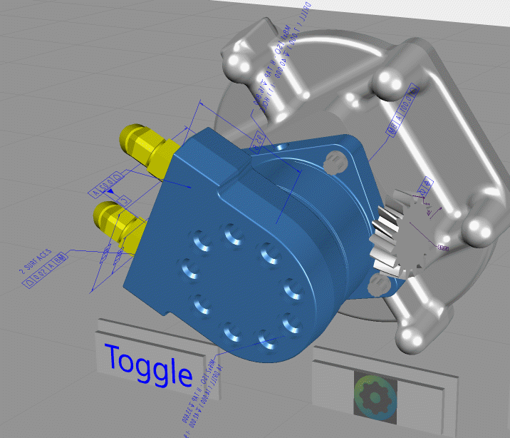
2020-05-08_15-00-41.gif

Based on the current functionality (as already mentioned) we can use a combination of 3d Images  and / or 3DLabels – some thing like this:
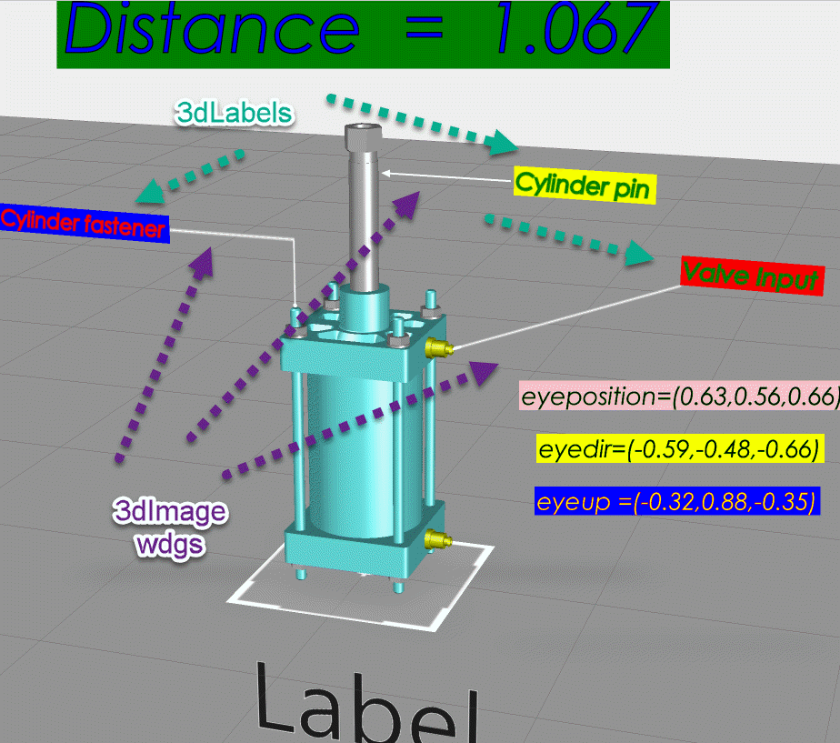
2020-05-08_15-15-46.gif

View solution in original post

1 REPLY 1

So far I know PTC dev team  has this in the pipeline - planed some projects for implementation  but I have no information about the current development status. Anyways it is not part of the current functionality yet ☹️

In one of the PCT internal forums are similar question and we had the following recommendation from dev team /according to the current functionality:

>>> PTC Dev Team:

>>>>=== PTC dev team
1. most importantly, "less is more" - what this means is only show the minimal amount of information that is required at any time.  A simple example might be that if there are 10 items to show, you should really only show one or two that are nearest the user.  

2. size and readability are important, and again you can use principal #1 to help guide here - the content of any augmentation (label etc.) should be kept to a minimum.  If you need a lot of information, put it in a 2d panel on the screen, not a label in 3d space.  Labels in particular should be kept very short/brief

3. be careful with billboarding - labels should be positioned so that they do not intersect with any physical or virtual geometry.  There are techniques to get the bounding boxes of 3d parts and use this information to help position labels.  Coupling this with the location of the user, it is easy to create a system of labels that appear correctly as the user moves around the object.  An extension to this is to not use the auto-billboarding (it is not ideal for most labels) and instead use either static labels that are positioned correctly based on the user location when the label is shown, or to use proximity to calculate the correct label orientation - they should ideally only rotate around the vertical Y axis. This is possible to achieve using JavaScript coding, but you/the customer may need to attend advanced Studio training classes to achieve this.  Talk to CSM and sales enablement mgmt. to identify how to receive better training..

4. support for leaderlines is on the product management requirements list.  There is a specification in place and a reference implementation ; we are hoping that one day the PM and dev team will be able to deliver this. My understanding is that this is not a priority at this time.   

A more advanced labeling solution, with leaders, will be introduced in an upcoming new product, possibly an extension of the expert capture & instruction editing solution.  There is no date specified for when this will be available.

In summary therefore, the best approach to creating labels with leaderlines is as follows:

1. use labels with automatic leaderline (this would require product team to implement the spec)

2. if 1 is not available, create a leaderline image asset (line+ endpoint).  This would be drawn with 'always on top=true. the leader would rise vertically to clear nearby geometry, and at th top would be placed a label.  

3. both items are not billboarded, but instead use proximity and user location information (tracking event) to correctly orient the label+leader to rotate about the vertical axis. The label snaps to a range of angles to prevent constant motion.

4. use of occlusion or masking on the remainder of the model help manage the depth effect of the label

5. a small number of labels are visible at any one time (max 5 I would suggest).  The length and spacing of the leaderlines helps to ensure the labels don't overlap
<<<=== PTC dev team


In the means time is possible to show a Creo Parametric Annotation in  Studio / in Creo Parametric style:

2020-05-08_15-00-41.gif

Based on the current functionality (as already mentioned) we can use a combination of 3d Images  and / or 3DLabels – some thing like this:
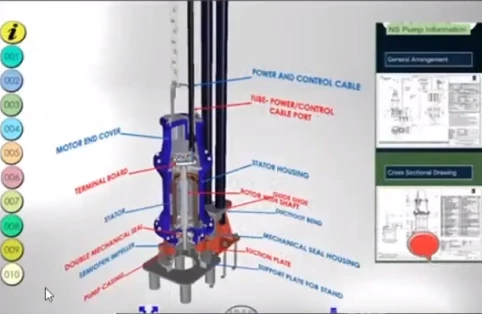
2020-05-08_15-15-46.gif

Announcements

Top Tags