Community Tip - Want the oppurtunity to discuss enhancements to PTC products? Join a working group! X
- Community
- Augmented Reality
- Vuforia Studio
- Re: UI problem with select component
- Subscribe to RSS Feed
- Mark Topic as New
- Mark Topic as Read
- Float this Topic for Current User
- Bookmark
- Subscribe
- Mute
- Printer Friendly Page
UI problem with select component
- Mark as New
- Bookmark
- Subscribe
- Mute
- Subscribe to RSS Feed
- Permalink
- Notify Moderator
UI problem with select component
Hi,
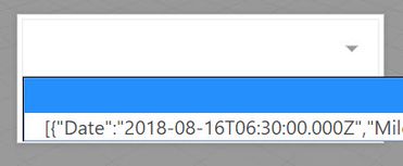
I have a strange behavior when using Select-component. In the middle of the screen I have a popup container with a Select- and Button-component. When I select the Select-component to choose one of the items in the list the UI moves upwards (To keep the component visible?), but when I'm done with the selection and closes it the UI remains in the upper position, it doesn't move back to it's original position. Not until I rotate the phone (UI is then re-drawn). Is it possible to force a re-draw with JavaScript?
Also, is it possible to remove the label part from the Select-component? If I leave it blank it still occupies most of the width, I would like the value itself to occupy the whole width.
Can it be done with CSS?
In general I find it really hard to find any documentation how to style the different widgets/components with CSS.
BR,
Tony
Solved! Go to Solution.
- Labels:
-
Coding
-
Design
-
Troubleshooting
Accepted Solutions
- Mark as New
- Bookmark
- Subscribe
- Mute
- Subscribe to RSS Feed
- Permalink
- Notify Moderator
Can you share a screenshot of the popup within Studio and it's configuration as well as the issue on your mobile device?
For the CSS, you can make the selection be the entire width by adding 'max-width: 100%' to your custom class @Giuseppe_Fiore provided and keeping
.input-label{
display:none;
}
- Mark as New
- Bookmark
- Subscribe
- Mute
- Subscribe to RSS Feed
- Permalink
- Notify Moderator
I have a similar setup in an experience i did a while back and I don't have the problem of it moving around. My popup is in the Left panel of the 2D layout but for the Popup widget the type is Floating and Centered is checked. this places it in the middle of the screen and it stays there on Android and iOS.
As for making the labels smaller I too would like a solution for this. I would imagine a hack method of using some JS to find the element that is the left half of the select object and modify it's width after load. But I have not tried this.
- Mark as New
- Bookmark
- Subscribe
- Mute
- Subscribe to RSS Feed
- Permalink
- Notify Moderator
for the label use this CSS for the select widget.
.newselect select {
-webkit-appearance: none;
-moz-appearance: none;
appearance: none;
position: absolute;
top: 0;
bottom: 0;
right: 0;
height:auto;
width: 100%;
border: none;
background: #fff;
color: #33cd5f;
font-size: 22px;
}
insert into class .newselect and insert a blank character into Label property of select widget.
I hope I was helpful
Giuseppe
I hope I was helpful
- Mark as New
- Bookmark
- Subscribe
- Mute
- Subscribe to RSS Feed
- Permalink
- Notify Moderator
I tried your css code but it still reserves some space for the label...
- Mark as New
- Bookmark
- Subscribe
- Mute
- Subscribe to RSS Feed
- Permalink
- Notify Moderator
try to add this into Application
.input-label {
display:none;
}
i can't try , i hope to solve your problem.
giuseppe.
- Mark as New
- Bookmark
- Subscribe
- Mute
- Subscribe to RSS Feed
- Permalink
- Notify Moderator
Sorry, but that code had no effect on the select widget.
- Mark as New
- Bookmark
- Subscribe
- Mute
- Subscribe to RSS Feed
- Permalink
- Notify Moderator
Can you share a screenshot of the popup within Studio and it's configuration as well as the issue on your mobile device?
For the CSS, you can make the selection be the entire width by adding 'max-width: 100%' to your custom class @Giuseppe_Fiore provided and keeping
.input-label{
display:none;
}
- Mark as New
- Bookmark
- Subscribe
- Mute
- Subscribe to RSS Feed
- Permalink
- Notify Moderator
I tried to create the setup exactly like you described, but still the same problem.
If I move the popup-window to the top there is no problem. So it only happens when the "default-mobile-selectionlist-ui" partly covers the popup window.
Experience was built with Vuforia Studio 8.3.7 and same version on the Vuforia View app.


