Community Tip - Visit the PTCooler (the community lounge) to get to know your fellow community members and check out some of Dale's Friday Humor posts! X
- Subscribe to RSS Feed
- Mark Topic as New
- Mark Topic as Read
- Float this Topic for Current User
- Bookmark
- Subscribe
- Mute
- Printer Friendly Page
How to plot a smooth line for a cumulative function?
- Mark as New
- Bookmark
- Subscribe
- Mute
- Subscribe to RSS Feed
- Permalink
- Notify Moderator
How to plot a smooth line for a cumulative function?
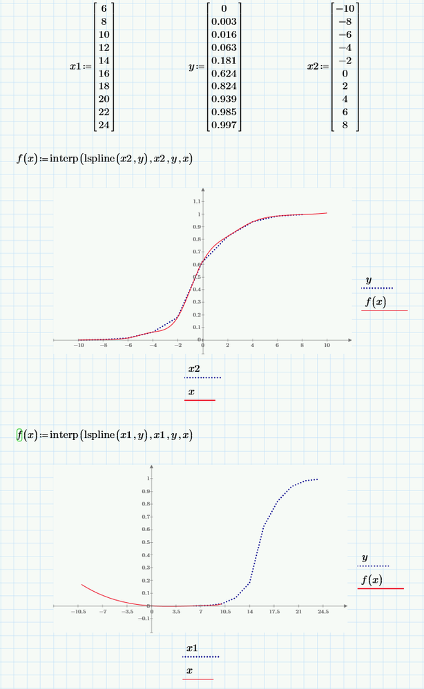
I want to plot a smooth line (like in Excel) and found out I can use a sort of an f(x)=interp(lspline(x1,y),x1,y,x) function, but it's not plotting properly (does not cover the range of the values of x1 vector and goes outside the range on the left side of the graph). Although it plots alright with the x2 values. See attached Mathcad file.
Why is it so and how can I plot a smooth line for x1 values?
Solved! Go to Solution.
Accepted Solutions
- Mark as New
- Bookmark
- Subscribe
- Mute
- Subscribe to RSS Feed
- Permalink
- Notify Moderator
My guess is that you don't like the red line to stop at x=10, right?
You did not define any range for x, so Prime by default choses the interval from -10 to +10. This happens to fit OK for the first plot, but not for the second one.
Solution could be to define an appropriate range for x OR you simply change the values on the axis scale. You can change the first, second and last value on each axis (if you manage to hit the tiny numbers).
In the attached sheet I changed the values on the x-axis to 0; 2 and 30 and on the y-axis to -0.1; 0 and last value not set so Prime can chose it as needed.
In the file attached I also changed the first trace in the plots to just show the data points and not the connection lines.
At the end of the file there is an example with a function fit in case you would like kind of a regression with a continuous function instead of an interpolation with a piecewise defined function.
- Mark as New
- Bookmark
- Subscribe
- Mute
- Subscribe to RSS Feed
- Permalink
- Notify Moderator
Try one of the smoothing functions ksmooth(), medsmooth() or supsmooth().
Success!
Luc
- Mark as New
- Bookmark
- Subscribe
- Mute
- Subscribe to RSS Feed
- Permalink
- Notify Moderator
My guess is that you don't like the red line to stop at x=10, right?
You did not define any range for x, so Prime by default choses the interval from -10 to +10. This happens to fit OK for the first plot, but not for the second one.
Solution could be to define an appropriate range for x OR you simply change the values on the axis scale. You can change the first, second and last value on each axis (if you manage to hit the tiny numbers).
In the attached sheet I changed the values on the x-axis to 0; 2 and 30 and on the y-axis to -0.1; 0 and last value not set so Prime can chose it as needed.
In the file attached I also changed the first trace in the plots to just show the data points and not the connection lines.
At the end of the file there is an example with a function fit in case you would like kind of a regression with a continuous function instead of an interpolation with a piecewise defined function.
- Mark as New
- Bookmark
- Subscribe
- Mute
- Subscribe to RSS Feed
- Permalink
- Notify Moderator
Your guess is correct.
Wow, thanks a lot, you are a hero.
Didn't know you could change the range by simply clicking first and last numbers of an axis, That worked, exactly what I was trying to achieve.
Also big thanks for extra method using fitting.


