- Subscribe to RSS Feed
- Mark Topic as New
- Mark Topic as Read
- Float this Topic for Current User
- Bookmark
- Subscribe
- Mute
- Printer Friendly Page
Mathcad Prime 5 graphs!
- Mark as New
- Bookmark
- Subscribe
- Mute
- Subscribe to RSS Feed
- Permalink
- Notify Moderator
Mathcad Prime 5 graphs!
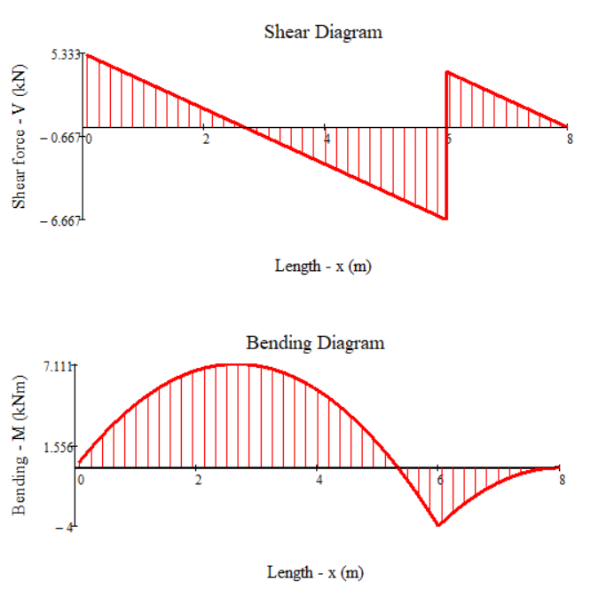
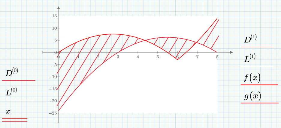
Mathcad Prime 5 displays some really nice 2D plots but is it possible to do something like this? Sort of a hatch for the graph.
Solved! Go to Solution.
- Labels:
-
Other
Accepted Solutions
- Mark as New
- Bookmark
- Subscribe
- Mute
- Subscribe to RSS Feed
- Permalink
- Notify Moderator
I guess the new charts aren't that capable. The best you can get seems to be a solid or a gradient fill, but no hatch.
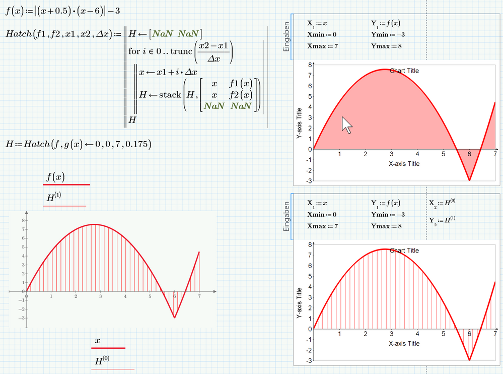
As in the versions before you'll have to program a hatch yourself.
I guess the new charts will look differently as shown in this screenshot if you open the attached file - especially I expect font and arrow size to be much larger unless you are using like me a small, but high resolution screen with a windows zoom (not in Prime) set to something like 250%-300%.
This is due to a bug in the implementation of this chart module - it does not consider the zoom factor set in windows 😞
Another bug is the preview of the new charts. Here is what i see with the chart were I had added the hatch (fortunately the result in the sheet is as it should be):
- Mark as New
- Bookmark
- Subscribe
- Mute
- Subscribe to RSS Feed
- Permalink
- Notify Moderator
- Mark as New
- Bookmark
- Subscribe
- Mute
- Subscribe to RSS Feed
- Permalink
- Notify Moderator
@DrilonShabani wrote:
This works really nice but the problem is that it is shown in the legend since it's not the same function as the one for the graph. Is there any way we can remove it from the legend?
Again I fear that the chart plot isn't that capable and you can't select which trace you'd like to see in the legend or edit it in some other way. These menu driven plot charts unfortunately are not very flexible and are a big disappointment.
You could give the second plot trace, the hatch, a name consisting of just one blank, but the colored square will still show up in the legend.
- Mark as New
- Bookmark
- Subscribe
- Mute
- Subscribe to RSS Feed
- Permalink
- Notify Moderator
Thanks for your reply.
- Mark as New
- Bookmark
- Subscribe
- Mute
- Subscribe to RSS Feed
- Permalink
- Notify Moderator
I disagree. Despite minor issues I think the charts are indeed very capable. Nice job here by PTC.
- Mark as New
- Bookmark
- Subscribe
- Mute
- Subscribe to RSS Feed
- Permalink
- Notify Moderator
@Charly wrote:
I disagree.
You disagree with ... what?
Your post is a direct reply to a post of mine
where I stated that
1) the new charts are not capable to hatch fill an area as was asked for by the OP
2) the new charts do not respect the scale/zoom factor which is set globally in windows and so the fonts are much too tiny
3) I mentioned a bug in the preview
Any point here you disagree with?
Sure I ranted about the new chart in some other posts in other threads here in this forum as I am very disappointed and those charts are rather useless for me and I sure don't consider it a well done job given that all we see after two years of "development" is a boldly integrated second-rate third party tool.
Here you sure may disagree if you really don't need more for your work than the new charts have to offer.
- Mark as New
- Bookmark
- Subscribe
- Mute
- Subscribe to RSS Feed
- Permalink
- Notify Moderator
Hi @Werner_E,
we had a convo already on another thread where you expressed your issues with the new Mathcad Prime 5 capabilites. I think, I may have found an annoying bug. I may be wrong or I am overseeing something but its a problem that should not occure in a software that champions its mastery of units as Mathcad.
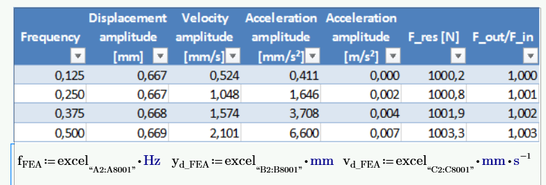
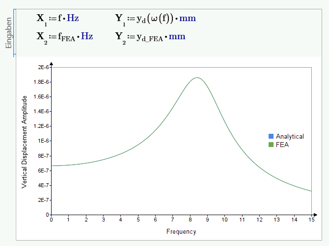
Anyways, I have a simple SDOF oscillator. The vertical displacement has been determined both analytically in Mathcad and by means of FEA. Now I am comparing the results in Mathcad. The FEA results have been imported into Mathcad using the Excel component as follows:
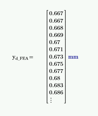
Let us focus on the vertical displacement which I have defined as output yd_FEA. The units are clearly in millimeter. A check of the yd_FEA values in Mathcad yields the following:
...which shows that the units are rightly understood by Mathcad from the embedded Excel file.
The analytically calculated vertical displacement of the SDOF system has been calculated as follows:
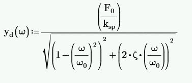
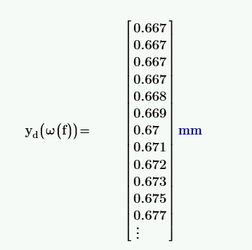
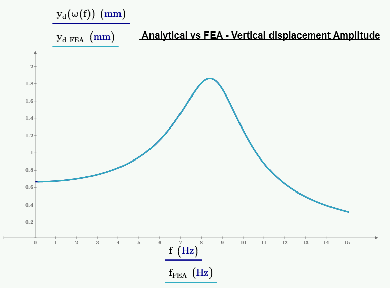
As u see in the chart, even though I have forced the units of the Y values to be in mm, and both results correlate well on the chart, the chart tool gives Y values that are *10^6 off. Only by changing the units to km, does it correlate to the calculate values.
What could be the problem? A bug or am I missing something??? If any one else can figure out what is going on, please let me know.
Thanks
- Mark as New
- Bookmark
- Subscribe
- Mute
- Subscribe to RSS Feed
- Permalink
- Notify Moderator
Btw, if I use the normal diagram option in Mathcad Prime, everything is fine. Only in the chart tool are the units messed up!
- Mark as New
- Bookmark
- Subscribe
- Mute
- Subscribe to RSS Feed
- Permalink
- Notify Moderator
In your plot you are multiplying the units with the variable. That gives you a unit squared. Normally you would divide the quantity by the unit you want to show, such that the values along the axes become unitless. Essentailly that is what the 'old' 2D plot of prime does, when you put the unit between brackets: it divides the quantity by that unit to get the values along the axes.
So instead of Y1:= yd(...) * mm, you should: Y1:= yd(...) / mm.
Success!
Luc
- Mark as New
- Bookmark
- Subscribe
- Mute
- Subscribe to RSS Feed
- Permalink
- Notify Moderator
![]()
Works like magic. My bad then. Would have been shocked if it was a bug with the chart tool. I just got too used to multiplying to get the right units that I missed the aspect of dividing by the unit to get the right values when dealing with variables
All good now 🙂
Thanks @LucMeekes
- Mark as New
- Bookmark
- Subscribe
- Mute
- Subscribe to RSS Feed
- Permalink
- Notify Moderator
So it looks like the chart component is not unit-aware and you can't set the unit you'd like to see like in the normal plot region!?
That would be a step backward, as it would be necessary to make the values unit-less by division as Luc had explained and as we have to do in Mathcad 15 and below.
As bad as the original plots in Prime are, they had at least two benefits over those in Mathcad 15 (apart from the arrows which I like, too):
1) being able to set the unit (basically Prime will do exactly the division explained above, but it looks better and more natural that way
2) being able to control not only minimum and maximum value for each axis by a Mathcad variable but also the step width of the axis ticks by setting the second value via a variable.
Both benefits are not available in the new chart component.
Especially the first is bad as Prime, mediocre as it may be compared to real Mathcad, had at least made some steps in the right direction making the software better unit-aware than it was (no SUC, units with odesolve,..)
Its as you wrote - "its a problem that should not occure in a software that champions its mastery of units as Mathcad." ...
- Mark as New
- Bookmark
- Subscribe
- Mute
- Subscribe to RSS Feed
- Permalink
- Notify Moderator
You are absolutely right @Werner_E. I do think it is a step backwards. I guess, that is the reason why I initally had problems defining the units in the chart tool: I had gotten so comfortable with the ease of using units in the normal Diagram option in Prime. I think it handles units very well and it feels natural that way. That is why I was multiplying instead. I had forgotten that with the classic mathcad , we also had to divide to get the right unit 😕
Also, the normal Diagram option of Prime could write powers such as 10² or 10³ on the axis. Apparently the new chart tool cannot do this. It can only do the scientific notation of 1E+2 or 1E+3 like in Excel which I think is a step backwards. I prefer the 10² notation especially when one has logarithmic scales.
Anyways, we live with what we get! 😄
- Mark as New
- Bookmark
- Subscribe
- Mute
- Subscribe to RSS Feed
- Permalink
- Notify Moderator
By the way, Does anyone know how to write subscripts and superscripts in the axis titles of the new chart tool? Or how to use calculated variables as axis titles? Is it even possible?
- Mark as New
- Bookmark
- Subscribe
- Mute
- Subscribe to RSS Feed
- Permalink
- Notify Moderator
- Mark as New
- Bookmark
- Subscribe
- Mute
- Subscribe to RSS Feed
- Permalink
- Notify Moderator
According to variables in axis titles, I guess thats not possible, too.
The only things you can bring from "outside" into the chart component are the mathematical axis expressions (without units) and min / max values for each axis.
All the rest can only be set manually in the components menu.
Maybe some day, if the pressure is hard enough, PTC will change the interface and allow additional options to be changed dynamically.
Concerning sub and superscripts: Did you really expect this to be possible? Ridiculous as it may sound but we still don't even have super- and subscipts in normal Prime text regions!
Its unbelievable that in 2018 in a current software we have to resort to clumsy and unsatisfyingly workarounds like the one @DrilonShabani has suggested. BTW, instead of fire up word you could start the windows system program "charmap".
- Mark as New
- Bookmark
- Subscribe
- Mute
- Subscribe to RSS Feed
- Permalink
- Notify Moderator
I disagree that the chart is not very capable. To me it is. I get charts like fig.1, which are of excellent quality and not before possible with MC.
- Mark as New
- Bookmark
- Subscribe
- Mute
- Subscribe to RSS Feed
- Permalink
- Notify Moderator
@Charly wrote:
I disagree that the chart is not very capable. To me it is. I get charts like fig.1, which are of excellent quality and not before possible with MC.
Sure, if thats all you need its fine for you.
For me the non-scaling bug alone makes those charts unusable as of the far too small font size.
Not speaking of missing labelled markers, the bad/not existent unit handling and the inability to control certain options like grid width from within the worksheet. Having that less dynamic formatting abilities and having to format each chart manually separately sure does not follow the spirit of Mathcad of being a dynamically working math/engineering software.
But obviously tastes and needs are different.
- Mark as New
- Bookmark
- Subscribe
- Mute
- Subscribe to RSS Feed
- Permalink
- Notify Moderator
- Mark as New
- Bookmark
- Subscribe
- Mute
- Subscribe to RSS Feed
- Permalink
- Notify Moderator
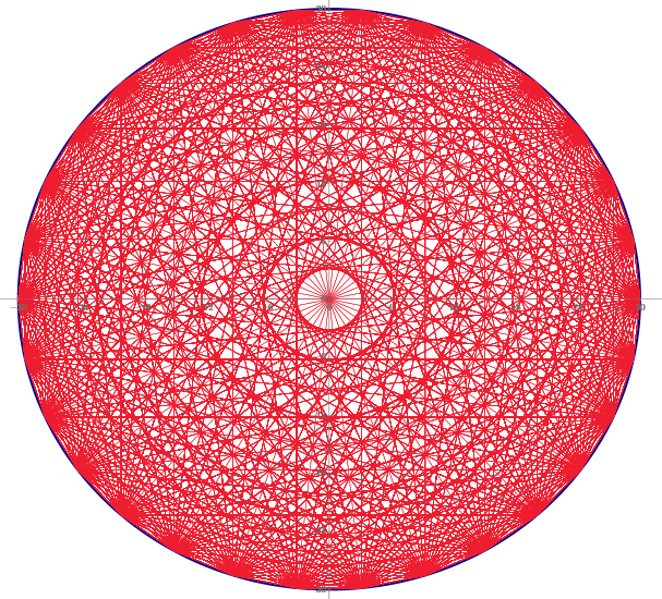
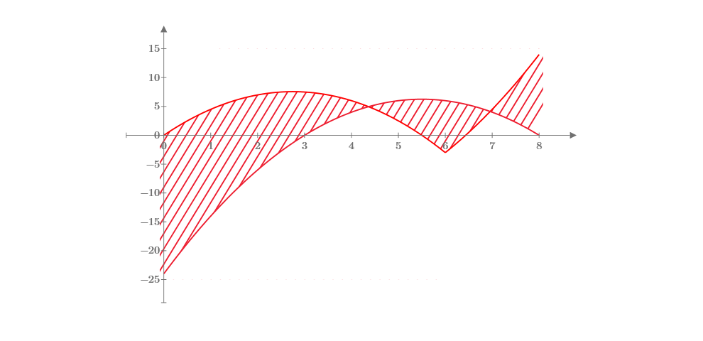
Using Hatch function by Werner_E Level 20 , (Inclined hatch) T.Tokoro.
- Mark as New
- Bookmark
- Subscribe
- Mute
- Subscribe to RSS Feed
- Permalink
- Notify Moderator
Can you show the angled hatch with a transparent background? 😉
- Mark as New
- Bookmark
- Subscribe
- Mute
- Subscribe to RSS Feed
- Permalink
- Notify Moderator
Angled hatch area is with a transparent background but other areas are fully filled by lines.
Therefore, the cross points of the functions are not solved (used).
- Mark as New
- Bookmark
- Subscribe
- Mute
- Subscribe to RSS Feed
- Permalink
- Notify Moderator
- Mark as New
- Bookmark
- Subscribe
- Mute
- Subscribe to RSS Feed
- Permalink
- Notify Moderator
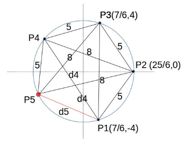
Pytagoreanth Puzzle.
There is a circle with center (0,0) and radius r.
Find 5 points P1 to P5 on the circle and P3 is set at (r,0).
All distances of any two points are Integer.
Find the smallest r and the positions of all 5 points.
How about 10 points of this probrem.
Yuo can use Mathcad of course.
T.Tokoro
- Mark as New
- Bookmark
- Subscribe
- Mute
- Subscribe to RSS Feed
- Permalink
- Notify Moderator
Hmmm, interesting puzzle!
Reminds me on "Cyclic Qudrilaterals" here -> http://www.contestcen.com/geom.htm
- Mark as New
- Bookmark
- Subscribe
- Mute
- Subscribe to RSS Feed
- Permalink
- Notify Moderator
> Angled hatch area is with a transparent background but other areas are fully filled by lines.
Yes, that was my point - my asking was a little bit nasty 😉
It took me a while thinking about how you achieved the nice, angled hatch effect with your two hatch functions until I realized that you are hatching a rectangle first and then you hatch-paint the "outside" white.
Clever idea nonetheless.
- Mark as New
- Bookmark
- Subscribe
- Mute
- Subscribe to RSS Feed
- Permalink
- Notify Moderator
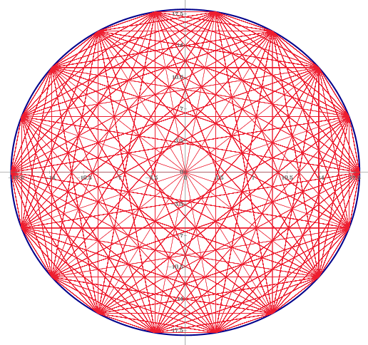
Does anybody have an example "Hatch" function that creates a hatch between two functions plotted in polar coordinates?
- Mark as New
- Bookmark
- Subscribe
- Mute
- Subscribe to RSS Feed
- Permalink
- Notify Moderator
Can you post an example of what you are looking for?
- Mark as New
- Bookmark
- Subscribe
- Mute
- Subscribe to RSS Feed
- Permalink
- Notify Moderator
It doesn't necessarily need to be in polar coordinates, but I was thinking that might be a convenient form if possible.
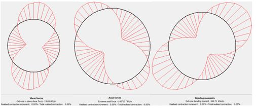
An example of what I'm attempting to recreate is attached. The example is showing forces distribution acting on a circular body. I'm starting with the x,y coordinates for the nodes along the circle and corresponding force/moments acting on each point.
- Mark as New
- Bookmark
- Subscribe
- Mute
- Subscribe to RSS Feed
- Permalink
- Notify Moderator
So post your worksheet with the plots (without the hatch).
This would also show which version of Mathcad or Prime you are using.

