Community Tip - Want the oppurtunity to discuss enhancements to PTC products? Join a working group! X
- Community
- Customer Success
- PTC eSupport Help Discussions
- Re: "Navigation menu has moved" is very annoying
- Float Topic for All Users
- Subscribe to RSS Feed
- Mark Topic as New
- Mark Topic as Read
- Float this Topic for Current User
- Bookmark
- Subscribe
- Mute
- Printer Friendly Page
"Navigation menu has moved" is very annoying
- Mark as New
- Bookmark
- Subscribe
- Mute
- Subscribe to RSS Feed
- Permalink
- Notify Moderator
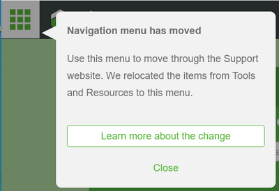
"Navigation menu has moved" is very annoying
Hi, for me the popup window notification that the menu has changed on support.ptc.com is coming up on each new screen/page that I open, especially in private mode (firefox).
As this is a modal dialog it required to click it to go away. This is very distracting. Please fix.
Solved! Go to Solution.
- Labels:
-
eSupport Portal
Accepted Solutions
- Mark as New
- Bookmark
- Subscribe
- Mute
- Subscribe to RSS Feed
- Permalink
- Notify Moderator
Hi @Rocko,
Thanks for making us aware of how this would impact users working in private mode. Any browser which has local storage disabled will exhibit the same. We've just pulled the "Navigation has moved" pop-up and replaced with a carousel item on the home page which has a link to the new nav info and feedback page.
Users can dismiss this to free up space, once read.
Peter.
- Mark as New
- Bookmark
- Subscribe
- Mute
- Subscribe to RSS Feed
- Permalink
- Notify Moderator
I'm also using Firefox but not in private mode. It seems to take two 'Close' events to make it 'stick'.
- Mark as New
- Bookmark
- Subscribe
- Mute
- Subscribe to RSS Feed
- Permalink
- Notify Moderator
I'm working on a shared customer machine, so I have to rely on private mode.
The dialog should be closable by clicking jsut somewhere, not just "close", this would make it much less intrusive.
It seems not to be tied to the account, so when I logon from a new machine, I get it again, even without private mode.
This is as bad as the "Welcome to our new search" dialog I get every single time when searching support db.
One would expect people have slowly become familiar with the "new" search, after clicking the dialog away for two years.
- Mark as New
- Bookmark
- Subscribe
- Mute
- Subscribe to RSS Feed
- Permalink
- Notify Moderator
- Mark as New
- Bookmark
- Subscribe
- Mute
- Subscribe to RSS Feed
- Permalink
- Notify Moderator
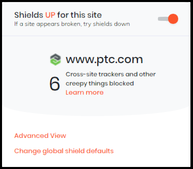
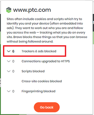
I just tried Brave. The 'Close' Seems to be sticking okay there, even with cookies not accepted.
This seems kind of creepy though:
- Mark as New
- Bookmark
- Subscribe
- Mute
- Subscribe to RSS Feed
- Permalink
- Notify Moderator
Hi @Rocko,
Thanks for making us aware of how this would impact users working in private mode. Any browser which has local storage disabled will exhibit the same. We've just pulled the "Navigation has moved" pop-up and replaced with a carousel item on the home page which has a link to the new nav info and feedback page.
Users can dismiss this to free up space, once read.
Peter.
- Mark as New
- Bookmark
- Subscribe
- Mute
- Subscribe to RSS Feed
- Permalink
- Notify Moderator
Thanks Peter!
- Mark as New
- Bookmark
- Subscribe
- Mute
- Subscribe to RSS Feed
- Permalink
- Notify Moderator
Slightly off topic, but I noticed that these pages are missing the navigation menu:
- https://support.ptc.com/partners/hardware/current/support.htm
- https://support.ptc.com/cs/product_calendar/WC_CPS.htm
Also, clicking the link to search the knowledge base tries to immediately search before any criteria have been entered, leading to this:
- Mark as New
- Bookmark
- Subscribe
- Mute
- Subscribe to RSS Feed
- Permalink
- Notify Moderator
Hi @TomU ,
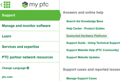
Sorry I didn't get back sooner on this. The Supported Platforms link is available under Enterprise Navigation in the Support Section, 3rd item down:
Regarding the CPS Calendar, just 0.2% of visitors accessed the page in FY20. We assessed the referrers to the page, and with most coming from the CPS FAQ Article, the main Product Calendar, or an alert we published last year, we took a decision to leave this out of the main navigation.
We also saw that several repeat visitors were using a browser bookmark to an old link which we redirect from.
Lastly, on the search issue, this looks to be the Brave browser which is preventing some resource files from loading, which we discussed in more detail here.
Thanks,
Peter.
- Mark as New
- Bookmark
- Subscribe
- Mute
- Subscribe to RSS Feed
- Permalink
- Notify Moderator
Hi @TomU ,
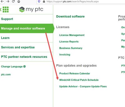
I just realised my last answer was confusing. Based on some internal conversations I thought we would be leaving CPS out of the Enterprise Nav, when in fact we've left it in there (for now):
I realized since that your request was about adding the new navigation paradigm also to those pages, and can confirm we have a plan ! As these pages are not maintained by our team, we needed to check with the owners first, but you can expect the box to appear in the top left on these pages also in the coming few weeks.
Sorry for any confusion !
Peter.
- Mark as New
- Bookmark
- Subscribe
- Mute
- Subscribe to RSS Feed
- Permalink
- Notify Moderator
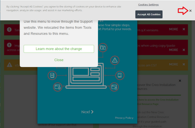
Is there something locking this on? No matter how many times I push the 'X', it won't go away and comes back after the page finishes reloading.

