- Community
- ThingWorx
- ThingWorx Developers
- Line Chart Padding Issue
- Subscribe to RSS Feed
- Mark Topic as New
- Mark Topic as Read
- Float this Topic for Current User
- Bookmark
- Subscribe
- Mute
- Printer Friendly Page
Line Chart Padding Issue
- Mark as New
- Bookmark
- Subscribe
- Mute
- Subscribe to RSS Feed
- Permalink
- Notify Moderator
Line Chart Padding Issue
Placed a Line Chart on the Mashup, as soon as Chart Plotted, the chart is not getting placed properly on the dashboard.
May be this is due to the Padding issue. The Line chart on the dashboard is something like this:
How Can Padding properly set for the Line Chart.
@paic @slangley @c_lowy @VladimirN
Thanks,
Shashi
+91 8099838001 | shashi@psptechhub.com,
PSPTechHub || World of PTC Thingworx || LinkedIn
Solved! Go to Solution.
- Labels:
-
Design
-
Mashup-Widget
Accepted Solutions
- Mark as New
- Bookmark
- Subscribe
- Mute
- Subscribe to RSS Feed
- Permalink
- Notify Moderator
The issue is solved by the CSS provided by @c_lowy .
ptcs-chart-line::part(chart-layout) {
padding: 0;
}
If there are 2 or more DataSources given to the Line chart,
1. Enable the Multiple Data source Visualization option in widget properties, and
2. Connect to the 2 or more Data Sources to chart widget again.
3. Select the X Axis as TimeStamp(in my case)
Thanks,
Shashi
+91 8099838001 | shashi@psptechhub.com,
PSPTechHub || World of PTC Thingworx || LinkedIn
- Mark as New
- Bookmark
- Subscribe
- Mute
- Subscribe to RSS Feed
- Permalink
- Notify Moderator
Hi @pshashipreetham ,
Kindly check the below attached article:
https://www.ptc.com/en/support/article/CS343992?posno=1&q=line%20chart%20padding&source=search
Revert back in case of further challenges.
Regards
Bhawna
- Mark as New
- Bookmark
- Subscribe
- Mute
- Subscribe to RSS Feed
- Permalink
- Notify Moderator
Hi @bchaudhary ,
tried the article, didn't help. The Picture in the issue posted is after trying out the article you have shared.
Thanks,
Shashi.
+91 8099838001 | shashi@psptechhub.com,
PSPTechHub || World of PTC Thingworx || LinkedIn
- Mark as New
- Bookmark
- Subscribe
- Mute
- Subscribe to RSS Feed
- Permalink
- Notify Moderator
Have you provided values for the properties "XAxisMaxmumValues", "XAxisMinimumValues", "YAxisMaximumValues" and "YAxisMinimumValues". These properties can be bound to services if the X Axis values change based on other issues.
Hope this helps.
- Mark as New
- Bookmark
- Subscribe
- Mute
- Subscribe to RSS Feed
- Permalink
- Notify Moderator
Hey Hi @PEHOWE
Thanks for quick response, as per the use case the X and Y axis should be auto can't put min and max values.
Thanks,
Shashi
+91 8099838001 | shashi@psptechhub.com,
PSPTechHub || World of PTC Thingworx || LinkedIn
- Mark as New
- Bookmark
- Subscribe
- Mute
- Subscribe to RSS Feed
- Permalink
- Notify Moderator
make the container fixed height
- Mark as New
- Bookmark
- Subscribe
- Mute
- Subscribe to RSS Feed
- Permalink
- Notify Moderator
Hey Hi @GuruPrasad1 ,
Didn't get you, can you show a example ?
Thanks,
Shashi.
+91 8099838001 | shashi@psptechhub.com,
PSPTechHub || World of PTC Thingworx || LinkedIn
- Mark as New
- Bookmark
- Subscribe
- Mute
- Subscribe to RSS Feed
- Permalink
- Notify Moderator
Hi Shashi,
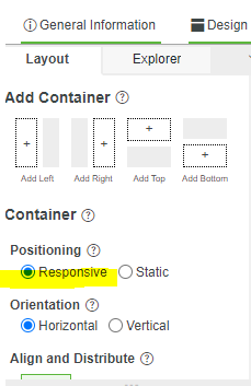
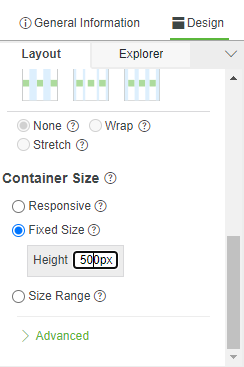
Usually this happens when the container in which your are placing the chart is responsive, if you instead choose a fixed length and give a value say 500px this would appear better. This settings you can find in the layout tab am attching
Regards
Guruprasad S
- Mark as New
- Bookmark
- Subscribe
- Mute
- Subscribe to RSS Feed
- Permalink
- Notify Moderator
The issue is solved by the CSS provided by @c_lowy .
ptcs-chart-line::part(chart-layout) {
padding: 0;
}
If there are 2 or more DataSources given to the Line chart,
1. Enable the Multiple Data source Visualization option in widget properties, and
2. Connect to the 2 or more Data Sources to chart widget again.
3. Select the X Axis as TimeStamp(in my case)
Thanks,
Shashi
+91 8099838001 | shashi@psptechhub.com,
PSPTechHub || World of PTC Thingworx || LinkedIn


