- Community
- ThingWorx
- ThingWorx Developers
- Re: Twx 8.5 Time series chart with multiple lines
- Subscribe to RSS Feed
- Mark Topic as New
- Mark Topic as Read
- Float this Topic for Current User
- Bookmark
- Subscribe
- Mute
- Printer Friendly Page
Twx 8.5 Time series chart with multiple lines
- Mark as New
- Bookmark
- Subscribe
- Mute
- Subscribe to RSS Feed
- Permalink
- Notify Moderator
Twx 8.5 Time series chart with multiple lines
Hi everybody,
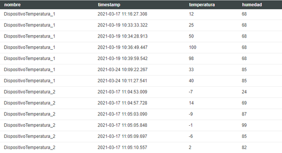
My problem is that I want to choose multiple items in the list and I want the historical data of the device appear in the chart. I have a service that receive a infotable from the list and get the historical data of the devices selected. The result of the service historical data is the following image when a I put in the input 2 devices.
but I want to binding this data to the chart. When I select the 2 devices I want a line with the historical data 'DispositivoTemperatura_1' and another with the historical data 'DispositivoTemperatura_2', but if I select 3 I want 3 lines, select 4 4 lines...
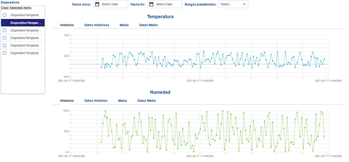
Is necesary make a service for change the rows data in columns of each device?
Thanks in advance,
Luis.
Solved! Go to Solution.
- Labels:
-
Analytics
-
Best Practices
-
Design
-
Mashup-Widget
Accepted Solutions
- Mark as New
- Bookmark
- Subscribe
- Mute
- Subscribe to RSS Feed
- Permalink
- Notify Moderator
It's been a few versions back since I've done this, but when I used QueryNamedPropertyHistory, the series all had different styles, they were basically the default styles for the Data1,2,3,4 etc. series.
Not sure if that Widget has changed a lot or not.
- Mark as New
- Bookmark
- Subscribe
- Mute
- Subscribe to RSS Feed
- Permalink
- Notify Moderator
Hi @LuisCabello
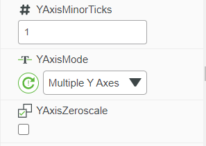
Have you checked the Multiple Y-axis feature of Time series widget. I think it will help you to achieve your use case. Pleas see the screenshot for your reference
Please refer help center for more details
Regards,
Toolika Dixit
- Mark as New
- Bookmark
- Subscribe
- Mute
- Subscribe to RSS Feed
- Permalink
- Notify Moderator
The time series chart can auto configure itself based on the number of series in the infotable.
I have done this by have a list of Properties that are logged for a Thing (GetLoggedProperties)
and then feed that into QueryNamedPropertyHistory to get selected series.
That output then goes to the timeseries chart and it will auto render.
- Mark as New
- Bookmark
- Subscribe
- Mute
- Subscribe to RSS Feed
- Permalink
- Notify Moderator
Thank you for reply :).
With the service that I said yesterday efectively works and as @PaiChung said it is autoconfigured by Thingworx (I had to change name of one field in the data shape and later it worked).
but now I have another question. Is it posible change the color of each line for device selected?
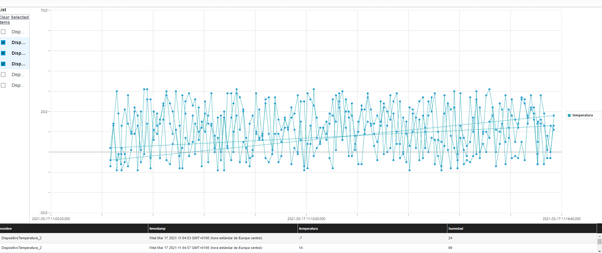
Remember that my service returns in this shape.
I want the temperature data line of my thing "DispositivoTemperatura_1" in red and "DispositivoTemperatura_2" in blue. How can I configure or what I have to do?
Thank you so much.
Luis
- Mark as New
- Bookmark
- Subscribe
- Mute
- Subscribe to RSS Feed
- Permalink
- Notify Moderator
The time series chart should've automatically given different colors per series, not sure if you have some CSS that overrides that. You should see that in the chart properties as it should provide configuration for each series.
The very advanced and more complicated way that I believe is possible is to provide styling/css based on what is selected. I've never done this and this might be a bit challenging if you aren't familiar with CSS
- Mark as New
- Bookmark
- Subscribe
- Mute
- Subscribe to RSS Feed
- Permalink
- Notify Moderator
Hi @PaiChung ,
thank you for your reply.
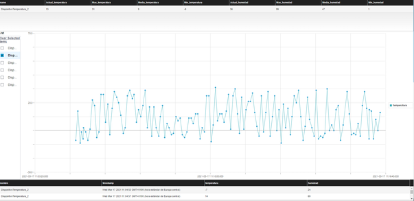
I think the problem is that the chart thinks only I have a series and this series is the data field "temperatura" en my case, as you can see in the legend label in my image.
And the other problem is that I want a legend label for each device. The mashup that I showed is a example and he hasn't have style.
Maybe I've configured in a wrong way the chart?.
How can I solve these?
Thank you.
- Mark as New
- Bookmark
- Subscribe
- Mute
- Subscribe to RSS Feed
- Permalink
- Notify Moderator
Try providing a data source with the 'max' series first and configure the styles.
Then change it back to your original data source.
I believe for the labeling it can be bound?
- Mark as New
- Bookmark
- Subscribe
- Mute
- Subscribe to RSS Feed
- Permalink
- Notify Moderator
Hi @PaiChung ,
The labeling is true you can binding. But the problem is that the styles are predefined with the data fields
no with the series. So, I don't know how to put the colors by series and not by data fields...
Thank you,
Luis.
- Mark as New
- Bookmark
- Subscribe
- Mute
- Subscribe to RSS Feed
- Permalink
- Notify Moderator
Did you try what I suggested? Initially bind to it a set of data with a defined number of series, so you can configure all the series ahead of time. Then bind your actual data source to it.
- Mark as New
- Bookmark
- Subscribe
- Mute
- Subscribe to RSS Feed
- Permalink
- Notify Moderator
Hi @PaiChung ,
Yes I try. I think that the problem is my service or if not I dont know. When you did with QueryNamedPropertyHistory you have diferent style for device's series or but data field series? I think that the styles depend of the data field not depend of the device data...
Thank you so much for your replies.
Luis
- Mark as New
- Bookmark
- Subscribe
- Mute
- Subscribe to RSS Feed
- Permalink
- Notify Moderator
It's been a few versions back since I've done this, but when I used QueryNamedPropertyHistory, the series all had different styles, they were basically the default styles for the Data1,2,3,4 etc. series.
Not sure if that Widget has changed a lot or not.
- Mark as New
- Bookmark
- Subscribe
- Mute
- Subscribe to RSS Feed
- Permalink
- Notify Moderator
Hi @LuisCabello.
If you feel your question has been answered, please mark the appropriate response as the Accepted Solution for the benefit of others with the same question.
Regards.
--Sharon


