Community Tip - Visit the PTCooler (the community lounge) to get to know your fellow community members and check out some of Dale's Friday Humor posts! X
- Community
- Augmented Reality
- Vuforia Studio
- Problems with vertical alignment of toggle buttons
- Subscribe to RSS Feed
- Mark Topic as New
- Mark Topic as Read
- Float this Topic for Current User
- Bookmark
- Subscribe
- Mute
- Printer Friendly Page
Problems with vertical alignment of toggle buttons
- Mark as New
- Bookmark
- Subscribe
- Mute
- Subscribe to RSS Feed
- Permalink
- Notify Moderator
Problems with vertical alignment of toggle buttons
Hi All,
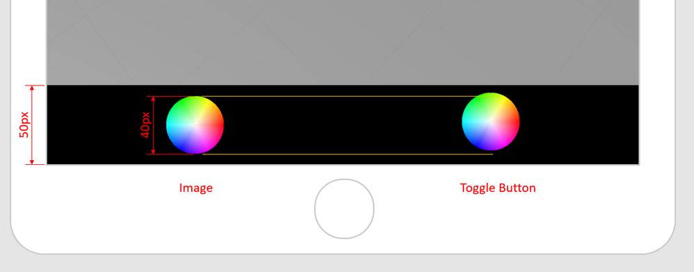
I've noticed that for some reason, toggle buttons have a bit of extra space below them. This can cause alignment problems when placing them in a grid.
Most experiences I create have a toolbar along the bottom of the screen with various "buttons". These buttons are usually either an image widget with some JS function called on the click event, or a toggle button to turn things on and off. The extra size of the toggle button means that is doesn't center vertically within the grid.
The screenshot shows what I mean. I have a grid layout with a single row and a single column. The row is set to 55px high and the column has Flex Direction set to Row and Alignment set to Center. When I put an image and a toggle button in and that are both set to 40px x 40px, the image is vertically centered, but the toggle button isn't:
When in the editor, you can see the extra blank space below the toggle button when you select on it.
I often have a row of buttons that are a mix of images and toggle buttons and this mis-alignment doesn't look great. Any ideas on how to fix this?
Solved! Go to Solution.
- Labels:
-
Design
- Tags:
- toggle-button
Accepted Solutions
- Mark as New
- Bookmark
- Subscribe
- Mute
- Subscribe to RSS Feed
- Permalink
- Notify Moderator
Of course, 30 seconds after I posted this I realised a solution.
I defined a CSS style to vertically center items and then applied that style to the toggle button.
The CSS:
.v-middle {
vertical-align: middle;
}
How it looks with the v-middle style applied to the toggle button:
Hope someone finds this useful.


