Community Tip - Learn all about PTC Community Badges. Engage with PTC and see how many you can earn! X
- Community
- Creo+ and Creo Parametric
- System Administration, Installation, and Licensing topics
- Re: Switching from Stroked Fonts to True Type Font...
- Subscribe to RSS Feed
- Mark Topic as New
- Mark Topic as Read
- Float this Topic for Current User
- Bookmark
- Subscribe
- Mute
- Printer Friendly Page
Switching from Stroked Fonts to True Type Fonts - Drawings & Models - Observations & Questions
- Mark as New
- Bookmark
- Subscribe
- Mute
- Subscribe to RSS Feed
- Permalink
- Notify Moderator
Switching from Stroked Fonts to True Type Fonts - Drawings & Models - Observations & Questions
This is going to be a rather long post, so I’m going to start with the questions I have. Then I’ll get into the issues.
Questions:
- Are stroked fonts machine readable? It was stated to me by one of my compatriots, that for MBE the stroked fonts were not machine readable for downstream applications.
- I’m beginning to doubt this because I can export a pdf with Stroked and Searchable text.
- Also if you look at the stroked_symbol_asme.src file you see that each character has code numbers associated with it.
- Correct me if I’m wrong, but I believe codes are only required for special fonts, all the standard keyboard characters don’t have codes.
- When trying to convert an existing drawing to true type fonts, I can get all the symbols to update to the new font by modifying the parts and assembly files, except for the plus minus symbol.
- Does anyone have a method to update this symbol on an existing drawing?
- The strange thing is, If you create a new drawing, then this symbol displays in the true type font.
- Obviously creating a new drawing is a non-starter when revising existing drawings!
- Does any one have the early PTC documentation on the stroked fonts and how to modify them? I’m talking early 90’s
- At that time they had an illustration in the printed books of the letter grid and talked about how the Move Draw format of the .src was used to draw the character, and how you could modify it and then recompile it.
- The current available docs barely cover this issue and without the illustration. Suggested Technique For Creating Custom Text Fonts
- I do know how to do this, and as you’ll see below I’ve recreated the illustration, but I’d like to review the old documentation to see if there is anything I’ve missed. I lost all my old PTC manuals in the Tubbs fire of 2017.
- Can anyone suggest good mono spaced True Type font?
- We have been considering two fonts:
- Meslo Font
- Consola that you will find here on your windows machine: C:\Windows\Fonts\Consolas
- I’m assuming unlike a stroked font, you can’t change the height to width ratio of a True Type Font. Is that true or not?
- There are times we change the width of some text on a drawing to fit within the title block or BOM cell.
Observations:
Let me start off with what I think my recommendation is going to be. It’s not worth the disruption that is going to be caused to existing drawings to move to move to true type fonts.
Background
We have ProEngineer and Creo models and drawings going back to early 1990 in our database. A huge amount of data. Almost 100% of that are drawings that may need to be revised or copied for a new design.
Issues with converting to a True Type Font
The problem is PTC didn’t think about this issue in a holistic framework. The conversion of a drawing to a True Type Font depends on not just the settings in the drawing detail setup file, but in the detail settings in the model.
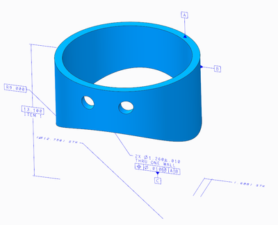
For example I have an assy of two parts that is a weldment. All of these files have to change to use True Type Fonts in the drawing. I would have expected the change in the drawing would have been all that was necessary. That fact that the display in the drawing is linked to the display in the models is a problem. At least the way I think about this it's a problem.
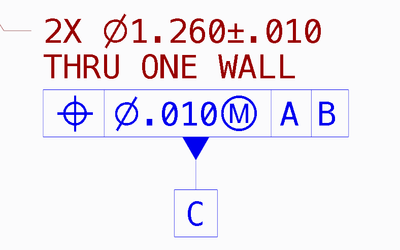
If I go into the drawing detail setup file and modify the default_annotation_font to a .ttf font, and the symbol_font to asme, I get these results.
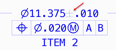
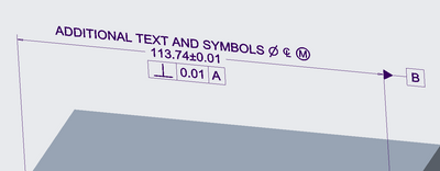
Notice that the,
- diameter symbols,
- the MMC modifier, and
- the plus minus are still stroked.
I have to open up the model that dimension was shown from, and modify the detail setup file to show the .ttf font and symbol_font as asme.
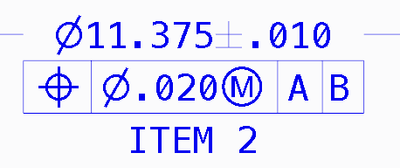
Which results in all but the plus minus symbol showing correctly in the drawing.
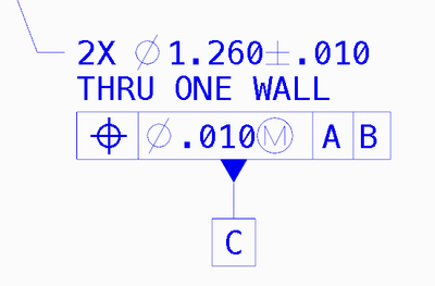
However if I look at a dimension that was shown from the other part in the weldment, it’s still messed up.
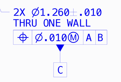
I have to go modify that part’s detail setup file also, after which I get this. But I know of no way to get the Plus Minus symbol to update to the True Type Font. GRRRRR!
If I create a new drawing and show that dimension, then it shows the Plus Minus in the .ttf font.
So instead of just changing the settings in the model, I have to change the settings, in this case. on 2 parts, 1 assy, and the drawing assuming there is a workaround for the Plus Minus Symbol. If not then I have to create a new the drawing in order to get that symbol to change to a True Type Font.
This may not be a huge issue when talking about a 2 part weldment. But considering we have some 30 page weldment drawings… this is a non-starter. The designers would run me out of town on a rail.
Other issues on the drawings with True Type Fonts
Font Width
The width and spacing of the characters isn’t the same as the default stroked font. Notes, Title Block, BOM table, BOM Balloons, Flag Notes, and stamps on the drawing, each of these has issues because the width of the new font. Words that fit in table cells before no longer fit. And because I can’t edit the width of the characters in the text properties, I can’t make them fit. Considering all the legacy drawings, this again is a non-starter.
Thickness of the font
The font is thicker in a print than the stroked font. We make drawing books to take out to our assembly facility during the assembly of experiments. An “E” size drawing on an “A” size page is still legible using the stroked font, This allows the techs and engineer to refer to the drawings while going through the steps of the assembly procedure. True Type Fonts are thicker by far when printed so that the legibility of the print is severely compromised. Again a non-starter unless a better True Type Font can be found.
MBE Considerations
My next consideration was why not change the MBE annotations to use the standard font instead of the default win_font.ndx, have it use font.ndx
So I change the default_annotation_font to font.ndx and the symbol_font to stroked_asme.
And that works. The model dimensions shown as annotations show in the same font as we’ve used for drawings all these years. To me this is a viable option that keeps the font the same in drawings and MBE.
So my question is…
- Will this font present a problem for down stream applications reading the model. Either with the native model, or a derivative step file.
About the Default Font Shown Here
Some of you may have noticed that the default font shown here is slightly different than what ships with Creo. That because long ago we modified the source file to have slashes in the zero, tick marks top and bottom of the capital “EYE” and a tick marks on the number 1.
Changing this font has no negative affect on the drawing or model. There is nothing the designer has to do to in either the drawing or model for this change. All the admin has to do is make sure the modified font files are in the proper folders in the load point.
We have not had to modify this font for quit a long time, so I’m one of the few people that remembers how to do this. We have had a discussion lately regarding the slash in the zero.
As it is now, the slash extends beyond the outline of the zero.
But since the True Type Fonts with the slash don’t extend past the out outline, that was one reason some folks wanted to dump this font for the True Type Fonts.
The thing is this is a simple modification.
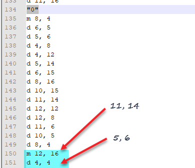
If you look at the source file for standard font you will see that is defined as 16 x 16 with a base line at 4.
In our standard font, this is what the definition for the zero looks like on the 16x16 grid. I’m showing both the existing slash that extends beyond the outline, and a slash that stays inside the outline.
The font could easily be update by changing of these two lines in the source and then recompiling the source.
FYI,
- m=move, which means pick the pen up and move to the location.
- d=down or draw, which means put the pen down and draw from where the pen is… to the coordinates listed on that line.
Modifying a stroked font
Placing files in the directory
- I copied our ascii.src file to a new directory.
- I went and found compile_font.exe and copied it to the same directory.
- C:\ptc\Creo 4.0\M090\Common Files\x86e_win64\obj\compile_font.exe
Editing the font file:
- Do a find in the editor, look for “0” This will find the character your looking for.
- Best if you map out the character points on graph paper or in Creo as shown above.
- Once you figure out what points to change in the definition as shown above, make those changes in the source file.
Compiling the font:
- Open up a command window and change the directory to the location of the modified source file
- Run this command:
- Compile_font ascii.scr ascii.fnt
Testing the font
The files go here: If you want backup the existing files someplace first, then overwrite the existing files.
C:\ptc\Creo 4.0\M090\Common Files\x86e_win64\text\usascii\ascii.fnt
C:\ptc\Creo 4.0\M090\Common Files\text\usascii\ascii.src
After the files are in place startup Creo and test that the mods are working as expected.
Standards – What they say about drawing fonts
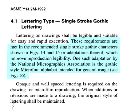
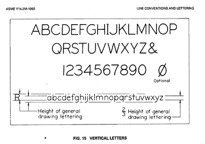
The following is what the standard have to say about fonts on drawings. The standard shows the Zero with the slash as extending past the outline of the zero. Which I’d forgotten when I created the graph image above.
However the true type fonts with the slash in the zero, keep the slash inside the outline.
I believe the slash inside is the better look, but if you want to be a stickler about the standard that is wrong unless there is an update to the standard I’m not aware of.
The two modified stroked fonts are attached. One with the slash inside and one with it outside. The other characters I and 1 are also modified.
- Mark as New
- Bookmark
- Subscribe
- Mute
- Subscribe to RSS Feed
- Permalink
- Notify Moderator
I have a copy of the Wildfire 4 Help Topic collection. It may have the information on constructing fonts in the Detail.pdf. I will look tomorrow.
As for fonts themselves, we changed from the PTC font to isofont a few years ago to get the O/0 (oh/zero) and l/I (lower case l/upper case I) distinction.
Very interesting thoughts on what is required to switch from stroked PTC fonts to TrueType fonts.
- Mark as New
- Bookmark
- Subscribe
- Mute
- Subscribe to RSS Feed
- Permalink
- Notify Moderator
This isn't going to help much, but PTC recommended and partially implemented Arial as the default true type font:
Read to the end for Tom's post about what parts changed.
- Mark as New
- Bookmark
- Subscribe
- Mute
- Subscribe to RSS Feed
- Permalink
- Notify Moderator
This is a well written post. There are so many different areas in Creo impacted by fonts. Getting PTC to fix all of them so they all work together correctly has been a real struggle. I have opened dozens of cases just on TrueType fonts in the last several years. Things are finally pretty good in the later builds, and the data being output (printed, PDF, and CreoView) finally matches what is displayed in Creo.
A couple of comments:
1.) Symbols in hole notes ignore all drawing and model settings and only use the stroked fonts.
https://www.ptc.com/en/support/article/CS296145
It looks like this may actually be fixed in Creo Parametric 7 (below) but it's still not in 6.0.5.0 (above).
2.) ASME Y14.2-2008 dropped that line about National Micrographics 'Microfont'.
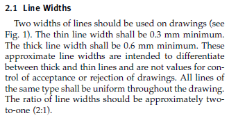
3.) We made the switch to TrueType fonts maybe a year ago now. Like you noticed, people initially complained about the width of the characters. (Compared to what we had before, everything looked 'bold'.) What we came to realize was that the characters are not too thick but the rest of our lines were way to thin. We weren't even close to the standard (and actually still aren't). If you set your (TrueType font) letter heights to what's called out in the standard, and then also set your line widths to what is called out in the standard, you will find that they actually compliment each other very well.
- Mark as New
- Bookmark
- Subscribe
- Mute
- Subscribe to RSS Feed
- Permalink
- Notify Moderator
Hi,
information related to "old" Creo fonts is available in Creo Installation and Administration Guide, page 107.
See https://www.ptc.com/support/-/media/support/refdocs/Creo_Parametric/7,-d-,0/installguide70.pdf?sc_lang=en (copy attached).
Martin Hanák
- Mark as New
- Bookmark
- Subscribe
- Mute
- Subscribe to RSS Feed
- Permalink
- Notify Moderator
Thanks all for the responses.
Martin – That is exactly the info I was looking for on the stroked fonts.
Chris – Thanks for the reminder about Arial, but that’s not going to work for us, we want a mono-spaced font
Tom – The issue in notes is another reason for us to at least delay moving to True Type Fonts. We currently have our line weights set to the standard. Many of our folks thought that was too thick. But they relented when we pointed out it was the standard.
- No one addressed my first question about Model Based Definition and the Machine Readability of the stroked fonts.
- Does anyone have any information about this subject?
Why we want a Mono-Spaced Font
We want tables of numbers to line up. Think of a spline defined by points to a very high precision. A cam would be a good example.
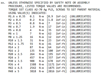
We also have notes like this where we want this information to be in columns for easy readability.
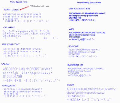
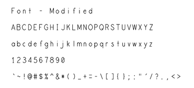
Currently the only mono-spaced fonts PTC supplies are stroked fonts. As shown in the left column below.
PTC doesn’t offer any mono spaced True Type Fonts.
This site lists some of the available Mono-Spaced True Type Fonts
https://en.wikipedia.org/wiki/List_of_monospaced_typefaces
We want a font that has the slash in the zero.
This is a sub set of Mono Spaced Fonts with slashed zero
- Consolas https://en.wikipedia.org/wiki/Consolas
- HyperFont https://en.wikipedia.org/wiki/HyperFont
- Iosevka https://en.wikipedia.org/wiki/Iosevka
- Menlo https://en.wikipedia.org/wiki/Menlo_(typeface)
- Monaco https://en.wikipedia.org/wiki/Monaco_(typeface)
- ProFont https://en.wikipedia.org/wiki/ProFont
- Roboto Mono https://en.wikipedia.org/wiki/Roboto
- Terminus http://terminus-font.sourceforge.net/
- Go Mono https://en.wikipedia.org/wiki/Go_(programming_language)
Letter Shapes
Although most of the text on drawings is upper case we do use lower case for some things.
I prefer a font that has an open tail on the lower case g rather than the closed tail, which I associate with a typewriter.
vs
If we eliminate the closed tail g from the list above we are left with:
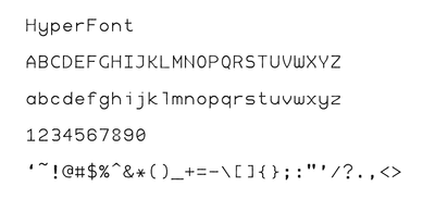
- HyperFont – Just tried this this morning – look promising – See below
- ProFont – Not tried
- Roboto Mono – Not tried
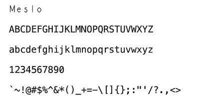
- Menlo – Mac, which has a windows Meslo equivalent which we have considered
- Monaco – Mac, don’t know if there is a windows equivalent
Our Standard Stroked font – PDF output from Creo
Hyper Font – PDF output from Creo – I like this because it’s not much thicker than the current font. I thing there is some weirdness in the 8 where it thins down too much in the middle. Same issue on the upper case N.
Meslo – A windows version of the Menlo font – PDF output from Creo – Too my eye this is too bold.
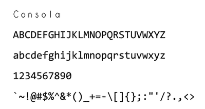
Consola – Standard Windows Font – PDF output from Creo – Same issue, this is too bold. Also the lower case italic i & j look weird, although I don’t recall ever using italic on a drawing.
- Mark as New
- Bookmark
- Subscribe
- Mute
- Subscribe to RSS Feed
- Permalink
- Notify Moderator
Keep in mind that while the TrueType fonts can be embedded in the PDFs, they are not included in the actual Creo files. If you use one of these special fonts, you will need to make sure it's installed on all user's computers, both those who use Creo and those who use Creo View. Also realize that anyone you send the native Creo files to will also need to add this special font to their system as well or Creo will just substitute a different TrueType font when opening the file.
- Mark as New
- Bookmark
- Subscribe
- Mute
- Subscribe to RSS Feed
- Permalink
- Notify Moderator
- Mark as New
- Bookmark
- Subscribe
- Mute
- Subscribe to RSS Feed
- Permalink
- Notify Moderator
It's clear to me from reading these posts that this group knows far more about fonts in Creo then I do! So I'm not sure how well I can answer this. I can tell you what settings we use in our templates and that we have not had any problems with models and drawings created with those templates in our downstream processes. I can also say that we will occasionally have an MBD model that has the incorrect settings (usually a results of copying an old model) and that the only problem with those that I've seen is that they don't look like the newly created ones.
For our MBD models we have 'default_annotation_font' set to 'win_font.ndx' and 'symbol_font' set to 'asme' or 'iso'
For our MBD drawings (usually just notes and tables, no annotations) we have 'default_annotation_font' set to 'te_font.ndx' and 'symbol_font' set to 'stroked_asme' or 'stroked_iso'
- Mark as New
- Bookmark
- Subscribe
- Mute
- Subscribe to RSS Feed
- Permalink
- Notify Moderator
If it helps to have a visual of what that looks like here is a model annotation with the settings we use.
- Mark as New
- Bookmark
- Subscribe
- Mute
- Subscribe to RSS Feed
- Permalink
- Notify Moderator
In the spirit of this great post and discussion, I added this as a product idea. I think I captured what was discussed here as well as what we would want at my own company.
Include a useable modern font (TrueType/OpenType) compliant with ASME Y14.2 Standard
Please vote if you like it and comment on it if you have anything to add/change...
"When you reward an activity, you get more of it!"
- Mark as New
- Bookmark
- Subscribe
- Mute
- Subscribe to RSS Feed
- Permalink
- Notify Moderator
Dave,
Checkout Incosolata. Inconsolata-Regular.ttf matches font.ndx almost exactly.
Pro's:
- Monspaced
- Matches Creo's default font.ndx (.8 width ratio) almost perfectly
- All unique characters
- Comes in 8 different line weights & 9 different width proportions.
- Open source so the lowercase "g" problem below could be rectified with the right resources.
Con's:
- Closed tail lowercase "g"
Inconsolata also comes as a "family" font file that supports variable width & weight for when PTC decides to support these TTF features.
- Mark as New
- Bookmark
- Subscribe
- Mute
- Subscribe to RSS Feed
- Permalink
- Notify Moderator
@BrianSnyder, this is very useful, thank you for posting!
I did some tests and it is very close to Creo's font.ndx while being a real font where we can bold, etc. It is not quite as clear as something like Arial, however, it is better than the stroked Creo font. I also like how it is monospaced and all letters and numbers are differentiable and unique shapes (no Ll1Ii confusion).
In the 3rd column the world "Consult" is bolded in all (except of course the Creo font.ndx because Creo won't let me control/change letter thickness of stroked fonts! Grr!)
I have no idea why but the inconsolata font cannot switch between bold and regular using the shortcut key whereas Ligconsolata (also included in the zip file) can switch between bold. I even tried renaming the font to the way other fonts are named and restarting Creo and that didn't work. It requires the user to manually change font style.
We would have to do quite a bit more testing of course but this might eventually help us switch.
"When you reward an activity, you get more of it!"
- Mark as New
- Bookmark
- Subscribe
- Mute
- Subscribe to RSS Feed
- Permalink
- Notify Moderator
NOTE: All of these mapkeys below are what I would consider experimental as I've only recently begun the trip down Creo's ttf lane.
Interesting anomaly about the mapkeys issue. Because Creo 7.0 has graphical slowdown when using TrueType fonts I created mapkeys to switch between ttf & stroked. Maybe you can compare and modify mine to work for you.
mapkey ttf @MAPKEY_LABELTrueType Font;\
mapkey(continued) ~ Command `ProCmdDwgProperties` ;\
mapkey(continued) ~ Activate `mdlprops_dlg` `OPTIONS_lay_Controls.push_Change.lay_instance`;\
mapkey(continued) ~ Input `preferences` `InputOpt` `default_annotation_font`;\
mapkey(continued) ~ Input `preferences` `EditPanel` `inconsolata-regular.ttf`;\
mapkey(continued) ~ Activate `preferences` `AddOpt`;\
mapkey(continued) ~ Input `preferences` `InputOpt` `symbol_font`;\
mapkey(continued) ~ Input `preferences` `EditPanel` `asme`;\
mapkey(continued) ~ Activate `preferences` `AddOpt`;\
mapkey(continued) ~ Activate `preferences` `ok`;\
mapkey(continued) ~ Activate `mdlprops_dlg` `DlgClose_push`;
mapkey ttr @MAPKEY_LABELStroke Font;\
mapkey(continued) ~ Command `ProCmdDwgProperties` ;\
mapkey(continued) ~ Activate `mdlprops_dlg` `OPTIONS_lay_Controls.push_Change.lay_instance`;\
mapkey(continued) ~ Input `preferences` `InputOpt` `default_annotation_font`;\
mapkey(continued) ~ Input `preferences` `EditPanel` `font.ndx`;\
mapkey(continued) ~ Activate `preferences` `AddOpt`;\
mapkey(continued) ~ Input `preferences` `InputOpt` `symbol_font`;\
mapkey(continued) ~ Input `preferences` `EditPanel` `asme`;\
mapkey(continued) ~ Activate `preferences` `AddOpt`;\
mapkey(continued) ~ Activate `preferences` `ok`;\
mapkey(continued) ~ Activate `mdlprops_dlg` `DlgClose_push`;
A mapkey to open the active drawing model and change the symbol font to asme (ttf).
mapkey fixmdlttf @MAPKEY_LABELFix MDL TTF;\
mapkey(continued) ~ Select `main_dlg_cur` `PHTLeft.AssyTree` 1 `node0`;\
mapkey(continued) ~ Open `main_dlg_cur` `PM_PHTLeft.AssyTree`;\
mapkey(continued) ~ Command `ProCmdOpenModel@PopupMenuTree`;\
mapkey(continued) ~ Activate `open_instance` `open`;\
mapkey(continued) ~ Command `ProCmdMmModelProperties` ;\
mapkey(continued) ~ Activate `mdlprops_dlg` `OPTIONS_lay_Controls.push_Change.lay_instance`;\
mapkey(continued) ~ Input `preferences` `InputOpt` `symbol_font`;\
mapkey(continued) ~ Input `preferences` `EditPanel` `asme`;\
mapkey(continued) ~ Activate `preferences` `AddOpt`;\
mapkey(continued) ~ Activate `preferences` `ok`;\
mapkey(continued) ~ Activate `mdlprops_dlg` `DlgClose_push`;\
mapkey(continued) ~ Command `ProCmdWinCloseGroup`;\
mapkey(continued) @MANUAL_PAUSEModel should now use TTF symbol fonts.;
One more mapkey to check the "default" box on font, width ratio, and thickness for all dimensions & notes (this includes tables) on a drawing sheet (this needs run on every sheet in a drawing). This helps a ton when doing the initial conversion to ttf fonts.
mapkey fixdrwttf @MAPKEY_LABELFix DRW TTF;\
mapkey(continued) ~ Command `ProCmdMdlTreeSearch` ;\
mapkey(continued) ~ Select `selspecdlg0` `SelOptionRadio` 1 `All Dimensions`;\
mapkey(continued) ~ Activate `selspecdlg0` `SelScopeCheck` 1;\
mapkey(continued) ~ Select `selspecdlg0` `RuleTab` 1 `Misc`;\
mapkey(continued) ~ Select `selspecdlg0` `RuleTypes` 1 `All`;\
mapkey(continued) ~ Activate `selspecdlg0` `EvaluateBtn`;\
mapkey(continued) ~ Select `selspecdlg0` `ResultList` -1;\
mapkey(continued) ~ Activate `selspecdlg0` `ApplyBtn`;\
mapkey(continued) ~ Activate `UI Message Dialog` `ok`;\
mapkey(continued) ~ Select `selspecdlg0` `SelectedItemsList` -1;\
mapkey(continued) ~ Activate `selspecdlg0` `CancelButton`;\
mapkey(continued) ~ Command `ProCmdDwgModTextStyle` ;\
mapkey(continued) ~ Activate `dial_txt_sty_asynch` `chk_usedeffont` 1;\
mapkey(continued) ~ Activate `dial_txt_sty_asynch` `chk_usedefwidth` 1;\
mapkey(continued) ~ Activate `dial_txt_sty_asynch` `chk_usedefthickness` 1;\
mapkey(continued) ~ Activate `dial_txt_sty_asynch` `psh_ok`;\
mapkey(continued) ~ Command `ProCmdMdlTreeSearch` ;\
mapkey(continued) ~ Select `selspecdlg0` `SelOptionRadio` 1 `Note`;\
mapkey(continued) ~ Select `selspecdlg0` `RuleTab` 1 `Misc`;\
mapkey(continued) ~ Select `selspecdlg0` `RuleTypes` 1 `All`;\
mapkey(continued) ~ Activate `selspecdlg0` `EvaluateBtn`;\
mapkey(continued) ~ Select `selspecdlg0` `ResultList` -1;\
mapkey(continued) ~ Activate `selspecdlg0` `ApplyBtn`;\
mapkey(continued) ~ Activate `UI Message Dialog` `ok`;\
mapkey(continued) ~ Select `selspecdlg0` `SelectedItemsList` -1;\
mapkey(continued) ~ Activate `selspecdlg0` `CancelButton`;\
mapkey(continued) ~ Command `ProCmdDwgModTextStyle` ;\
mapkey(continued) ~ Activate `dial_txt_sty_asynch` `chk_usedeffont` 1;\
mapkey(continued) ~ Activate `dial_txt_sty_asynch` `chk_usedefwidth` 1;\
mapkey(continued) ~ Activate `dial_txt_sty_asynch` `chk_usedefthickness` 1;\
mapkey(continued) ~ Activate `dial_txt_sty_asynch` `psh_ok`;\
mapkey(continued) ~ Activate `GET SELECT` `done_sel`;\
mapkey(continued) @MANUAL_PAUSECAUTION: Review text fit of tables and notes;
One thing I haven't figured out is a way to quickly change the format font. I'm not sure it can be done to be honest.
- Mark as New
- Bookmark
- Subscribe
- Mute
- Subscribe to RSS Feed
- Permalink
- Notify Moderator
Thanks for sharing the mapkeys! I am not quite ready to go down this route yet, still exploring possibilities. That sure is disappointing that Creo 7 has performance issues...I am assuming they know about it or that you reported it to them and hopefully, they clear that up fast in a future build!
"When you reward an activity, you get more of it!"
- Mark as New
- Bookmark
- Subscribe
- Mute
- Subscribe to RSS Feed
- Permalink
- Notify Moderator
I apologize. I misread your comment. To fix the "bold toggle" issue remove any capital letters where the default font is called out in the drawing detail options. Use lower case only. This bug only affects the drawings default font.
I've also removed capital letters from the font filenames as a precaution.

