- Community
- ThingWorx
- ThingWorx Developers
- Re: Bar chart truncated XAxis label
- Subscribe to RSS Feed
- Mark Topic as New
- Mark Topic as Read
- Float this Topic for Current User
- Bookmark
- Subscribe
- Mute
- Printer Friendly Page
Bar chart truncated XAxis label
- Mark as New
- Bookmark
- Subscribe
- Mute
- Subscribe to RSS Feed
- Permalink
- Notify Moderator
Bar chart truncated XAxis label
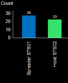
I'm working on ThingWorx 9.3.5, I have difficulties on styling the XAxis label for bar chart widget. As you can see on the image, the XAxis label is truncated due to insufficient space at the XAxis. Is there anyway to add new line below instead of truncating it?
Solved! Go to Solution.
- Labels:
-
Mashup-Widget
-
Troubleshooting
Accepted Solutions
- Mark as New
- Bookmark
- Subscribe
- Mute
- Subscribe to RSS Feed
- Permalink
- Notify Moderator
Hello @MA_9708362,
Did you try setting the "HorizontalAxisMaxHeight" and "HorizontalAxisLabelsRotation".
I do not expect the first will give you the result you are looking to find. I would expect that the second will give you a better result.
- Mark as New
- Bookmark
- Subscribe
- Mute
- Subscribe to RSS Feed
- Permalink
- Notify Moderator
Worked on a similar issue today as well. "HorizontalAxisMaxHeight" gave the extra room for my vertical text.
Thanks.
- Mark as New
- Bookmark
- Subscribe
- Mute
- Subscribe to RSS Feed
- Permalink
- Notify Moderator
I have tried setting those properties, it works for the "HorizontalAxisLabelsRotation", but for the "HorizontalAxisMaxHeight" it is still showing the same no matter how much I change it. By default the axis label is oriented vertically as shown in the picture, I set the horizontal axis rotation to 0 to make it appear horizontally. At the same time, it makes the x axis label to be truncated, I tried to change the "HorizontalAxisMaxHeight" property, but it made no difference.


