

Plus-Minus Tolerance Alignment - TTF Issue
I borrowed this from another forum as I can see this as being a problem soon enough.
I called this into TC and they explained to me the problem but didn't have a solid solution.
That is why I added this to the idea area:
Align Plus-Minus Tolerance "Properly" with TT fonts
Please vote if you can.
This was brought to my attention by another user.
Indeed, I know this will happen to me one day if it hadn't already.
With the increasing need to have TT Fonts be the default font, the plotted outcome too needs to be represented in a professional manner.
It seems half my time in getting use to Creo from Pro/E 2000i has been spent trying to resolve client font compatibility issues.
Here is yet another one:
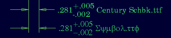
The top TT font (Century Schoolbook) is like most TT fonts where each character is uniquely spaced. This makes a real mess of the over/under Plus-Minus tolerance callouts. Either the 1st numerical character or the periods should line up vertically. Shown in the second example, one of the few monotype TT fonts is Symbol.ttf. Unfortunately, this will neither let you use this as a default font as it is mostly gibberish for notes or prefix/append text to a dimension. It seems that symbol.ttf is also the -only- default monospace TT font installed. If nothing else, can we not get a better assortment to at least meet the minimal requirements for the short term?
So with the heavy push to make TT font acceptable in Creo Parametric, and the lack of solid control of these characters really makes the detail drawings, and in fact, model annotation look really "unfinished". Combine this with the poor substitution from non-TTF fonts in the drawings to printing using the PDF export (TTF by default?), you really get the solid sense that the fit and finish of Creo is no better than -any- of its predecessors. As a matter of fact, now it is more work to have a consistent look and feel than ever before.
I did submit this as a problem to TS. The use of a monospace font was the "solution" which is not acceptable since customers pick the font they expect on a drawing. In the meantime, the work around is about as Neanderthal as it gets by dropping little +/- notes all over the drawing and making space for them in between the dimension leaders. Never mind trying to sustain these and move dimensions around. It is just a nightmare.
But remember, for those of us with many clients of all backgrounds... "The customer is always right!".
PTC, we need help here! This situation requires special formatting if TT fonts are really going to be the drawing fonts of the future in PTC products.
This thread is inactive and closed by the PTC Community Management Team. If you would like to provide a reply and re-open this thread, please notify the moderator and reference the thread. You may also use "Start a topic" button to ask a new question. Please be sure to include what version of the PTC product you are using so another community member knowledgeable about your version may be able to assist.