Arial on pdfs from worker looks bold when zoomed out.
Dear all,
we have bumped into strange issue, or possibly we're doing something wrong.
We have a Windchill product in which we use client's configs including fonts, in their case Arial.
Suddenly some drawings started using different font which caused text overspilling its respective table cells.
Anyway, during investigation we learned that for some reason we were missing Arial in the default Creo folder on worker machine (../common/text/fonts) and in the config.pro there was no other folder specified (pro_config_dir commented out).
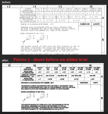
We copied over the Arial font to the folder, and drawings started using the font all right, BUT it's displayed in a very strange way.
Attaching an image to illustrate it (picture 1) - the "futher" you are the more the font looks as if it's bold.
And it even prtins out this way on a paper.
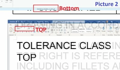
But when I zoomed in typed fragment of text in Word and overlayed one with another (picture 2), it looks all right.
Arial bold should be proportionally different from plain Arial, but these are identical.
How come the more we zoom away the more bold it looks? Is there some settings in the config.pro / *.dtl file that affects this?
I must apologize, but I am not very experienced with this, so any clue will be appreciated.
Best regards,
Daniel