

1-Visitor
March 30, 2017
Solved

How do I create a contour plot from tabulated data Mathcad Prime 4?

  • March 30, 2017
  • 4 replies
  • 2776 views

How do I generate a color-coded contour plot with three columns of tabulated data in Mathcad Prime 4? I've seen articles on how to plot a z-axis with the x- and y-axes defined as functions, but I don't want to do that. I want to take my measured and tabulated x, y, and z data and put it in a contour plot. Thanks in advance.
Best answer by Fred_Kohlhepp

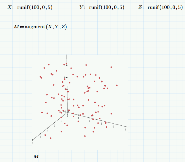
You should be able to do a 3D scatter plot

4 replies

25-Diamond I
March 30, 2017

Contourplot means that you have a surface, but your list just represents a bunch of single, not connected points. To represent a surface we would need a mesh structure, need the information which points should be connected, which points form a facette of the surface.

While Prime sure is not the right tool for 3D or contourplots, you may try to fit a surface to your points an use this for a contour plot.

23-Emerald I
March 30, 2017

You should be able to do a 3D scatter plot

jbiggers1-VisitorAuthor
1-Visitor
March 30, 2017

Thanks, gentlemen. It was the "augment" function I was missing. Basically, I just defined the z-axis as 

:= "augment("x-axis column label", "y-axis column label", "z-axis column label")

aaaaand BOOM. Pretty contour plot. Problem solved.

23-Emerald IV
March 30, 2017

"Problem solved."

then

Mark it as such...?

(and give Fred the credits.)