1-Visitor
September 26, 2013
Solved

Recall matrices into a matrix from a loop

  • September 26, 2013
  • 9 replies
  • 5506 views

The first section of my programme is fine where it shows the progression of infection after every cycle however its this next part i am having a problem with. I am trying to see how the percentage of immunised population affects the final amount of infected people however I am having some trouble as to varying the immunised percent (x) in my programme loop. I only need to display the infected for the final stage of the loop not after every cycle which I have managed to do for a specifi x value however cant seem to get it for a range of x values from 0-1 at 0.01 intervals.

Any help would be appreciated.

in the long run i also want to average this out over a certain amount of runs. In otherwords i want to creat a matrix to hold the amount of infected population against the immuised percent x while varying that x value from 0-1. I then want to repeat that for say 1000 cycles and plot the average.

Best answer by Werner_E

My aim is to show how the percentage of immunisation affects the amount of infected.

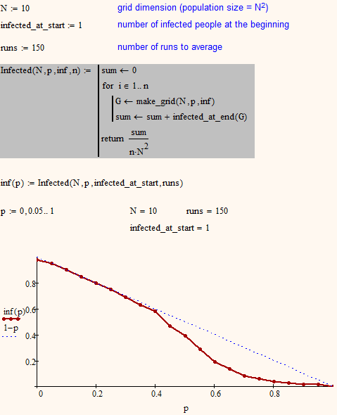
Yes, but I still don't see why you would be interested in finding out by a long winded simulation that an immunisation rate of 37% results in an infection rate of approx. 63%. In other words - all persons not immunized will get infected sooner or later in the long run. Deviations from the ideal line are due to the mentioned effects when unvaccinated people or the first infected person are surrounded by immunized.

I haven't used your sheet to obtain the results and thats one reason for not attaching it. I would not be patient enough to wait until a simulation, where every immunization rate would be averaged over 1000 runs, finishes with a grid bigger than 10x10 (as in the first pic).

Did you already change your iteration/infection routine?

You should build more function which should be dependend on all variables you would like to change later and they should not rely on calculations made outside the program. That way you can easy use them in loops or plotting functions.

As a hint a list of the functions I used in my sheet:

  • make_grid(n,p,inf) ... returns a n x n matrix with p percent immunized and inf is the numer of initial infected people
  • step(grid) ... takes the matrix grid, applies the infection algorithmus and returns the newly derived matrix
  • steps(n,grid) ... routine which calls step() n-times; used for the animation
  • make_points(grid) ... creates the datastructures needed for the graphical representation of the grid; used for animation
  • infected_at_end(grid) ... will call step as long as the number of infected person changes and then returns the number of infected persons at the end
  • count(nr,M) ... returns how often nr is found in matrix M

To plot the infection rate at the end over the immunization rate, I used the following
infected2.png

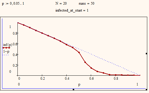
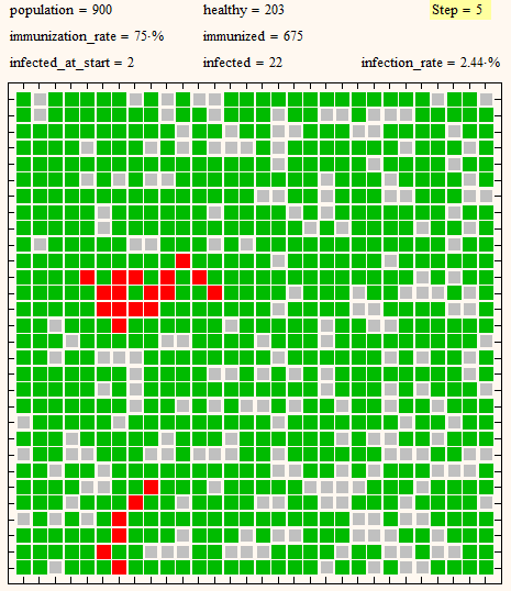
BTW, I had an error in my Infected() routine and so the plots in my previous post are wrong. They would all look more or less like the above and it seems that the effect for higher immunization rates of groups of healthy people being fully surrounded by immunized ones is getting bigger with growing poulation size (see below for poulation size 400). So you can't cope this with averaging over 1000 runs as for higher immunization rates and greater population (say 75% and 30x30) it will happen nearly all of the time. The pic below with all those islands of healthy and islands of infected people being separated by immunized ones is typical, not an outlier. But then - would this have much meaning for real life?
infected1.png grid30.png

9 replies

Werner_E
25-Diamond I
September 26, 2013

To be able to vary the percentage of immunized persons you will have to turn all vital routines into function of that percentage. See if the attached helps.

I think the routine which simulates the infection of other people is not programmed correctly as the freshly to the right and below an infected person would immedeatly infect their neighbours in the same step.

So beginning with

1.png

you will end up with

2.png

which I guess is not intended. Ther come two ways into my mind to cope with that.

1) you could copy the matrix to a temporary one and use one for the conditions and set the value to 2 in the other.

2) Set the value to 3 or any other higher number or to a string in the first run and then go through the matrix a second time and set the value to 2 if its 3 or whatever you had set it before.

BTW, this could be a nice expample for an animation made with Mathcad.

Werner_E
25-Diamond I
September 28, 2013

Some additional thoughts:

in the long run i also want to average this out over a certain amount of runs. In otherwords i want to creat a matrix to hold the amount of infected population against the immuised percent x while varying that x value from 0-1. I then want to repeat that for say 1000 cycles and plot the average.

What do you expect to get? Basically you would end up with the function f(p):=1-p as at the end nearly all not immunized persons would be infected. With higher immunization rates some healthy, not immunized persons can be fully surrounded by immunized people and would never be infected (see in

the included animations). It can also happen, that the one infected person at the beginning is surrounded by immunized individuals and can only infect a very small amount of people being on the same "island". But these are effects specific to the way the simplified simulation is set up and in the long run we will end up with approx. all not immunized people being infected. You could add incubation time, declining vaccination, death, recovery, ... to make it a bit more realistic and interesting.

infected1.pnginfected2.pnginfection3.png


1-Visitor
September 28, 2013

HI werner

Thanks for the reply. My aim is to show how the percentage of immunisation affects the amount of infected. Now i know what you were saying about sometimes the inital infected maybe completely surrounded by immunised people and therefore wouldnt spread but thats why i wanted to run it over say 1000 runs and take and avergae. Not sure how to get this data out from my loop to plot graphs like yours.

Werner_E
Werner_E25-Diamond IAnswer
25-Diamond I
September 29, 2013

My aim is to show how the percentage of immunisation affects the amount of infected.

Yes, but I still don't see why you would be interested in finding out by a long winded simulation that an immunisation rate of 37% results in an infection rate of approx. 63%. In other words - all persons not immunized will get infected sooner or later in the long run. Deviations from the ideal line are due to the mentioned effects when unvaccinated people or the first infected person are surrounded by immunized.

I haven't used your sheet to obtain the results and thats one reason for not attaching it. I would not be patient enough to wait until a simulation, where every immunization rate would be averaged over 1000 runs, finishes with a grid bigger than 10x10 (as in the first pic).

Did you already change your iteration/infection routine?

You should build more function which should be dependend on all variables you would like to change later and they should not rely on calculations made outside the program. That way you can easy use them in loops or plotting functions.

As a hint a list of the functions I used in my sheet:

  • make_grid(n,p,inf) ... returns a n x n matrix with p percent immunized and inf is the numer of initial infected people
  • step(grid) ... takes the matrix grid, applies the infection algorithmus and returns the newly derived matrix
  • steps(n,grid) ... routine which calls step() n-times; used for the animation
  • make_points(grid) ... creates the datastructures needed for the graphical representation of the grid; used for animation
  • infected_at_end(grid) ... will call step as long as the number of infected person changes and then returns the number of infected persons at the end
  • count(nr,M) ... returns how often nr is found in matrix M

To plot the infection rate at the end over the immunization rate, I used the following

infected2.png

BTW, I had an error in my Infected() routine and so the plots in my previous post are wrong. They would all look more or less like the above and it seems that the effect for higher immunization rates of groups of healthy people being fully surrounded by immunized ones is getting bigger with growing poulation size (see below for poulation size 400). So you can't cope this with averaging over 1000 runs as for higher immunization rates and greater population (say 75% and 30x30) it will happen nearly all of the time. The pic below with all those islands of healthy and islands of infected people being separated by immunized ones is typical, not an outlier. But then - would this have much meaning for real life?

infected1.png grid30.png

1-Visitor
September 30, 2013

attached is my idea just for reference.

forgive my broken english