

Question
Responsive Application
Hello,
I'm building an application that must fit on a smartphone screen. Everything works fine except when I rotate the device. I have to images below to exemplify the case.
The application is composed with a master that is horizontally divided and has one header and one responsive row. The header is 130px height.
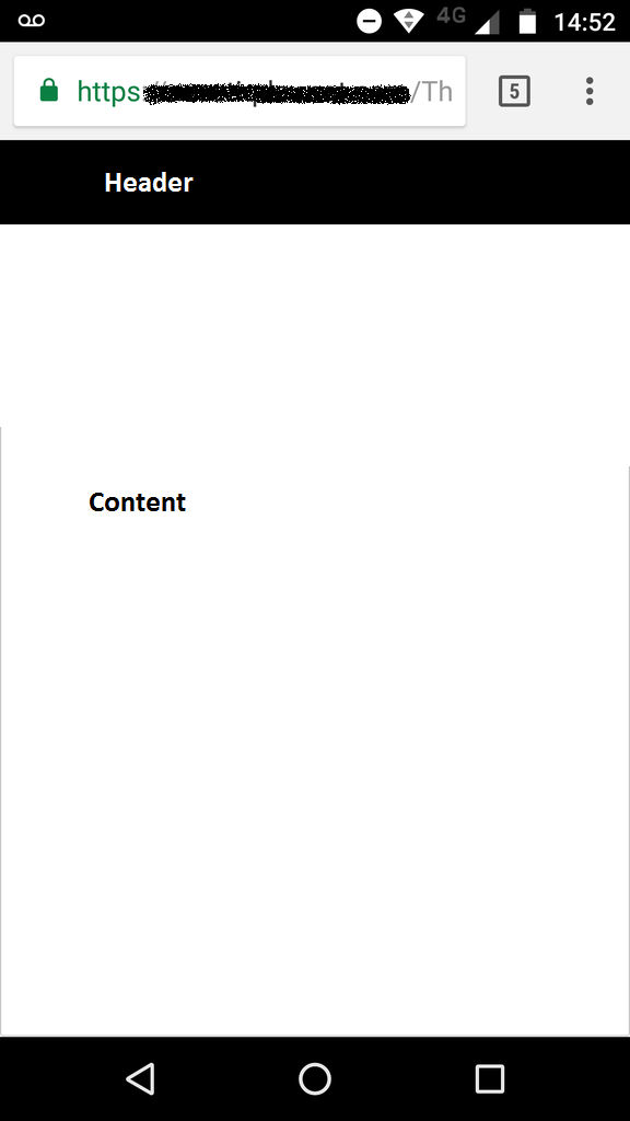

As we can see on the images above, when the device is vertically rotated, the header seems to consume less space on screen than when it's horizontally rotated. Ideally, I want everything to work as if it was vertically.