
Risolto
Scatterplot creation
How should I be able to make a scatter plot of the two sets of data marked red in the graph, in order for me to easily see their relationship.For example, the scatterplot below.
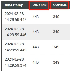
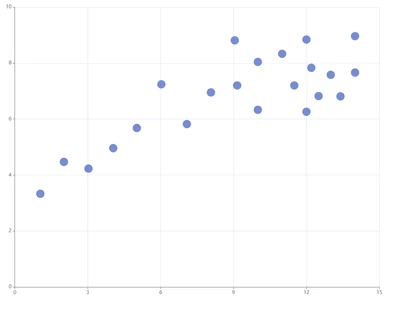

How should I be able to make a scatter plot of the two sets of data marked red in the graph, in order for me to easily see their relationship.For example, the scatterplot below.
You would use a Line Chart widget for this, it has a property "ChartType" which you can set to Scatterplot.
You assign the infotable returned by a service call to the property Data, NumberOfSeries to 1, XAxisField to VW1044 and DataField1 to VW1046.
Enter your E-mail address. We'll send you an e-mail with instructions to reset your password.