

Question
Creo 4.0 Appearances look terrible in "samples"
We recently (last week) switched from Creo 2.0 to Creo 4.0.
I have a number of appearances I've used for years that consist of a basically "white" (equal parts red, green and blue) color with a distinct highlight. It gives subtle coloring without being gaudy, accentuates curvature, etc. With Creo 4.0, when I attempt to define the appearance of a part, the "sample" depictions of the different selections does shows more of a black blob than a nicely colored sphere. See the image below for an example.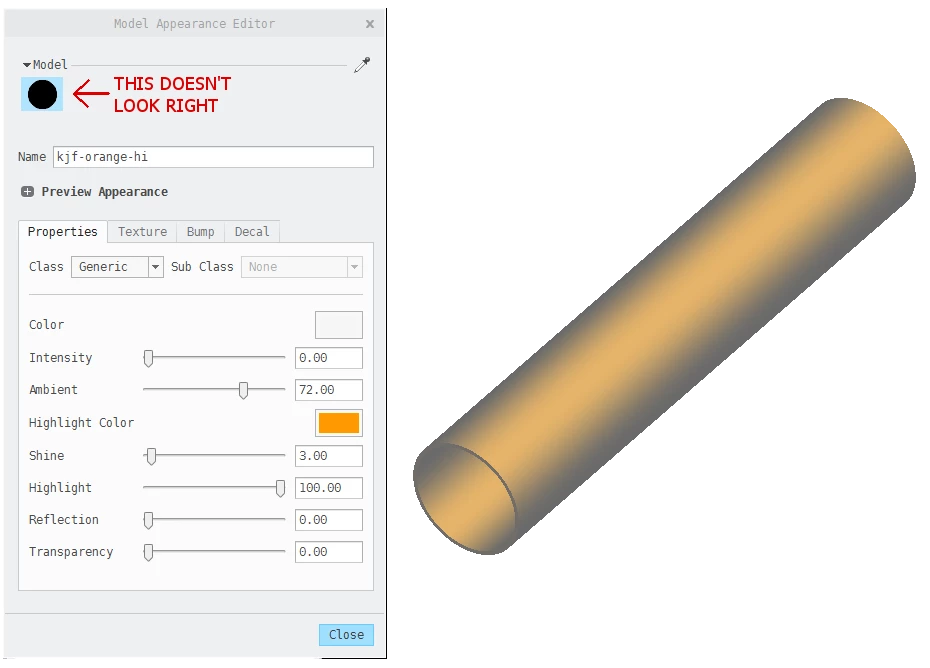 Is there something I'm missing (settings, etc.) that is keeping the Appearances menu from showing a useful representation of the appearances I've defined? It's kind of hard to select a particular one from a bunch of colorless blobs.