

Another thing on UI Customisation
I have created a custom tab to make Creo Parametric 2 look the way I think I want it to. Strangely, though, some of the icons are large and others are teeny. 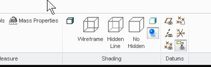
So, in the image above, the Shaded with edges icon is teeny, but the Wireframe icon is large. Why is this? Am I doing something wrong?
Also, at the top of the screen, above the tabs, there is a 20mm vacant space, just wasted. Is it possible to reduce the height of this dead space? I think it may be caused by the help, learning connector and command search icons hudding together for warmth beneath the minimise, maximise and close icons at the top right.
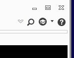
Is it possible to entice them out from under?
Then there's the 12mm strip at the bottom of the screen, which has all of 5 icons and a selection filter box in it, but extends all the way across the whole screen. Can I reclaim some of that fertile area?
Cheers,
John