15-Moonstone
March 18, 2015
Question

behavior of sketcher text font?

  • March 18, 2015
  • 1 reply
  • 1901 views

font.jpg

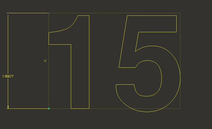
is this is how the sketcher text font should appear?....the numbers are not equal in length..and one is below the other.

    1 reply

    1-Visitor
    March 18, 2015

    Unless there is something wrong with the font interpreter, there isn't anything inherently wrong with this result. A lot of font design involves small tweaks to the font, including extensions below the baseline. This particular tweak to a digit isn't familiar to me, and I wonder what the font designer was thinking.

    15-Moonstone
    March 18, 2015

    its a sanserif bold font.

    this behavior is very annoying..as the numbers are of different length and they are not symmetric also.

    1-Visitor
    March 18, 2015

    Which font/typeface? I've read numerous blogs and articles on fonts and my only recommendation is to keep looking for one you like. There are too many characteristics to easily catalog and find one that matches a rough description.

    Check http://partners.adobe.com/public/developer/en/font/T1_SPEC.PDF for a start on font definition and PostScript fonts - Wikipedia, the free encyclopedia, especially the references if you can stand even more.

    I'm sure there are dozens of websites with font design experts.