
1-Visitor
September 16, 2013
Solved

Filtering of "rubbish" from regression curves

  • September 16, 2013
  • 12 replies
  • 6360 views

Hi,

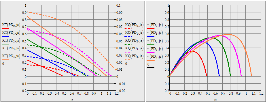
I have been given the polynominal regression coefficients for the torque, thrust, and efficiency curves - corresponding to different propeller pitch to diameter ratios. When I graph these curves - they come out fine - apart from the fact - that because they are polynomials - they "re-appear" - outwith the range of that particular curve.

So my question is - how can the "rubbish" be filtered out of these regression curves? If you look at the attached spreadsheet - you will see the efficiency curves - have a lot of rubbish - beyond the "curve".

So in essence - I would like to "stop" - the graph - once the "curve" has been displayed. I suspect - I need a program to do this - but I am unsure how to do this.

Look forward to your ideas.

Gordon.
Best answer by Werner_E

Inspired by Fred - here is another functional approach. Plotting is somewhat slow as the functions will try to determine the zero point for every call to the function.

The local approach using the sign of the derivative sure is quicker and works, as long as the type of function doesn't change much. It will certainly not work for eta.But then my way of using root to find the zeropoint is also limited to "good behaved" functions KT and KQ.

17.09.png

12 replies

Werner_E
25-Diamond I
September 16, 2013

It depends upon how exactly you would define "rubbish". For instance thats what you eta1 looks like

16.09.png

How would you change the values in this vector? It woule be reasonabla that the length of the vector (as its part of a bigger matrix) should not be changed. So the "rubbish" values have to be changed in a way the corresponding points are not seen in the graph. One approach could be to keep the values constant as soon as the first value is negative. Don't know if this what you want, but it will look like this:

16.09.png

Look if the attached would help.

1-Visitor
September 16, 2013

Hi Werner,

Many thanks for looking into this - and your proposal. I have been having some further thoughts about this - and have partly been able to answer my own question - but not completely.

I have attached some pictures - and as you will see I have succeeded in filtering the rubbish out of the efficiency curves - but I have not succeeded in filtering the rubbish out of the Kt, Kq graph - in particular - the brown curve - which dips below zero - and then starts to climb up again.

Could I trouble you to explain why this is not working?

Look forward to your thoughts.

Gordon.

Regression+Graph+Issue+2.bmp.jpg

Regression+Graph+Issue+3.jpg

Werner_E
25-Diamond I
September 16, 2013

The new plots seem to be from a differnt data set. As far as I see you successfully suppress negative values but positive value are unchanged. It seems that you don't ant to see positive values after the plot is going negative the first time. You routine would not do that because every data point is handled on its own without considering what happend before. Furthermore the routine for filtering K.Q is obviously done after K.Q was calculated the first time. So there is no need to calculate all values again. On contrary - in your try to filter for K.Q you already have K.Q calculated and what you do is: if K.Qij is postive, you calculate the value again (to no avail), other you leave it as is, This means that K.Q wouldn't change at all.

For eta this is different as you filter while eta is calculated the first time, so values, where K.q is negative are not calculated and stay at their default value 0.

There are two reasons why I had chosen to set the values we want to filter not to zero but to the first negative value found:

1) If i would set the first negative value to zero, the last segment (the connection of the last point with positive value to the next) would be slightly false.

2) Keeping all filtered values negative keeps them out of the way. If they were zero, you could see them at the bottom, especially if you chose to add symbols like dots to the plots.

23-Emerald I
September 16, 2013

If you create KT and KQ as functions, then you can discard values that don't make sense to you. (Note that negative thrust and torque are both physically possible!)

1-Visitor
September 16, 2013

Hi Fred,

I much appreciate your help with this too. However, if you have a look at the first picture below - I have drawn a red loop - round a "small portion" of the brown dotted curve - which shouldn't be there. Any ideas why that is there?

I reduced the size of the "interval j" - and as you will see the efficiency curves look good - in the second picture.

So - the only remaining thing - is to sort the brown curve - which persists in re-appearing.

Look forward to your thoughts on this.

Gordon.

Fred+Picture+1.jpg

Fred+Picture+2.jpg

1-Visitor
September 16, 2013

Hi Fred, Werner,

I deliberetly increased the X axis limits - to see what the polynominal curves were doing - once they had dipped below zero on the Y axis - and I noticed they all had positive gradients (first picture).

So I added the additional restraint of the differential of the curve - if it was positive - then it had to be a "not a number" as well.

I liked the idea of turning the regression equation into a function - that was a good idea Fred.

So I think this answers my question now - so many thanks to you both for your help. Much appreciated.

Gordon.

I Gordon+Picture+0.jpg

Gordon+Picture+1.jpg