1-Visitor
August 8, 2017
Question

X-Axis labels are cut off on Label Chart

  • August 8, 2017
  • 5 replies
  • 6968 views

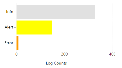
I've found that the X-Axis labels are often cut off on the right hand side of a Label Chart.  Is there a way to fix this to show the full value?  It should show 400 in the chart below.  I'm on version 7.2.5.-b56.

labelcut.PNG

5 replies

1-Visitor
August 9, 2017

I'm interested too

5-Regular Member
August 11, 2017

I know this doesn't really answer your question, but have you tried the new chart widgets available on the marketplace? I find they render much more nicely than the old chart widgets: https://marketplace.thingworx.com/tools/custom-chart-widget

as for the old chart widgets, the best bet is the xaxisLabelRotation property to rotate the label until it is in view.

1-Visitor
August 11, 2017

Hi James, yes it renders better, but has a low less features than the standard ones...

(Also we have the standard ones customized to support TimeZone )

rflanagan1-VisitorAuthor
1-Visitor
August 14, 2017

I found a quasi-solution for time series charts and label charts with a vertical chart orientation.  If you add a secondary Y axis and clear out the secondary Y axis formatting, you get some extra label space on the right.  It doesn't work with the horizontal label chart above but has fixed my other charts.

labels.PNG

rflanagan1-VisitorAuthor
1-Visitor
August 14, 2017

Adding a legend to the right hand side with a cleared format helps for horizontal label charts like above (assuming you don't need the legend!).

1-Visitor
November 30, 2018

Hi, 

It can be rectified by adding the Longest X-Axis Label to X-Axis Format. It worked for me. 

Regards,

Manirajan.V