

1-Visitor
August 10, 2016
Solved

Label Chart Formatting.

  • August 10, 2016
  • 2 replies
  • 2477 views

Hi,

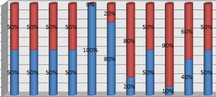
I have a label chart displaying power consumption (y axis) against each month (x axis) . Y axis range is 0 to 100 units. I have a state formatting,  if the value of power is less than 50 then its green, if its less than 80 then yellow else red. The formating applies to full bar based on the value, is it possible to segregate the bar coloring into different types ? like sample below,
Best answer by Aanjan

Dinesh, as you noted the State-based formatting will apply to the entire bar and not sections. You would need to create a custom widget of sorts to render as shown in your picture.

2 replies

Aanjan5-Regular MemberAnswer
5-Regular Member
August 11, 2016

Dinesh, as you noted the State-based formatting will apply to the entire bar and not sections. You would need to create a custom widget of sorts to render as shown in your picture.

1-Visitor
August 12, 2016

Aanjan, Thanks for the reply. I was able to use the 'Custom Chart Widget' from Marketplace and use the stacked view .