


Ascherer17
16-Pearl
November 22, 2017
Solved

Plotting Limit Lines on Chart

  • November 22, 2017
  • 4 replies
  • 3729 views

I've plotted data into a Time Series Chart widget.  I need to be able to overlay horizontal lines on the same chart to show limits that the data should be over/under.

Is this possible with the regular time series chart widget or is there an extension widget that can accomplish this?  I'm working with Thingworx 7.1 right now.
Best answer by CarlesColl

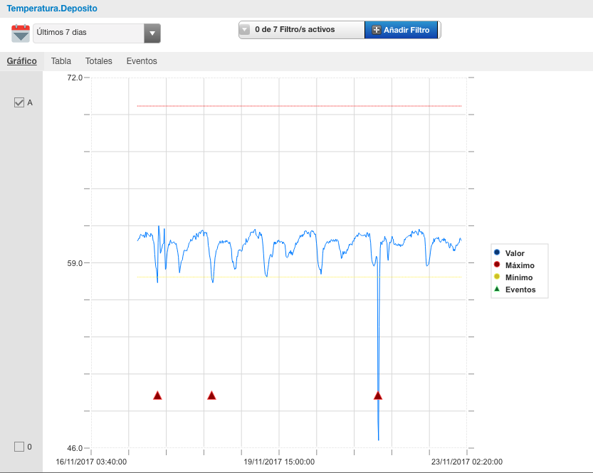
As a workaround, you can add two new time series fake data which are the Upper and Lower limits, we already did it:

Captura de pantalla 2017-11-23 09.51.56.png

4 replies

1-Visitor
November 22, 2017

Unfortunately, this is a customization.  You will need to modify the out of the box chart widget to accept the upper and lower x values for your line start/end and then draw those lines on new blank canvas that overlays the chart widget.  Or use a different chart library that offers this functionality, pass in the required data, and let the library handle the rendering.

1-Visitor
November 23, 2017

As a workaround, you can add two new time series fake data which are the Upper and Lower limits, we already did it:

Captura de pantalla 2017-11-23 09.51.56.png

Ascherer17
16-Pearl
December 14, 2017

I'll mention what I ended up actually doing in case it helps someone else:

I already had a "helper" Thing created for services I needed to write.  I wrote a simple service to get the first and last entries in my InfoTable (ordered by time stamp) and create a 2 row Info Table containing these times with the same limit Number value.  Plotting this Info Table in a Time Series Chart gives a horizontal line at the y-value limit (as long as you have the Chart type set up for a Line).  I also edited the Styles of the pens to give a dotted or dashed line.

22-Sapphire I
December 14, 2017

Probably a bit late, but DeriveFields is perfect for creating these additional series.